Managing Input Page Elements
This topic describes how to manage input page elements.
This section describes how to:
Add input page elements to pages.
Use the Input Selection page.
View defined input page elements in the Layout grid.
Adding Input Page Elements to Pages
To add an input page element:
Access the Layout grid on the Layout Designer – Layout page.
Select to access the page.
Determine the position in the grid to add the page element.
Click the row directly above where you want to add the page element to make it the current row.
The Current Row icon (blue arrow) displays in the first column of the row to indicate that it’s the current row.
Field or Control
Definition

The Current Row button.
Click the Add Input button on the Layout grid toolbar.
Field or Control
Definition

The Add Input button.
After you click the Add Input button, the Input Selection page appears.
Using the Input Selection Page
Image: Input Selection page
This example illustrates the fields and controls on the Input Selection page. You can find definitions for the fields and controls later on this page.
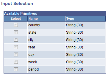
Use the Input Selection page to select the primitive for the input field.
|
Field or Control |
Definition |
|---|---|
| Select |
Select the primitive for the input element from the list. |
After you select the value for the element the Layout Designer – Layout page appears.
Viewing Defined Input Page Elements in the Layout Grid
After you define an input element by selecting a primitive value for it, the Layout Designer – Layout page appears and the element appears in the Layout grid.
The default element ID for input page elements is the name of the primitive you defined for it., for example <primitive_name>_n.
Image: Input element defined in the Layout grid
This example illustrates an input element defined in the Layout grid.

In the example, WEEK_1 is the element ID.
By default the system populates the Label Text field with the name of the primitive that you defined for the element, week in the example. This is the same name defined in the Element Name field for the primitive in the PeopleSoft document. This value appears as the label for the input element. You can keep the default value, define a different value, or remove it.
Click the Properties link to access the Input Properties page to define properties for the element.
Use the other fields to apply CSS3 classes and styles to the button label, as well as apply jQuery themes.
Understanding Defining Input Page Element Properties
This topic describes how to define input page element properties using the Input Properties page.
Many properties that appear on the Input Properties page also appear on the properties pages for other page elements. These common properties are described in the topic Common Layout Page Element Properties. This topic discusses using the properties on the Input Properties page that are unique to working with input page elements only.
Understanding Input Types
One of the properties you can define for an input page element is the input type.
By default the framework defaults the input type to the data type of the primitive you selected when you defined the element. You can select a different input type to correspond to the primitive type. For example, a primitive type String defaults in as Text. But you can select another input type.
The Mobile Application Platform supports the basic HTML5 inputs shown in the following table:
|
HTML Inputs |
Considerations |
|---|---|
|
Keep in mind that HTML5 date fields are not supported on every browser, whether mobile or desktop. |
|
When any of these input types are defined, the appropriate optimized virtual keyboard will be displayed. |
Defining Input Properties
Input page element properties are located on the Input Properties page. To access the page, in the Layout grid on the Layout Designer – Layout page click the Properties link next to the input element for which you want to define properties.
Image: Input Properties section
This example illustrates the fields and controls in the Input Properties section of the Input Properties page. You can find definitions for the fields and controls later on this page.
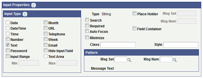
The following table describes the fields and controls in the Input Properties section of the Input Properties page. The fields and controls are listed alphabetically.
|
Field or Control |
Definition |
|---|---|
| Auto Focus |
Select the property for the input element to automatically get focus when the page loads. |
| Class |
Enter the name of a custom CSS3 class for the element. The class must be defined on the Layout Designer – CSS page. |
| Field Container |
Select this property to enable a field container for the element to assist in rendering the element on wider screens, such as in table devices. |
| Input Type section |
Select the type of input desired. By default the system populates the input type with the data type of the primitive element defined when the element is created. If no input is selected the default value (Text) is used. The valid values are:
|
| Minimize |
Select the option to create a more compact version of the element. |
| Pattern section |
Use the properties in this section to define a message catalog entry to describe the pattern expected for data input. For example, if you specify a date, you may require that users enter it in a mm-dd-yyyy format.
|
| Place Holder |
Select the property to define a short hint of the expected value of the input field. |
| Place Holder Msg Set and Msg Num |
These field become enabled when you select the placeholder property. Define the hint message using a message catalog entry by defining a message set and message number.
|
| Required |
Specify that an input field must be filled out before submitting the form. |
| Search |
Select this property to define the input with a search field. Search fields are styled inputs. They start out with a search icon (magnifying glass) in the left of the input field. As the user begins to type, a clear icon (an “x”) will appear in the right f the input field. Tapping on the stop icon will clear the user’s input. |
| Style |
Enter the name of a custom style for the element. The class must be defined on the Layout Designer – CSS page. |
| Type |
Displays the data type of the primitive element defined for the element. |