Using the Layout Toolbar and Layout Grid
The Layout Designer – Layout page features a toolbar and grid that you use to:
Insert page elements into a layout page.
Access page element properties.
View summary details about the page elements inserted in a page.
To access the Layout grid and toolbar, select
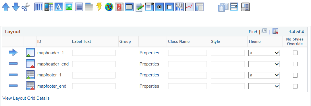
Image: Layout toolbar and Layout grid
This example illustrates the fields and controls on the Layout toolbar and Layout grid. You can find definitions for the fields and controls later on this page.
Use the layout toolbar to insert, move and delete page elements in the layout grid.
Image: Layout toolbar
This example illustrates the fields and controls on the Layout toolbar. You can find definitions for the fields and controls later on this page.

The toolbar is divided into three sections. Use the first three buttons to move and delete page elements in the Layout grid. Use the middle buttons to add page elements to the layout grid. And use the last two buttons to copy pages and containers into the layout grid, and to add references to other layouts in the grid.
Use the following buttons to move and delete page elements in the Layout grid:
|
Button |
Label |
Description |
|---|---|---|

|
Move Item Up |
Click a row in the Layout grid and click the button to move the selected page element up in the grid. |

|
Move Item Down |
Click a row in the Layout grid and click the button to move the selected page element down in the grid. |

|
Delete Current Row |
Click a row in the grid and click the button to delete the selected page element from the page. |
Use the following toolbar buttons to add elements to the Layout grid:
|
Button |
Label |
|---|---|

|
Add Container |

|
Add Mobile Grid |

|
Add Static Text |

|
Add Image/Static Text |

|
Add Listview |

|
Add Select Menu |

|
Add URL |

|
Add HTML Area |

|
Add Action Sheet |

|
Add Flip Toggle |

|
Add Pushbutton |

|
Add Input |

|
Add Select Box |

|
Add Radio Button |

|
Add Checkbox |

|
Add Slider |

|
Add Table |

|
Add Sidebar |
Use the following toolbar buttons to copy and reference containers in the Layout grid:
|
Button |
Label |
|---|---|

|
Copy page/container |

|
Reference Layout Container |

|
Sub Container |
Use the Layout grid on the Template Designer – Layout page to add elements to a mobile application page and define the properties for the elements.
Image: Layout grid
This example illustrates the fields and controls on the Layout grid. You can find definitions for the fields and controls later on this page.
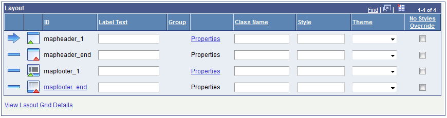
By default, header and footer elements are added to every page in a layout. These elements appear in the Layout grid by default with the default element IDs mayheader_1/mapheader_end and mapfooter_1/mapfooter_end, respectively.
The following table describes the buttons and icons that appear in the Layout grid:
|
Button/Icon |
Label |
Description |
|---|---|---|

|
Current Row |
Indicates the current row in the grid. |

|
Non-current Row |
Indicates a non-current row. |

|
NA |
Several page elements allow you to nest other page elements within them, including these element:
A green triangle at the bottom right-corner of a page element icon indicates where you can begin to nest other elements, and functions similar to a visual start tag. To nest an element, click the icon in the grid under which to nest a page element, and then click a page element in the Layout toolbar to insert the new page element within the top element. |

|
NA |
A red triangle at the bottom right-corner of a page element icon indicates the end of a top element for nesting purposes. |
This table describes the fields and controls on the Layout grid:
|
Field or Control |
Definition |
|---|---|
| ID |
Indicates the unique system-generated ID for an element. This ID can be used in JavaScript. If an element ID appears in the grid as a link, you can assign a custom ID by clicking the link. If you choose to customize element IDs, you are responsible for ensuring that you use unique IDs, as the system does not scan for duplicate IDs. |
| Label Text |
Enter a label for the element as it is to appear on the user interface. |
| Group |
You can group together certain element types to achieve specific behaviors. Grouped elements are denoted by a system-generated group number and the group numbers appear in this field. |
| Properties |
Click the link to define properties for the element. |
| Class Name |
Enter a class name to assign to the element. |
| Style |
Enter styles for the element. |
| Themes |
Choose a jQuery theme for the element. |
| No Styles Override |
Select the box so that styles you define for an element are not overridden by the application of a template, or when you use the Sync Element Types button to synchronize a layout with a template. |
| View Layout Grid Details |
Click the link to view a list of elements and element properties defined in the Layout grid. |