Using the Page Details Page
Use the Page Details page (IB_DOCPAGEDTLS_SEC) to set properties for a layout page.
To access the select . Navigate to the page for which to set properties and click the page number above the document tree.
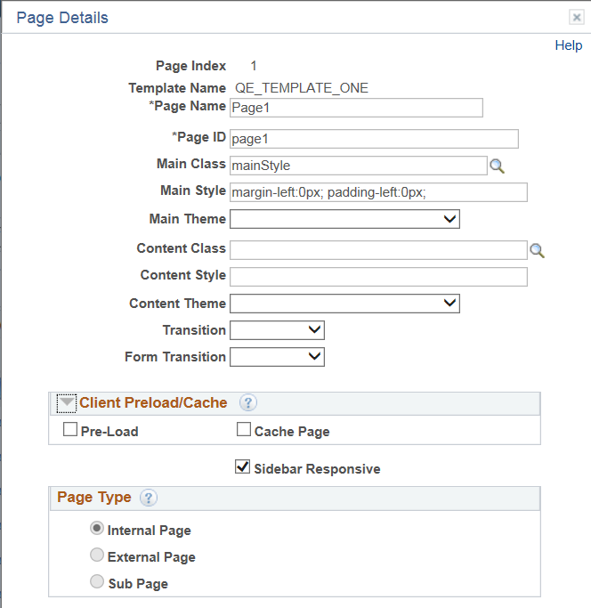
Image: Page Details page
This example illustrates the fields and controls on the Page Details page. You can find definitions for the fields and controls later on this page.
|
Field or Control |
Definition |
|---|---|
| Page Index |
Displays the page number. |
| Template Name |
If applied, displays the name of the template applied to the page. |
| Page Name |
If using tabbed pages, enter the name to display on a tabbed page. |
| Page ID |
Enter the ID to assign to the page. The default value is the page number in the format page1. |
| Main Class |
(Optional.) Select a main class to apply to the page. If a layout template is applied to the page, this field displays the main class defined on the Main container in the template if one is defined. To override the value, click the Lookup button and select another Main class from any of the other container classes defined in the template. |
| Main Style |
(Optional.) Select a main style to apply to the page. If a layout template is applied to the page, this field displays the main style defined on the Main container in the template if one is defined. To override the value, delete the contents of the field and enter styles in CSS3 format. |
| Main Theme |
(Optional.) Select a theme to apply to the page. If a layout template is applied to the page, this field displays the main theme defined on the Main container in the template if one is defined. To override the value, select another theme from the drop-down list. See the “Themes” section in the Understanding Layout Template Container Terms and Concepts topic for more information about the values that display in the drop-down list. |
| Content Class |
(Optional.) Enter a class name to apply to the content of the page. If a layout template is applied to the page, this field displays the class defined for the content container if one is defined. To override the value, click the Lookup button and select another class from any of the other container classes defined in the template. |
| Content Theme |
(Optional.) Select a theme to apply to the content on the page. If a layout template is applied to the page, this field displays the theme defined on the content container in the template if one is defined. To override the value, select another theme from the drop-down list. See the “Themes” section in the Understanding Layout Template Container Terms and Concepts topic for more information about the values that display in the drop-down list. |
| (Page) Transition |
(Optional.) Define the transition from this page to other pages in the layout. The options are:
|
| Form Transition |
(Optional.) If the page has a Form control as part of its page (that is, a Save button is defined) the default transition can be set. Select the transition from the drop-down list. The same values for page transitions described in the previous row are available for you to choose for form transitions. |
| Client Preload/ Cache |
(Optional.) Use this section of the page to set preload and cache settings. The valid values are.
|
| Sidebar Responsive |
(Optional.) If a sidebar is part of the page, select the Sidebar Responsive box to set a breakpoint in the widget at 55em (880px). This breakpoint is not applied by default to make it easier for you to write custom breakpoints that work best for your content and design. |
| Page Type |
Select the page type.(Optional.) Select the box to define the page as an external page. You can define any page in a layout an external page, other than the first page of a layout. This option is not enabled on the first page of a layout.
This setting impacts page and layout navigation. See Defining Page and Layout Navigation for more information about the impact of this setting. |
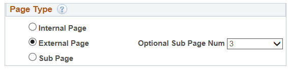
External Page as a Sub Page
You can use a Sub Page as a re-direction when it comes to an External Page. For example say Page 3 is defined as an External Page. When the External Page is invoked, if the External Page is defined with an Optional Sub Page Number then that page will be rendered instead of the External Page
Image: External Page Type Options
This example illustrates External Page Type selected.