Configuring Overlay
Note: Chart overlay is available when the display option is Chart Only and the data appears in bar charts.
Image: Specify Data Model Options page, example of using overlay
If the display option is Chart Only in the Specify Data Model Options page, selecting a column as an overlay field results in plotting multiple charts based on the Y axis and the overlay field. In this example, Unit Cost is used as an overlay field.
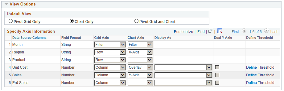
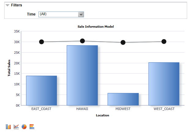
Image: Initial display for overlay
The chart is plotted with Region as the X axis and Unit Sales as the Y axis. The second chart is plotted with Region as the X axis and Unit Cost as the Y axis.
Note: You can change the overlay field using fields in the Specify Data Model Options page, Chart Options section.
See also, Limitations of Charts and Gridsfor limitations on overlay.