Appendix A - Layout and Designs
Whether you are developing new documents for use with 'paper' and mobile presentation or mobilizing existing documents for mobile delivery, user experience should be at the forefront of the effort. Work with a Mobile Author that has experience in SPA based interactive web pages to create a prototype of the targeted mobile experience of the document and then match that to the paper based layout. Keep in mind that not all content in the paper layout needs to be included in the mobile content and vice versa.
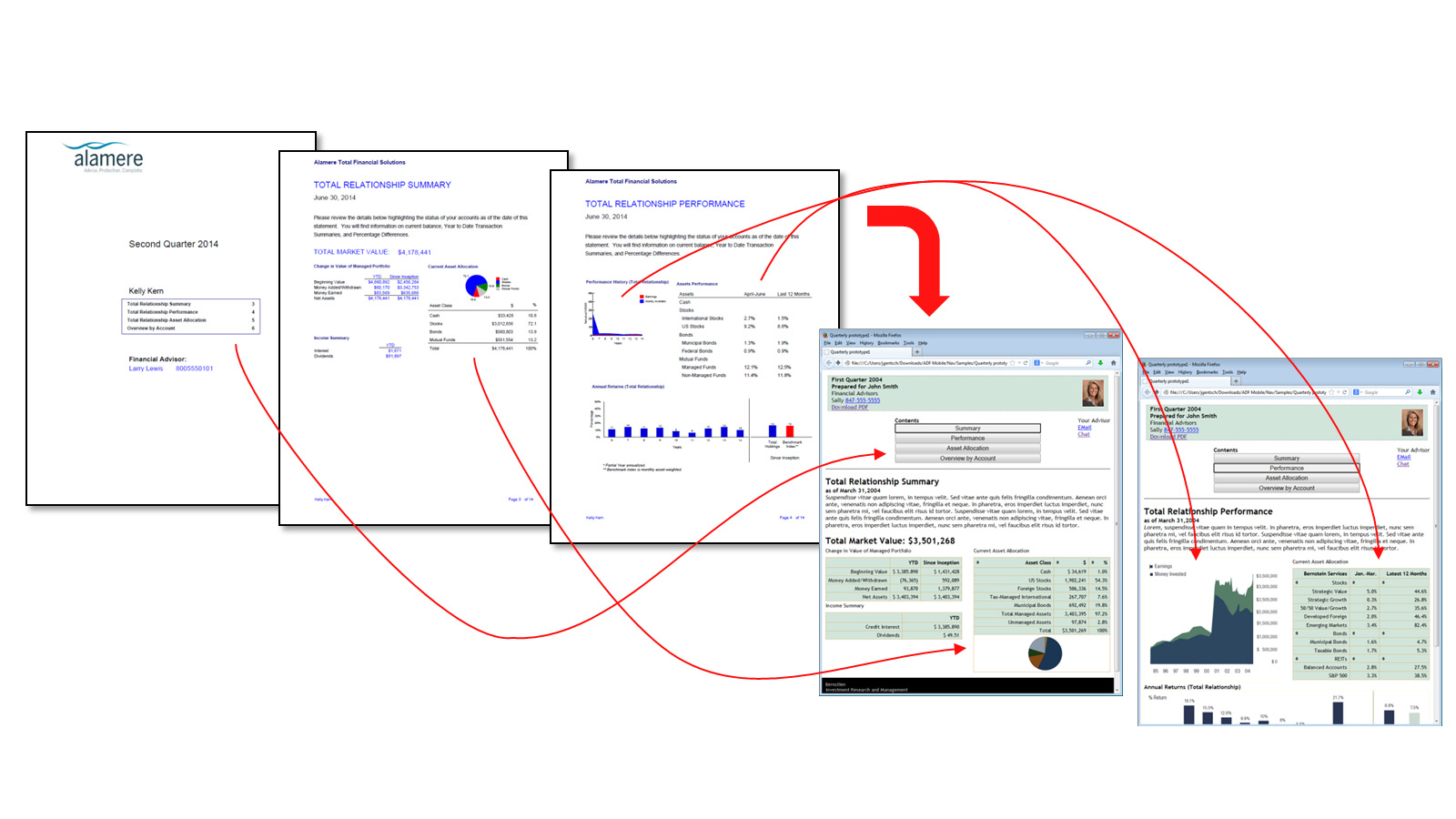
An example paper to mobile project is shown here:
For the interactive SPA based web page:
- Layout for mobile
- Navigation
- Content segmentation for navigation (pages, sections, other divisions that make sense for the content)
- Interactive controls used for navigation (buttons, tabs, index sliders, etc)
- Content based interactive navigation (table or chart drill in, content hyperlinks)
- Content data based interactions
- Table sorting
Data interactions such as “what if” type controls (data entry elements, sliders, other controls)
Layout Example
Let us consider the following pages to design an implementation of a financial statement document.
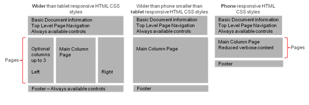
Mockup Design for Mobile
Mobile Author generates an initial mockup design “HTML Wireframe” layout for mobile. See, below:
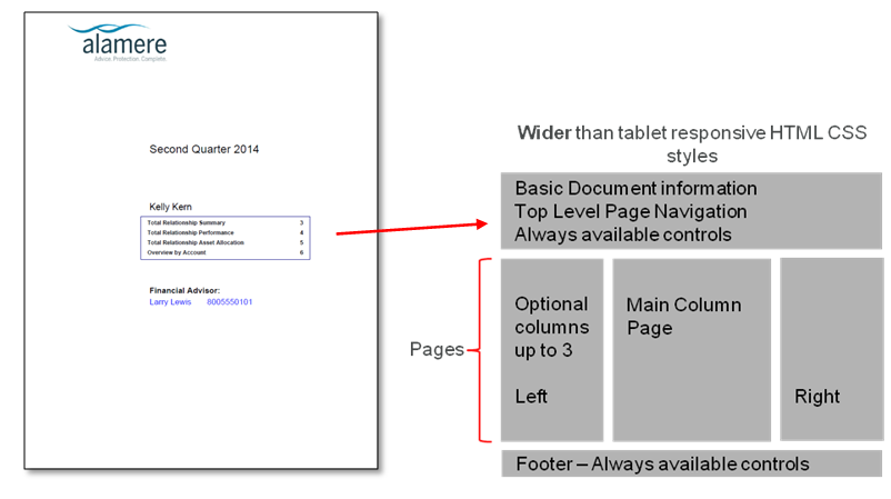
Based on the initial mockup mobile design and the contents of the example page based document, the first page has a simple table of contents as shown below:
Navigation
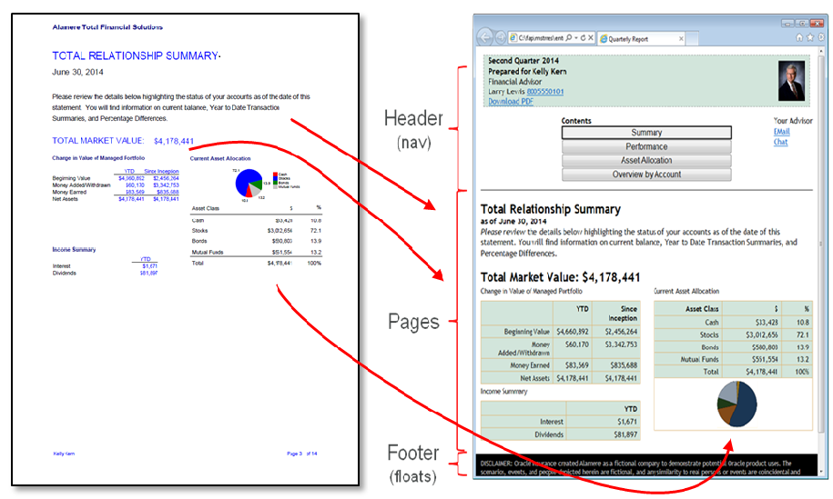
Once you decide the basic division of content that should appear in the mobile view (e.g. mobile content pages), you can begin mapping the content from the page based document to the mobile layout:
Content Data based Interactions
Once the content is generally mapped to the mobile layout, you can begin looking at content interactions in the mobile view beyond just moving between pages, such as content drill down. For example, in the financial statement, the Relationship Summary table holds rows of totals from other content pages. These rows become a point of navigation to be able to jump from the table row with the totals to the mobile page with the details for that table row as shown in the following figure:
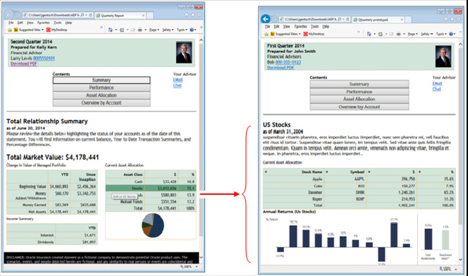
In the example above, the "drill in" navigation is accomplished with styling on the table through Cascading Style Sheets (CSS) and actual navigation triggered through JavaScript. The table row will be highlighted in dark green when the user hovers their mouse over the row. This green highlighting provides a visual clue of drill in support along with a corresponding drill in tooltip.
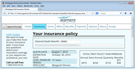
A wide range of content interactions are possible through HTML5 based mobile content output including controls on the mobile web page that can update embedded data and re-compute values providing mild online analytical processing (OLAP) results.
In the figure below, the death benefit amount is updated and the estimated policy premium values are recomputed as the slider bar under Desired Death Benefit text is moved from side to side.
XSLT Techniques
XSLT supports a recursive processing model to break up the transformation process into blocks of instructions called Templates, where a top most Template is triggered when the XML document root is found in the XML being transformed. That Template can in turn then trigger other more specialized Templates to process child XML elements it contains.
An XSLT Template can be thought of as a subroutine setup to handle the XML transformation which matches an XPATH selection expression defined for the Template. Here is a conceptual example of an organization for an XSL style sheet with layers of Templates for processing output from the default snippets shipping with Documaker:
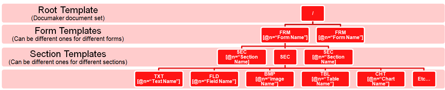
In the example above, the XSL Template associated with the XML root (“/”) first performs any processing desired at the Documaker document set level and then calls more specific XSL Templates to process the child contents of the XML root element via an apply-templates statement. Those Templates then in turn do the same thereby breaking up the XSL transformation process into smaller and smaller specialized chunks of transformation instructions where the transformation details for each chunk are defined in the lower level Templates.
In the example above, the lower level Templates define an XSL match definition (which is an XPATH expression) that, in this example, also contain XPATH predicate syntax to filter XML elements eligible to be processed by the Template via the value of an “N” attribute. The “N” attribute is populated by the default snippets from Documaker with the name of their publishing object. This capability enables specific XSL Templates to then be defined for processing publishing objects by both object type (e.g. Form, Section, etc.) and by the name of the publishing object (e.g. Form name or Section name that was defined in the Documaker Studio for the MRL).
In the example below, the lowest level section Templates are used to produce mobile aware HTML for specific document sections found in the XML formed by the default snippets.
This mobile aware HTML could have been authored in external tools and then pasted into the XSL Template syntax. The HTML syntax in the XSL Template can be further updated with other XSL syntax such as <xsl:value-of select="FLD[@N=’SomeFieldName’]"/> which will cause values from the XML being transformed to be inserted directly into the resulting HTML output that forms the mobile presentation end users will see in their browser.
There are also times when a formset will contain repeating data for transformation. The XSL sheet that process the XML to HTML can use techniques such as XSL Templates that are described above to recursively process repeating data, or it can use syntax such as <xsl:for-each select="myExpresion"> in Templates to process repeating data. XSL supports syntax that groups duplicates of repeating data so only unique occurrences are processed such as <xsl:key name="Grouped-Forms" match="FRM" use="@N"/> and <xsl:apply-templates select="FRM[generate-id() = generate-id(key('Grouped-Forms', @N)[1])]"/>, or syntax that can look for specific occurrences of repeating data such as: <xsl:value-of select="FRM[@N=’FrmName’][1]/SEC/FLD[@N=’FldName’]"/>. Both of the preceding can be used to process only the first occurrence of a form either at the whole XML document level or at the level of Forms under a Group, respectively.
The preceding paragraphs are an example of a few techniques that are available for use through XSLT. Using recursively called XSL Templates is not a requirement for processing MRO output from Documaker, but is an option worth consideration. There are no restrictions on any XSLT techniques that can be used with Documaker mobile.