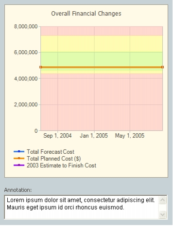
Graphs display historical or current information graphically. The data is displayed with its indicator or value colors enabling an instant recognition of areas requiring attention. The graph's name appears at the top of the graph area.
Below the graph, the following additional elements may appear:
- Prompt Line: Displays the prompt defined for the graph.
- Annotation Text Box: Displays the annotation for the graph.
Graph Types
There are four types of graphs:
- Column/Bar Graph: Converts tabular data into a Clustered or Stacked Column, or Bar graph.
- Scatter Graph: Displays data as scattered points indicating values on the x-axis and y-axis. Scatter graphs reflect the distribution of the items in a portfolio according to two defined parameters.
- Distribution Graph: Displays the distribution of the items in a portfolio according to the values of a specific category. These graphs apply only to portfolios.
- Trend Graph: Display a line graph indicating performance over time.
- Radar Graph: Allow you to compare the magnitude of multiple properties on a single chart.
- Pareto Graph: Show incremental quantities of one category in descending order with bars, and the cumulative total percentage of the same category, over the same period, with a line.
For more information on graph types refer to Graph Types in Configuring the System Components.
Graph Details Pop-Up
Clicking a graph opens the Graph Details pop-up window in which the graph is maximized. When a pie graph is shown within the Graph Details popup, the distribution percentages are rendered as callouts, connected to each slice, as can be seen below:
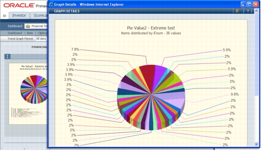
On the bottom of the Graph Details pop-up window is an annotation box (you may need to scroll down to see it). The annotation text entered here is also displayed as a tooltip when the cursor is above the graph in the Dashboard display.