Applying Styles
The layout of all page elements in a fluid application is controlled by free from style sheets using CSS 3.0 standards. This is one of the most critical differences to consider when comparing classic applications to fluid applications. With each control that you add to a page, PeopleTools automatically applies a style class to that control structure, and that style class enables that control to behave and render successfully on a fluid page.
In some cases, a single style class creates a change in behavior, color, or look and feel of a page element. In other cases, depending on the control, a structure of multiple style classes are applied to create the behavior and look and feel of a control. It is critical that before you attempt to override any delivered default styles that you observe the structure of the control in the HTML source of the rendered page so that you can gain insight into the elements involved in the control’s structure and the styles that are currently being applied, not to mention the order in which they are applied.
When the system applies a style, by default or override, the style is applied to the container in which the control resides, and those styles apply to all elements in that container, which includes the structure of the control, the label, the field, and so on. In a fluid application, you do not apply a style to discreet elements, such as just to the label for instance.
PeopleTools provides a main style sheet for fluid pages and controls, while also supplying additional style sheets for various fluid features, such as the NavBar.
|
Style Sheet |
Description |
|---|---|
|
PSSTYLEDEF_FMODE |
General style sheet for fluid applications (included on every page), containing the majority of fluid style classes. |
|
PTNUI_NAVBAR_CSS |
Contains the styling used for the Navigation Bar (NavBar). |
|
PTPN_NOTIFYWIN_CSS |
Notification/Alerts styling. Included on every page where notifications are enabled. |
|
PTNUI_PINTO_CSS |
Controls the styling for the “Add to…” functionality. Included on pages with the Add to feature enabled. |
|
PTS_NUI_FFSTYLE |
Used by both global search and component search features. |
|
PTPG_MENUSTYLE |
Used by pivot grid search features. |
|
PTPG_NUI_GRID_CSS |
Used by pivot grid display. |
The system default style sheet is PSSTYLEDEF_FMODE, which contains all the default, delivered styles for all page elements and controls.
You can create custom free form style sheets in Application Designer, and you can choose to include them and override or extend the default styles at varying levels for page elements.
The system-wide style sheet can be overridden by way of the PeopleTools options page, by selecting the custom style sheet and assigning it to the Default StyleSheet Name option. This is a global, system-wide setting. If set, the system completely ignores any style contained in the delivered style sheet, PSSTYLEDEF_FMODE. Otherwise, if not set, the system applies PSSTYLEDEF_FMODE by default.
Note: Overriding the delivered system-wide style sheet is not recommended.
Note: Use PeopleTools, Portal, Branding, Branding System Options to set fluid branding options in the Fluid Component group box.
To incorporate additional style sheets at either the component or page level, use the AddStyleSheet built-in PeopleCode function:
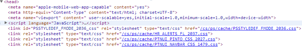
AddStyleSheet(StyleSheet.STYLESHEET_NAME);The AddStyleSheet function adds the reference to the style sheet to the header section of the HTML page.
Image: Style sheets in HTML head section
This example illustrates style sheets added into the HTML <head> section.
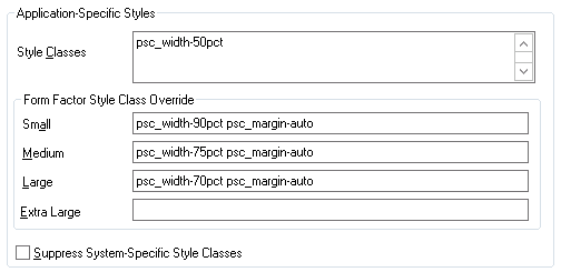
In Application Designer, you can also elect to override or extend the default styles, using the Fluid tab for any page or control use the Free Form Style group box to call out styles to be modified. To completely ignore the default style, select Override PeopleTools Style, otherwise you extend or add to the default style. For situations where you have adjustments to make depending on the form factor of the device, you can set those in the Form Factor Override fields for the various form factors.
When working with the order in which style sheets are applied, consider:
When you call AddStyleSheet, the system checks if there is a theme with a mapped, skinned style sheet for that style sheet. If so, the system loads that style sheet after the style sheet passed in the argument.
The order in which you call AddStyleSheet determines the order in which the style sheets appear in the stylesheet list.
The system determines the order in which the PeopleTools style sheets are applied.
Regardless of custom changes you may make, standard CSS rules always apply. It is very important for the developers to understand how CSS and style sheets work.
Image: Form Factor Override
This example illustrates an approach to adjusting the layout of controls based on the form factor of the device accessing the fluid page.
For details on the override options, see Setting Properties on the Fluid Tab.
Free form styles set in Application Designer are static and can’t be changed, however, styles set using PeopleCode are dynamic, meaning they can be switched programmatically at runtime. Styles set in Application Designer can’t be changed or queried using PeopleCode at runtime. Dynamic styles are applied only with PeopleCode; they can be added, changed, deleted or queried at runtime.
It is not recommended to add style to the system containers. Add your own group boxes, and add style to that.
Example:
&fld1.AddFFClass("addffclass");
		&fld1.ReplaceFFClass("addffclass", "replaceffclass");
		&fld1.FreeFormStyleName = "pc_ffclass";
In your implementation, Oracle strongly recommends that you only override style classes with respect to coloring, theme, and branding; a practice often referred to as “skinning.” Oracle strongly discourages overriding delivered style classes with regard to page layout (positioning, padding, filling, and so on).
You only skin complete style sheets, not the sub style sheets contained within a style sheet. To extend (or skin) a delivered style sheet, you want the delivered style sheet to appear first in the style sheet list, followed by the override or “skinned” style sheet. For example, PSSTYLEDEF_FMODE should appear before PSSTYLEDEF_FMODE_SKINNED, allowing the original to be applied, and the “skin,” containing the supplemental changes, to be applied after.
Note: With CSS style sheet application, the last style sheet in the sequence to be applied takes precedence.
It is recommended to skin or extend only one style sheet at a time. As in, if you have multiple style sheets, have the skinned style sheet appear just after (under) the style sheet it extends or overrides. If the extended or override style sheet appears beneath other style sheets in the list (assuming there are multiple style sheets), any override in the skinned style sheet will apply to any style sheet specified before it, which may result with unintended style overrides.
If you intend on extending or overriding the delivered styles, consider these items:
You need to be aware of all the styles applied in any previously applied style sheet(s).
If overriding styles, it is recommended to change only color characteristics.
It is not recommended to override any styles related to structural (layout or positioning) characteristics or behaviors applied to page elements.
Do not modify a delivered style sheet. Any changes will be overridden in any future upgrade.
Styles are associated directly to structure (container, label, control, and so on), and any change PeopleSoft makes to structure in future releases can affect any custom styles you’ve implemented.
Not all content displays as desired when stretched to a maximum size of a device or reduced (shrunk) too much to fit a smaller space, or device. There are functional minimum and maximums, which should be defined on the content so that scrolling occurs or the size of the area no longer grows in terms of minimum and maximum values for width. When creating custom fluid pages, or customizing delivered pages, it is your responsibility to manage the styling for these minimum and maximum values.
It is recommended that you do not set the minimum and maximum values directly on the group box with the style ps_apps_content, as this can cause browser issues.
The ps_apps_content style implements the flex model. Pages are laid out as a column based on flex model with horizontal stretching. This can cause varying results per browser type when attempting to stretch the width fully while restricting the width based on a max-width value.
It is recommended to include a layout group box within the ps_apps_content group box containing your page content, and apply the minimum and maximum widths on the interior group box.
|
Layout Element |
Example |
|---|---|
|
Structure and Style Class |
|
|
Style |
|
You can style an entire column in a flex grid by using the page field name of the field (or group box) within a grid. The page field name will be applied directly to the column (both the table header [TH tag] and the cells [TD tag]) as a style. At that point, you can affect styling an entire column (centering, font weight, and so on).
You can hide an entire column stylistically, using the page field name (as opposed to hiding the column using PeopleCode, which can prohibit complete rendering of the column).
If you are hiding a column using style, you must consider the following items.
|
Consideration |
Description |
|---|---|
|
Accessibility |
If you stylistically hide the trigger column used for the row action, you must make sure that you expose the trigger column in screen reader mode. This is because in screen reader mode, the row action is disabled and the column used as the trigger field now becomes actionable and can receive focus. In screen reader mode, the row action trigger should have the following characteristics:
For example, if you have a field on a grid that has a page field name of “ABC_XYZ”, the style applied on all references to that column is “ABC_XYZ” (TD and TH tags in the table). To properly hide the entire column, use the following: |
|
Grid Header Alignment |
If you stylistically hide a column, do not stylistically hide the last column in a grid. Doing so can adversely affect grid header layout. PeopleTools uses the last column of the grid to adjust the grid header if it needs to have an overhang for the scroll bar, enabling the grid scroll bar to appear as part of the grid. If you hide the last column, the overhang is assigned to the last column and if it is hidden, the overhang can be lost, resulting in a misaligned grid header. |
A flex grid consists of two table structures that support both the fixed grid header and a scrollable grid body. The column styes are applied to both table constructs that make up this page element. However, these styles can have adverse effects on the grid header, causing alignment issues if you attempt to adjust column dimensions.
If you are attempting to set any dimensions on columns, make sure you are familiar with the limitations of using minimum and maximum values on grid columns.
If you attempt to set a dimension of any type (width, min-width, max-width, and so on), make sure you affect only the real table and not the header-only table, which the system uses for header alignment.
For example, assume a column named XYZ_ABC as a page field name in the grid. That class is assigned to all “TD” and “TH” tags both in the real table (ps_grid-flex) as well as the table used internally for fixed header implementation (ps_grid-flex-head). To style a dimension and change the text color, see the following:
.ps_grid-flex .XYZ_ABC { min-width:10em; } /* set dimension only on real table */
.XYZ_ABC {color: #A00;} /* set color both real and header-only table */