Using the Gauge Classes
This section provides an overview of gauge terms and gauge types, and discusses how to use the gauge classes
The following is a list of terms pertaining to the gauge classes and their descriptions:
|
Field or Control |
Definition |
|---|---|
| Metric |
Refers to the actual numeric data point that you want to display in the gauge. |
| Tick marks |
Refers to the major and minor markings along the value axis of the gauge. |
| Threshold values |
(Optional) Provide additional context about the metric that you display in your gauge. On dial and status meter gauges you can add bands of color to the background by associating an instance of the Threshold class, typically to help indicate whether the metric is low, medium, or high. |
Use the gauge classes to create gauges that display metrics in several common formats, including status meters, LEDs, and ratings.
Three gauge classes are available: LEDGauge, RatingGaugeChart, and StatusMeterGauge. Each of these gauges must be implemented and instantiated as a different class.
Of these gauge types, the LEDGauge and StatusMeterGauge classes share many common characteristics, including the methods you can invoke and the properties you can set. While rating gauges share some characteristics with the other gauge types, the RatingGaugeChart class and supporting classes are described separately within this topic.
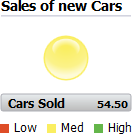
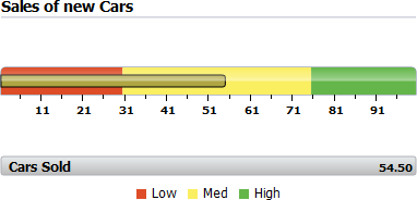
The following examples use the same value, 54.5, as the gauge metric. In addition, an instance of the Threshold class is used to specify the color shading on the dial gauge and the status meter gauge, as well as the color of the LED.
Example of an LED Gauge
Image: Example of an LED gauge
The following example displays an LED gauge:
Example of a Status Meter Gauge
Image: Example of a status meter gauge
The following example displays a status gauge:
You can specify a field in a rowset and have it depicted graphically as a gauge with minimal PeopleCode. The data in the field must be numeric. You can also choose to make the gauge interactive.
The high-level steps involved in creating any gauge are:
Identify a field on a record that has a numeric value that you want to show in a gauge.
Add a chart area to a page in Application Designer. Associate the record and field in Step 1 with that chart area.
In PeopleCode instantiate a gauge object using one of the built-in functions available for gauges:
GetLEDGauge
GetRatingGauge
GetStatusMeterGauge
Set property values for the gauge object as needed, keeping in mind the design guidelines below. Most properties have default values, so you can start by reviewing your gauge with no properties set and then set those that you need to in order to tailor the appearance and functionality of the gauge.
Depending on the gauge type:
For the LEDGauge and StatusMeterGauge classes, optionally, create an instance of the Threshold class and associate it with your instance of the gauge.
For the RatingGaugeChart class, create instances of the RatingGaugeState class and of the GaugeThreshold class and associate them with your instance of the gauge.
The following design guidelines apply to dial gauges, LED gauges, and status meter gauges only.
Sizing
The height and width for a gauge is determined differently depending on whether the chart control for the gauge appears on a fluid page or a classic page:
The overall dimensions of the gauge area will be used and will need to hold all the elements that you choose to have along with the gauge graphic itself. This includes:
Top labels
Bottom labels
Metric labels
Legends
The more elements that you want to include in the gauge area, the smaller the gauge graphic will become. The gauge rendering software will try to make a best fit.
As you design your gauge, it's important to carefully consider what you want your gauge to contain and to review the results of your gauge as you use edge cases of small and large values and labels as well as most likely cases. Also, consider the design of your gauge in the context of the rest of the page in which the gauge will appear. For example, do other elements on the page provide enough context so that you can reduce or eliminate the use of labels and legends in the gauge area?
Scaling
You can use the GaugeMinimum and GaugeMaximum properties to provide the low and high points of your dial or status meter gauge. Knowledge of the nature of your data will help you determine an appropriate scale.
You’ll also want to consider for a gauge whether you want the gauge minimums and maximums to be static (for example, minimum of 0 and maximum of 100 because test results can only fall within that range), or whether you want them to be dynamic (for example, make the minimum half of the metric value and make the maximum 50% greater than the metric value.
Labels
Three types of labels can be placed in the gauge – a top label, a bottom label, and a label for the metric. The top and bottom labels are customizable – they can be any text you desire. The metric label will always be the numeric value of the gauge metric.
The labels can be positioned in different locations along with the gauge. Any label can be placed inside the gauge. Additionally, top labels can appear above the gauge, bottom labels can appear below the gauge, and metric labels can be positioned with the bottom label or below it.
Generally, it’s better to constrain the use of labels to the minimum needed. Labels will take up space from the gauge itself, making the gauge smaller, and too much text in a label can result in ellipses that don’t look good and can be difficult to read.
Reference Areas and Legends
You can provide additional context about the metric that you display in your dial gauge, LED gauge, or status meter gauge by associating an instance of the Threshold class to the gauge using the SetThreshold method (available with all gauge classes). On dial and status meter gauges, you can add bands of color to the gauge background, typically to help indicate whether the metric is low, medium, or high. On LED gauges the values in the threshold instance determine the color and direction of the LED.
For more information on using the Threshold class, see Using the Threshold Class.
A legend is available if you use thresholds. The legend will show the colors and descriptions of all reference areas on your gauge.
Tick Marks
Tick marks on status meter gauges can often provide useful context information but possibly at the cost of making the gauge appear busy and cluttered. You should try them to see if they work for your situation.
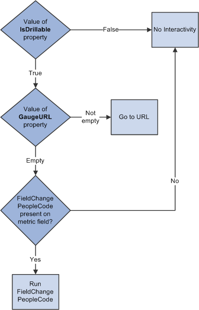
You can make your gauges interactive. You can either run FieldChange PeopleCode or redirect users to a URL. Interactivity will be initiated when a user clicks on (or touches) the gauge.
Image: Gauge interactivity flowchart
As illustrated in the following flowchart, in order to have your gauge be interactive, you must set the IsDrillable property to True. Then, if you have set the GaugeURL property to a valid URL, a click will redirect the user to that URL. If GaugeURL is not set, but there is FieldChange PeopleCode on the field that defines the gauge’s metric (that is, the field you passed into the GetStatusMeterGauge or GetLEDGauge function), then that PeopleCode will run. Otherwise, if neither GaugeURL is set nor FieldChange PeopleCode is present, then there is no interactivity even if IsDrillable is True.
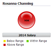
The Threshold class is used in conjunction with the two gauge classes: LEDGauge and StatusMeterGauge. The Threshold class provides a way to add reference areas and color coding to your gauges.
Image: An LED gauge colored by a Threshold object
On the LED gauge, the Threshold class can be used to color the LED gauge according to the defined threshold values.
Creating Thresholds Using the Threshold Class
To use the Threshold class, follow these basic steps:
Create an instance of the Threshold class in PeopleCode by using the GetThreshold built-in function:
&thrshld = GetThreshold();Set the properties on the instance of Threshold class that you created.
Associate the instance of the Threshold class to an instance of one of the gauge classes.
&gauge.SetThreshold(&thrshld);
Using Thresholds with Gauges
Image: A LED gauge
The following example presents a LED gauge with color from the Threshold class:
To render the gauge in this way, you would create an instance of the Threshold class. Each property of the Threshold class is an array that you would populate as follows:
|
Values array |
Colors array |
|---|---|
|
Value of first threshold |
Yellow |
|
Value of the second threshold |
Green |
|
NA |
Red |
A user-defined PeopleCode function that instantiates this instance of the Threshold class looks like this:
Function bld_thrshld Returns Threshold;
   Local Threshold &thrshld;
   &thrshld = GetThreshold();
   &thrshld.Values = CreateArray(CJY_SLRY.CJY_SLRY_MIN, CJY_SLRY.CJY_SLRY_MAX);
   &thrshld.Colors = CreateArray(%ChartColor_Yellow, %ChartColor_Green, %ChartColor_Red);
   Return &thrshld;
End-Function;
However, you can add a Descriptions array to control what is displayed in data hints and in the legend:
|
Values array |
Descriptions array |
Colors array |
|---|---|---|
|
Value of first threshold |
Below Range |
Yellow |
|
Value of the second threshold |
Within Range |
Green |
|
NA |
Above Range |
Red |
The Descriptions array is added to the same user-defined PeopleCode function:
Function bld_thrshld Returns Threshold;
   Local Threshold &thrshld;
   &thrshld = GetThreshold();
   &thrshld.Values = CreateArray(CJY_SLRY.CJY_SLRY_MIN, CJY_SLRY.CJY_SLRY_MAX);
   &thrshld.Descriptions = CreateArray("Below Range", "Within Range", "Above Range");
   &thrshld.Colors = CreateArray(%ChartColor_Yellow, %ChartColor_Green, %ChartColor_Red);
   Return &thrshld;
End-Function;
Rating gauges are typically used to display or accept user feedback on a product or service. A rating gauge can be interactive or display only.
Display-only rating gauges (the ReadOnly property is True) set the gauge to the value of the field that was used when the rating gauge was created with the GetRatingGauge built-in function. The value of the rating gauge cannot be changed by the user.
Interactive rating gauges (the ReadOnly property is False) can update the underlying value in the RECORD.FIELD that was used when the rating gauge was created with the GetRatingGauge built-in function. If there is FieldChange PeopleCode on the field, the PeopleCode executes only for an interactive rating gauge.
The display of a rating gauge can be changed in two ways:
Based on the state of the rating gauge.
Based on threshold values against which the value of the rating gauge is compared.
A rating gauge can support four different states depending on the chart type:
Unselected
Selected
Hover (interactive only)
Changed (interactive only)
Here’s an example of a gauge transitioning through three states. Each state displays the gauge data differently:
|
Field or Control |
Definition |
|---|---|
 |
A rating gauge in the unselected state. |
 |
A rating gauge in the hover state. |
 |
A rating gauge in the selected state. |
You can set the display characteristics for each state using the RatingGaugeState class. You create an instance of this class, set its properties, and assign the instance to the corresponding state property on the RatingGaugeChart instance that you created.’
In addition, a rating gauge supports up to three thresholds. Different thresholds can cause the rating gauge to change color and present different tooltip text based on the gauge value:
|
Field or Control |
Definition |
|---|---|
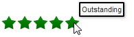 |
A rating gauge with thresholds (Outstanding rating) |
 |
A rating gauge with thresholds (Satisfactory rating) |
You can set the characteristics for each threshold value using the GaugeThreshold class. You create an instance of this class and set its properties, including the threshold maximum. Create an array of GaugeThreshold instances and assign the array to the RatingGaugeChart object using its SetRatingGaugeThresholds method. If a gauge color or border color is set in a gauge threshold, those colors override the colors set by the rating gauge states.
Any gauge and threshold objects can be instantiated from PeopleCode only. You can use these objects only in PeopleCode programs that are associated with an online process, not in an Application Engine program, a message notification, a component interface, and so on.
Gauge objects are declared using the one of the three gauge classes data types. For example:
Component LedGauge &oLED;
Component RatingGaugeChart &oRating;
Component StatusMeterGauge &oSM;
In addition, optional threshold objects for use with dial gauges, LED gauges, and status meter gauges are declared using the Threshold class:
Component Threshold &oThrshld;
Gauge state objects and gauge threshold objects for use with rating gauges are declared using the RatingGaugeState class and the GaugeThreshold class respectively:
Local RatingGaugeState &oRatGaugeSelState, &oRatGaugeUnSelState, &oRatGaugeHovState, &oRatGaugeChangState;

Local GaugeThreshold &oGTresh1, &oGTresh2, &oGTresh3, &oGTresh4;The PeopleCode program is terminated if a field or record is missing at runtime.
If a valid record is specified but no data is found, or for any other error, the chart is replaced by the message "Image creation failed."
If the Java Runtime Environment (JRE) is missing, an error appears and is logged.
The properties can be grouped as follows:
Gauge type – You can select different visual representations for each gauge class
Minimums and maximums – You can specify the range of values that you want the gauge to cover
Labels – You can determine which, if any, labels, you want to accompany the gauge
Gauge increments – Specify gauge increments if more numeric context is needed.
Legends – A legend can be displayed to help users interpret the reference areas.
Animation – You can choose the type and duration of animation for the gauge display.
Interactivity – You can choose to have an event occur if the user clicks (or touches) the gauge.
|
Category |
LEDGauge |
StatusMeterGauge |
RatingGaugeChart |
|---|---|---|---|
|
Gauge type |
NA |
||
|
Minimums and maximums |
NA |
NA |
|
|
NA |
|||
|
NA |
|||
|
NA |
|||
|
Labels |
NA |
NA |
|
|
NA |
|||
|
NA |
|||
|
NA |
|||
|
NA |
|||
|
NA |
|||
|
NA |
|||
|
Gauge Increments |
NA |
||
|
NA |
NA |
||
|
NA |
NA |
NA |
|
|
Legends |
NA |
||
|
Animation |
NA |
||
|
NA |
|||
|
Interactivity |
|||
|
NA |
|||
|
Miscellaneous |
NA |
||
|
Gauge state |
NA |
NA |
|
|
NA |
NA |
||
|
NA |
NA |
||
|
NA |
NA |