Processing Components
This section discusses how to interact with components and pages.
Components typically consist of several related pages within the same window; however, some components contain only one page. Typically, significant pages, such as those containing required fields, come early in the page order. As you finish with one page, you can select the folder tab of another page to open it. You can think of this as leafing through several pages of a single form.
In addition to selecting tabs, you can click the links at the bottom of each page in the component to move to other pages within the component. Alternatively, you can press the corresponding access keys.
See Using Access Keys.
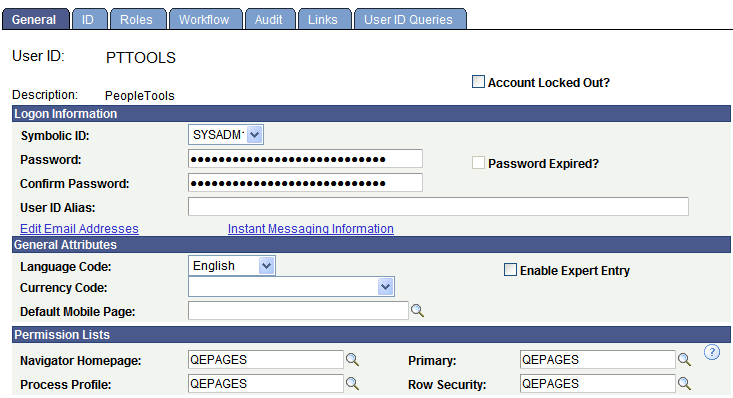
Image: Sample component
This example illustrates a sample component.
To access a component:
Select the content reference from the menu hierarchy or navigation page that relates to your page.
On the search page, enter search criteria to identify the row of data that you want to retrieve from the database.
Click Search to perform the search.
If your search returns multiple results, they appear in a grid from which you can select the data you want to view. If your search returns only one result, the system automatically displays that result on a page in the browser.
See Entering and Saving Search Criteria.
All pages in a group have the same search record, so the prompt in the initial search dialog box is the same regardless of which page you access first. You will not be prompted to enter new search criteria as you move from page to page in a component.
Likewise, during a save, pages in a component are treated as a single entity. When you click Save, the system commits the data on the pages to a database. If you have not completed all required fields, the system prompts you to enter additional data.
In addition to having links to other pages within a component, some pages have links to related components or pages. The related links appear at the bottom of the transaction area and immediately before the toolbar. You can click any of these links to move easily to related transactions for the same key field, so you can enter data without going through the search process again.
When you click a component link, the new transaction contains the same component links, which enable you to return to the original transaction. The component or page in which you are working appears in black text and is not underlined. Some applications may identify these related links in another way. For example, you might see the phrase Go to: along with the related links at the bottom of a page. You might also see a drop-down list box with the word …More, which contains additional related transaction links.
Use the New Window feature to open the current component in a new browser tab (or window). From this window, you can view or enter new data. You can open as many child windows as needed by clicking the New Window item.
Whether the New Window item is displayed at all and where it is displayed depends on the current component:
For fluid components and “fluid wrappers,” New Window is displayed as a menu item in the Actions menu. See Using the Actions Menu.
Note: A fluid wrapper is a fluid activity guide, a fluid navigation collection, or a master/detail component.
When a fluid component is displayed standalone, outside of a fluid wrapper, the component settings determine whether the New Window item is displayed in the Actions menu.
When a master/detail component is displayed, the master/detail component determines whether New Window is displayed in the Actions menu except when a fluid component is the currently displayed item. Then, the component settings of the fluid component determine whether New Window is displayed.
Fluid navigation collections display the New Window menu item by default, unless the configuration for that fluid navigation collection overrides this setting.
Note: The component settings for fluid components are ignored in a fluid navigation collection.
Fluid activity guides never display the New Window menu item.
For classic components, New Window is displayed as a link in the pagebar on the page. See Using the Pagebar
Whether the New Window link is displayed depends on the component settings. The New Window link will not be displayed if the pagebar is disabled or if the New Window option is disabled in the component properties.
Note: When a classic component is displayed within a fluid wrapper, two New Window items can be displayed depending on the settings of the wrapper and the settings of the classic component. The resulting action depends on which of these two New Window items you click.
What is displayed in the new window depends on the current component:
From a fluid wrapper (a fluid navigation collection or a master/detail component) the new window redisplays the fluid wrapper with its default item selected, which is the first item by default. In both cases, what is the default item can be overridden.
From a classic component or a standalone fluid component with a search page:
When the URL for the current component does not include any explicitly defined keys, the system-generated component search page is displayed.
When the URL for the current component includes explicitly defined keys, the default page from the component is displayed displaying the specific transaction associated with those keys.
From a classic component or a standalone fluid component without a search page, the new window displays the default page from the component.
From a classic WorkCenter or a classic activity guide, the currently displayed component is redisplayed outside of the classic WorkCenter wrapper subject to the conditions regarding components with or without search pages.
The Back button is not displayed on any page displayed in a new browser window or tab, either as the result of clicking the New Window item or as the result of a PeopleCode program. This new window has a separate session and navigation history stack. See Using the Back Button.
Important! Do not select from the browser menu. Doing so copies the current HTML from the parent window instead of opening a new PeopleSoft-maintained window session.
After modifying the data on a page, you must click the Save button to commit your changes to the database. When you click the Save button, a processing sign spins in the upper right corner of the page. When processing is complete, the Saved icon appears.
If you attempt to leave the page without saving—by clicking another content reference from the menu hierarchy or by clicking a different toolbar button, such as Next in List,—a save warning appears. Click OK to return to the page to save your changes. Click Cancel to exit the page without saving.
Note: Do not use the browser’s back button to exit the page. It does not trigger standard component processing and can result in the loss of data, corruption of the navigation history stack, and other processing errors. Instead, only use the Back button that is displayed in the fluid banner. See Using the Back Button for more information.
When you work with PeopleSoft applications, dialog boxes might appear to provide different types of messages. Dialog boxes might display an error, a warning, or an informational message.
All dialog boxes share these characteristics:
They are modal, meaning that they hover on top of a primary page, which is grayed out.
You can drag and relocate them using the title bar.
They display informational text.
They display at least one button.
To dismiss a dialog box, you must click one of the buttons in the dialog box or click the Close button on the right side of the title bar.