Redwood Compatibility
This document outlines the JET upgrade theme for the OIPA application in version 12.0.0.0 on how common components operate throughout the system.
| V.11x | V.12.X |
|---|---|
| Updated Logo and Banner | |
|
The application banner in OIPA v11.x was in Red color with a light banner as shown in the below image.
|
Oracle product and service logos have undergone a visual update to reflect the new Redwood brand standards. With the latest JET upgrade, the application banner has been redesigned with a Lilac theme and Redwood style. |
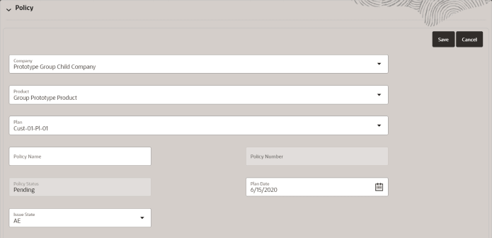
| Updated Form Labels | |
|
In OIPA, for all the form fields the form label is displayed outside the field.
|
All the form labels will be displayed inside the form field. Example of a field that does not have an entry: When the field is empty, the field label is displayed in the middle and when user selects/enters data the field label moves to the top.
|
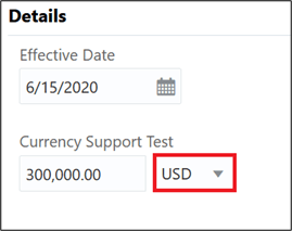
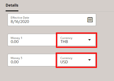
| Currency Labels | |
|
The drop-down associated with the Money field currently does not display a label.
|
The drop-down associated with the Money field will display the Currency label. |
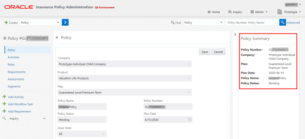
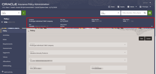
| Updated Summary Pane | |
|
The OIPA screen is designed in a three-pane layout. The Summary pane is present on the right and can be minimized.
|
The OIPA page layout is updated to the two-pane layout, now users can view the Summary Pane at the top, it is configurable to display additional information in the context of the entity i.e., Policy, Client, Case, Customer, etc. To hide the Summary pane users can click the ^ minimize icon.
|
| Updated Entity Screen | |
|
In v11, the entities are displayed in a table with caret (>) icon. The user needs to click the caret icon of the required entity to view the details.
|
From the v12.x OIPA application, the entities are displayed in a table where the user needs to click on a entity to view the details.
|
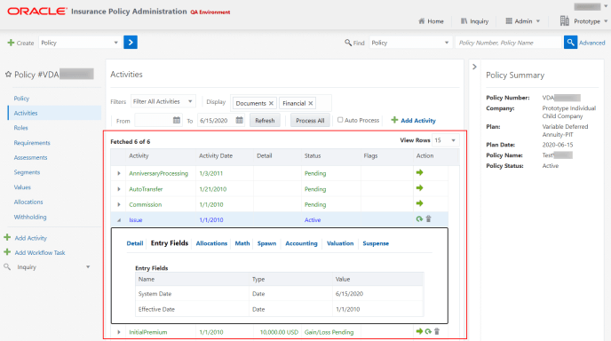
| Updated Entity Details Screens | |
|
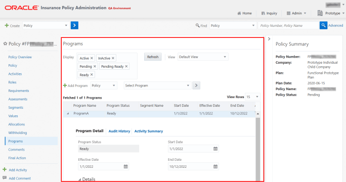
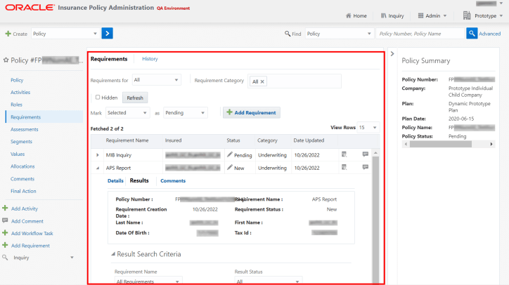
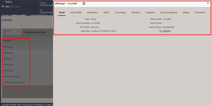
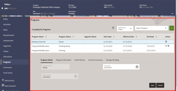
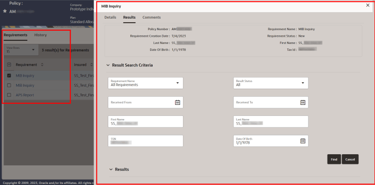
Currently, details related to an entity are displayed in an expanded table row. When there are multiple layers of data displayed in nested tables and it can be cumbersome to navigate through the data. For example, screens such as Activity, Roles, Requirement, etc.
Activity Screen:
Program Screen:
Requirement Result Screen:
PlanNameSegmentScreen:
|
To improve usability and accessibility, the entity details information will now be displayed in a window. When user clicks the entity name in the summary table, the entity details window appears. This design allows a larger area for viewing data, so it reduces the amount of scrolling and puts focus on the current data and also supports Screen Reader and Keyboard Navigation. For example, screens such as Activity, Roles, Requirement, etc
Activity Screen: For more information, see Activity Screen.
Program Screen: For more information, see Program Screen. Requirement Result Screen: For more information, see Requirement Result Screen. PlanNameSegmentScreen: For more information, see PlanNameSegmentScreen.
|
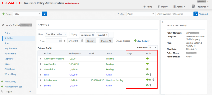
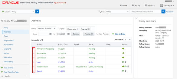
| Activity Status Colors with Activity Shading Enabled | |
|
The Activity Status column lists the status of each activity. If the system is configured with Activity Shading enabled, it will display the Activity information in the Activity table in the assigned colors, as shown in the below image:
|
From the v12.x OIPA application, the Status column displays the Activity Shading color. This is to distinguish the activity status shading from the drawer link/activity name color. For more information, refer to the Activity Status page. |
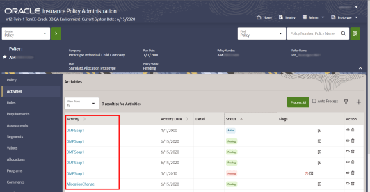
| Screen Filter Redesign | |
|
In V11, for the screens where the filter option is available the filter section cannot be hidden or collapsed. For example, this filter option is available in screens such as Activity screen, Requirements screen, Programs screen, etc.
|
From the v12.x OIPA application, to improve the usability and accessibility users can now hide or collapse the filter section in the screens where filter option is available. This enhances the viewable area of the screen and reduce the need for vertical scrolling. For example, this filter option is available in screens such as Activity screen, Requirements screen, Programs screen, etc. For more information, see Filters. Activity Screen when Filter is Closed:
Activity Screen with Filter Section Open, Filter Selected, Filter Icon Highlighted and Selected Filter Icon Tool Tip Displayed:
|
| Updated More Menu | |
|
The More menu on the Entity page is displayed as Hamburger icon. Hamburger menu is used for navigation. |
The More menu on the Entity page is displayed as Ellipse icon. |
| Locked Action and Flags Column | |
|
As per the user’s entity details table configuration, if there are more columns to access the Action or Flags columns, users have to scroll right or left.
|
To improve the usability and accessibility of the Action and Flags column, they are locked in the Entity details table. If there are more columns in the table the Action and Flags column will always appear on the right side of the table; however, to view other columns in the table users can still scroll right or left. For example: In the Activities page the Actions and Flag columns are fixed columns.
|
| Buttons and Icons | |
|
In V11.X, the buttons and icons are in the below format:
|
In V12, to improve usability and accessibility, below are the updates related to the buttons and icons.
|
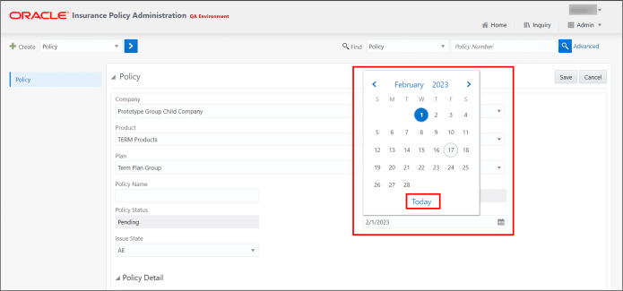
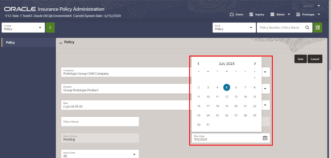
| Calendar icon | |
|
In the V11, in the Calendar window, the Today link navigated the user back to the current date.
|
From the v12.x OIPA application, the Calendar window does not have the Today link.
|


