21.7 Redwood Theme
Redwood Theme for Unifier: User Interaction & Interface Changes
Redwood is the name of Oracle's next-generation product and communication design, user experience platform, and brand design system. It's more than our applications adopting new branding, color, style, and typography; through a user-centric approach, we're continually making improvements to every task, flow, and interaction.
From version 21.7 onward, Unifier will be using the Oracle JavaScript Extension Toolkit (Oracle JET or “OJET”). As a result of using OJET 10.1.1,
- OJET components used to build user interface screens are implemented as-is,
- No changes are made to the native component behavior, and
- Most components will provide keyboard navigation.
User interface screens in Unifier User mode that use OJET have undergone changes, primarily in colors, icons, and the font.
Here are highlights of the changes between the current version of Unifier and previous versions.
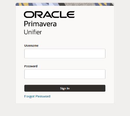
- The login screen has been updated.
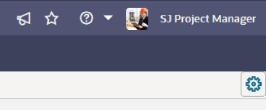
- The admin mode switch is now a cog with a square outline when it is enabled.
- The navigator now uses single-angle brackets to show or hide sub-nodes.
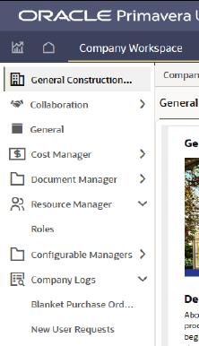
- Icons in the Navigator have been updated.
- In a new tab, a scroll bar is displayed when you hover over a long list.
- Within toolbars, a multi-row arrangement is replaced by a single-angle bracket indicating there are more tools to use.
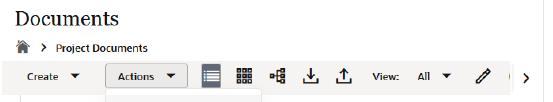
- When a log pane is narrow, the bottom information strip can be scrolled left and right.
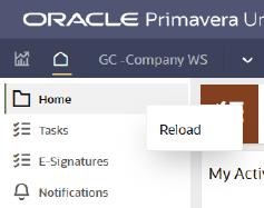
- In previous versions of Unifier, each node in the navigator was a hyperlink. Now, right-click a node to refresh the screen and reload the log data.
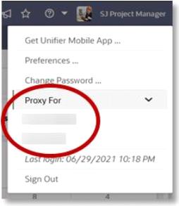
- When you want to act as a proxy user, the list of available users is shown in-line, rather than to the left of the user menu.
- When there's a sub-menu – such as within an Actions item menu-- the arrow has moved closer to the text label.
- In Date and Date/Time fields, the options to select "Today" and "Now" are no longer available.
- For quick searches, there is no separate search field. Instead, clear the word "Select" and then begin typing any sequence of letters.
- The word "Select" no longer appears in lists of values within pull-down fields.
- To clear the value in a pull-down field, highlight it and then press delete or backspace, followed by “enter” or a tab.
- When entering text, a required field has a label at its bottom-right corner; when you begin entering text, a character limit may be displayed.
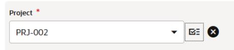
- For a field that uses a picker, both the Selection and Clear buttons are no longer inside the field area; they are now outside the field, to the right.
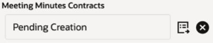
- For fields that include BP manual auto-creation, the "Create" and "Clear" buttons are outside the value area.
- The Comments area associated with a BP record is differently styled.
- The "Search" and "Find on Page" text actions are now represented by icon buttons in the same location.
- The appearance of read-only fields has been changed.
- Icons for common actions have been updated.

- Action buttons are inactive until a record is selected
- In User and Group pickers, the appearance of the Group indicator has changed.
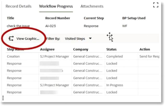
- The location of the View Graphic button in the Workflow Progress tab has changed. It is now just above the progress log, above the Step Name.
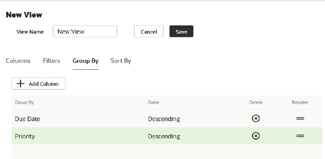
- When editing or creating a new View, the Group By and Sort By tabs now use a table structure. The gear menu has been replaced with a single Add Column button. Controls to delete or reorder criteria are included in the table itself.
- And finally, in the Document Manager, Search now includes a separate drop-down for the category to search within.
Last Published Wednesday, February 18, 2026