Viewing ELM Insights
ELM Insights offers new dashboards for Learning Insights and Certification Insights.
Learning Insights helps the managers to view the status of mandatory and non-mandatory learnings. The manager can quickly and easily view how many learners in the team are overdue, due in the upcoming days, completed, etc. Managers can view the most enrolled courses and enrollment trends over a period.
The Certification insights facilitates the managers to view the learner’s certification status. Managers can quickly analyze the count of expired certifications, certifications that are going to expire, and certifications completed by learners.
Note: These insights are built only for internal learners. Supplemental learning that is not associated with any course or program to get the waiver is not included in these dashboards.
This topic provides an overview of the deployment and access of these insights for ELM, discusses how to view the insights for managers.PeopleTools Search Technology: “Working with Insights Dashboards for PeopleSoft Application Data”, Managing a Delivered Dashboard.
Before users can access the learning and certifications insights, the following steps should be performed:
Deploy and run the below search indexes.
(PeopleTools > Search Framework > Administration > Deploy Search Objects)
LM_ACT_ENRLMNTS: Course Enrollments – by Manager
LM_DR_LEARNING: Course Enrollments – Direct Reports
LM_DR_RGSTNS: Program Registrations – Direct Reports
LM_PRG_RGSTNS: Program Registrations – by Manager
Deploy the below dashboards:
Team Learning Insights Tile
Team Learning Insights Dashboard
Learning by Manager Tile
Learning by Manager Dashboard
Team Certification Insights Tile
Team Certification Insights Dashboard
Certifications by Manager Tile
Certifications by Manager Dashboard
(PeopleTools > Search Framework > Administration > Deploy Insights Dashboards)
Assign the Learning Manager Fluid user role to users to access and view learning and certification visualizations:
For more information about the Deploy Insights Dashboards page, see PeopleTools Search Technology: “Working with Insights Dashboards for PeopleSoft Application Data”, Managing a Delivered Dashboard.
Use the Learning Insights tile to access the Insights home page.
Navigation
This example illustrates the fields and controls on the Learning Insights tile.
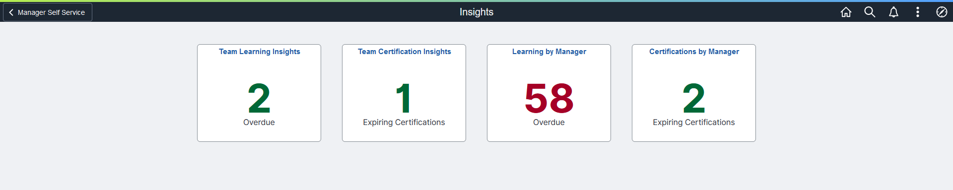
Use the Insights home page to access the following tiles:
Team Learning Insights
Team Certification Insights
Learning by Manager
Certifications by Manager
Navigation
Click the Learning Insights tile available on the Manager Self Service home page.
This example illustrates the fields and controls on the Insights dashboard.
Use the Team Learning Insights to view and analyze the enrollment details of the employees who directly report to the logged in manager.
Navigation
Click the Team Learning Insights tile on the Insights home page.
This example illustrates the fields and controls on the Team Learning Insights dashboard.
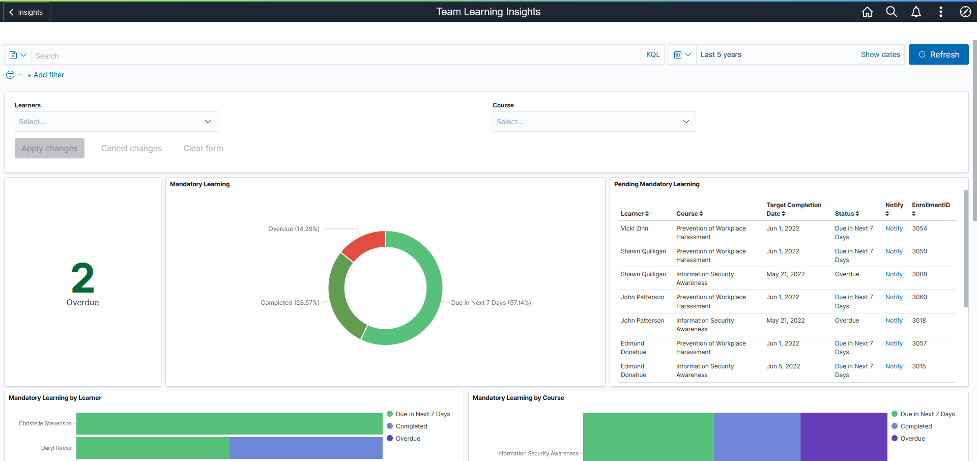
You can filter the visualization based on Learner and Course. Visualizations on Dashboard react to the changes made in these filters. For more information on working with the data visualization tool and filters, see PeopleTools Search Technology, “Working with Insights Dashboards for PeopleSoft Application Data” documentation.
Mandatory Learning Visualizations
This group of visualizations helps the managers to view and manage the status of mandatory learning enrollments of their direct reports.
It includes:
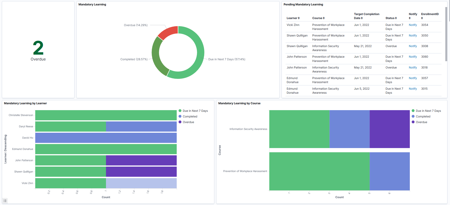
Metric Visualization: This visualization displays the count of mandatory learning courses that are overdue for the direct reports.
Mandatory Learning: Mandatory Learning Visualization shows the count of direct reports who completed the mandatory course and the count of direct reports who are yet to complete.
Completed
Due
Overdue
Due in Future
Due Today
Due in seven days
Note: ‘Due in seven days’ is set as the default value. You can modify this based on requirements.
Pending Mandatory Learning – Pending Mandatory Learning list displays more information on pending status with details like the learner’s name, course, target completion date, etc. in tabular form, based on the applied filter.
Mandatory Learning by Learner – This visualization helps the managers to view the mandatory learning status of their direct reports. It gives information like how many courses enrolled for a specific learner, how many are completed, how many are due in next seven days, how many are due to complete by today and how many are due in future.
Mandatory Learning by Course – This visualization helps the manager to view and analyze the mandatory learning status of the direct reports based on the course. It gives the details like how many direct reports have enrolled to a specific mandatory course and their completion status.
This example illustrates the fields and controls for the Mandatory Learning Visualizations on the Team Learning Insights dashboard.
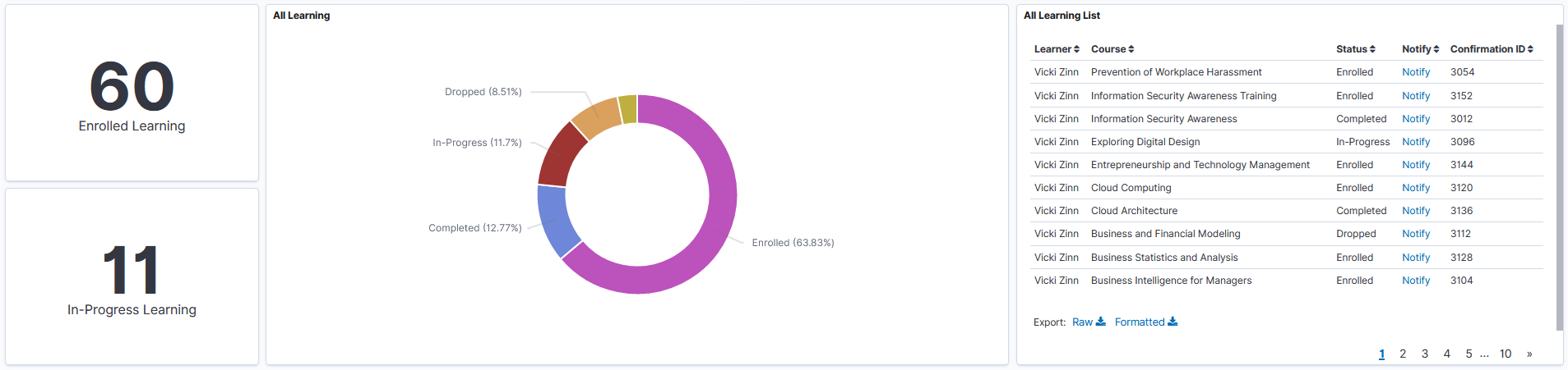
All Learning Visualizations
This group of visualizations helps the Manager visualize the status of mandatory and non-mandatory courses enrolled by the direct reports.
It includes:
Metric Visualization – This visualization displays the count of enrolled and ongoing learning courses for the direct reports.
All Learning Visualization– This visualization helps the manager to view the status of both mandatory and non-mandatory learnings for the direct reports.
Possible statuses are:
Enrolled
Completed
Dropped
In Progress
Not Completed
All Learning List- Displays the details of mandatory and non-mandatory learnings like the learner’s name, status, etc. in tabular form, based on the applied filter.
This example illustrates the fields and controls for the All Learning Visualizations on the Team Learning Insights dashboard.
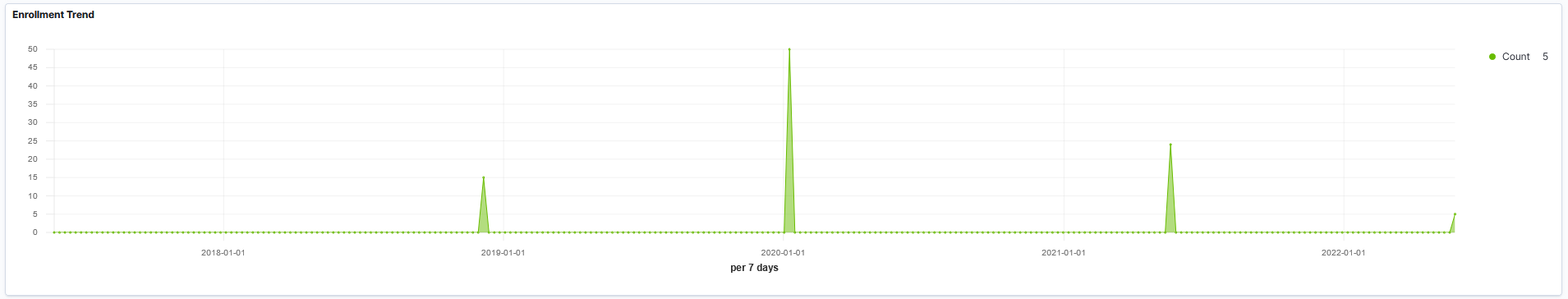
Enrollment Trend
This visualization displays the number of dropped enrollments by the direct reports over a period.
This example illustrates the fields and controls for the Enrollment Trend on the Team Learning Insights dashboard.
Use the Learning by Manager insights to view and analyze the enrollment details of all the managers (direct/indirect) in the organizational hierarchy of the logged in user.
Navigation
Click the Learning by Manager tile on the Insights home page.
This example illustrates the fields and controls on the Learning by Manager dashboard.
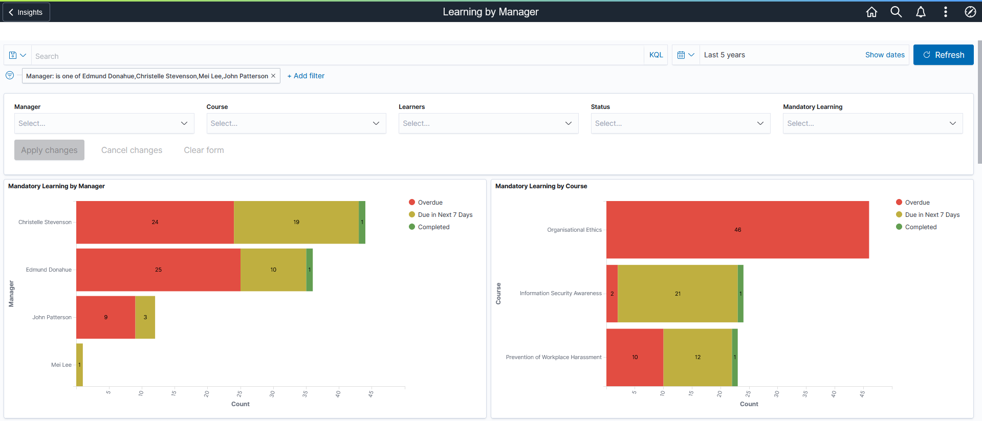
Mandatory Learning Visualizations
This group of visualizations display the status of mandatory learning enrollments for the all the managers (both direct and indirect) in the organizational hierarchy of the logged in user.
It includes:
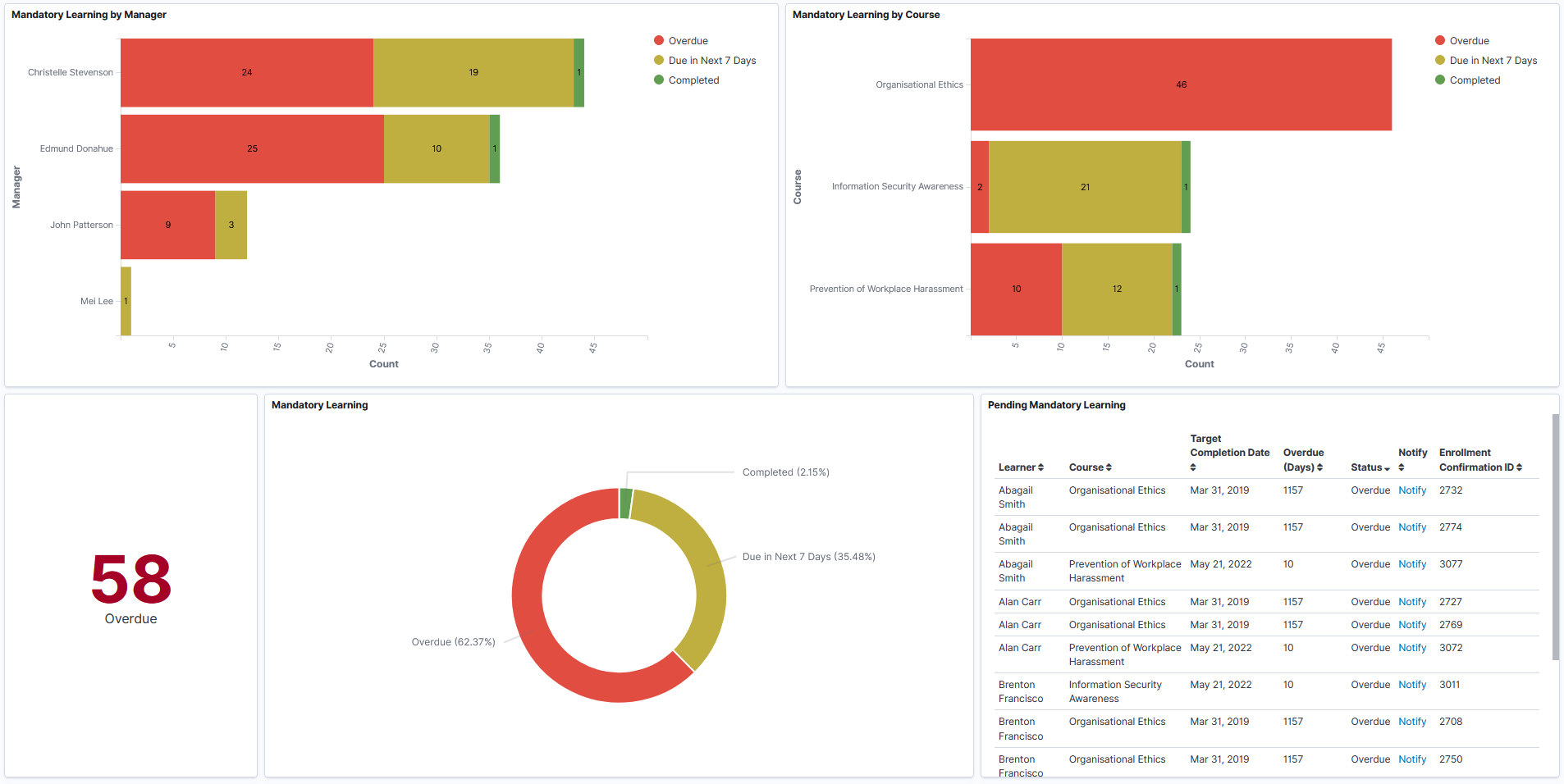
Mandatory Learning by Manager – Mandatory Learning by Manager visualization shows all managers (both direct and indirect) in the organizational hierarchy of the logged in user who have completed the mandatory course. If Manager filter is not selected, then it shows the mandatory learning status of all the managers (direct or indirect manager) who report to the logged in person. By default, direct reporting manager is selected in the Manager field. It also displays all statuses such as Completed, Overdue, Due Today, Due in next 7 days, and Due in Future.
Mandatory Learning by Course – This visualization displays the mandatory learning statuses of all managers (both direct and indirect) in the organizational hierarchy of the logged in user.
Metric Visualization- This visualization displays the count of mandatory learning courses that are overdue for all managers (both direct and indirect) in the organizational hierarchy of the logged in user.
Mandatory Learning- This visualization displays the status of all mandatory learning courses for all managers (both direct and indirect) in the organizational hierarchy of the logged in user.
Pending Mandatory Learning – Pending Mandatory Learning list displays details of the pending mandatory learning courses of all managers (both direct and indirect) in the organizational hierarchy of the logged in user.
This example illustrates the fields and controls for the Mandatory Learning Visualizations on the Learning by Manager dashboard.
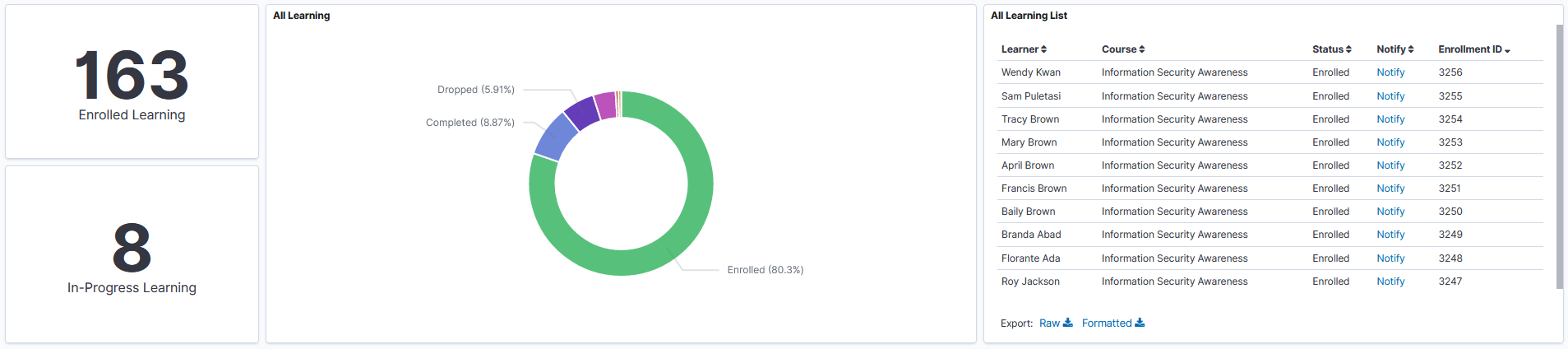
All Learning Visualizations
This group of visualizations helps the Manager visualize the status of mandatory and non-mandatory courses enrolled by the organization of the direct reports.
It includes:
Metric Visualizations – This visualization displays the count of enrolled and in progress learning for all managers (both direct and indirect) in the organizational hierarchy of the logged in user.
All Learning Visualization – This visualization helps the manager to view the status of both mandatory and non-mandatory learnings for all managers (both direct and indirect) in the organizational hierarchy of the logged in user.
Possible statuses are:
Enrolled
Completed
Dropped
In Progress
Not Completed
Waitlist
Pending
All Learning List – Displays the details of mandatory and non-mandatory learnings like the learner’s name, status, etc. in tabular form, based on the applied filter.
This example illustrates the fields and controls for the All Learning Visualizations on the Learning by Manager dashboard.
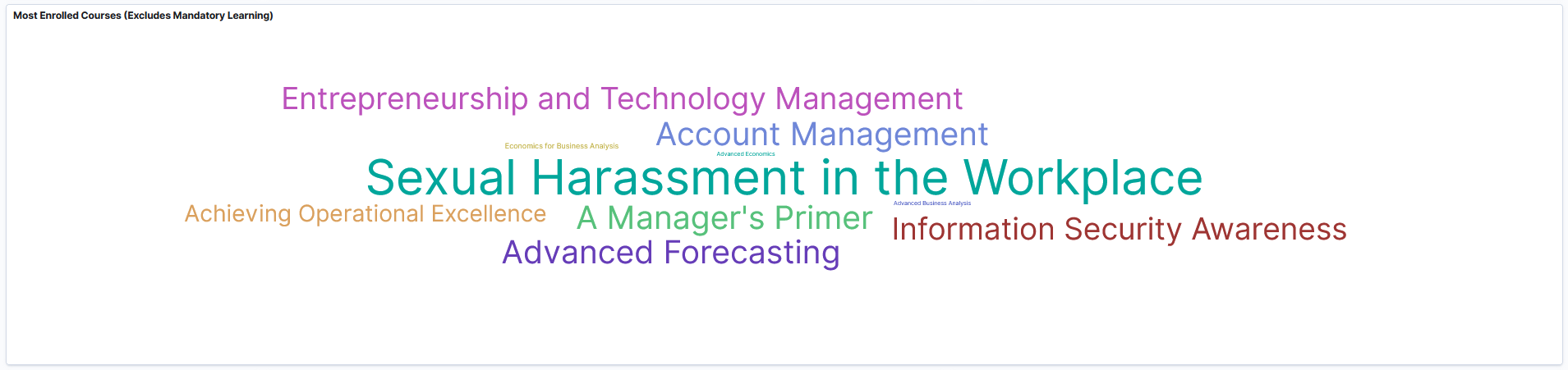
Most Enrolled Courses (Excludes Mandatory Learning)
This tag cloud visualization displays the non-mandatory learning courses that people are taking on their own interest. The most enrolled courses are displayed in larger fonts
This example illustrates the fields and controls for the Most Enrolled Courses (Excludes Mandatory Learning) on the Learning by Manager dashboard.
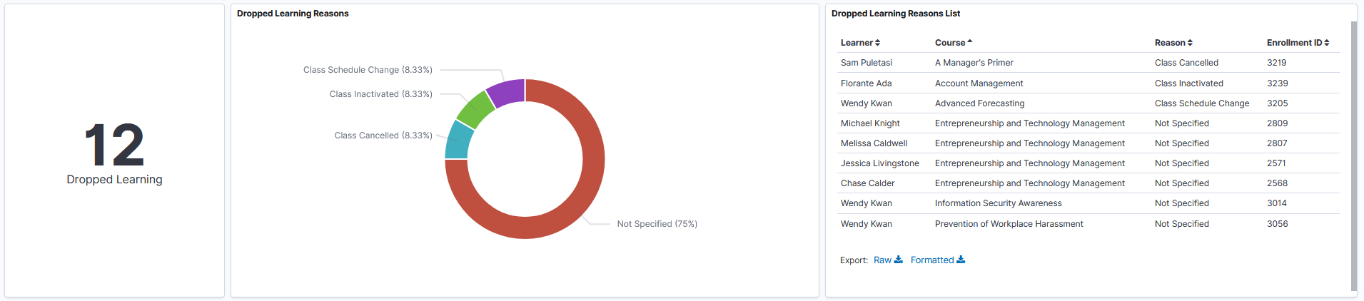
Dropped Learning Visualizations
This group of visualizations display details of learning enrollments that are dropped.
It includes:
Metric Visualization – This displays the count of enrolled courses that are dropped.
Dropped Learning Reasons – This visualization helps the managers to analyze the reasons for dropping the enrolled courses.
Dropped Learning Reasons List – This visualization displays the list of all dropped learnings.
This example illustrates the fields and controls for the Dropped Learning Visualizations on the Learning by Manager dashboard.
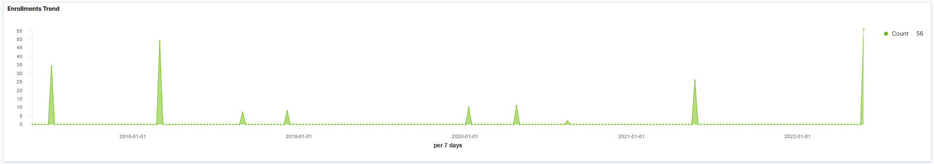
Enrollments Trend
This visualization displays the number of dropped enrollments of all managers (both direct and indirect) in the organizational hierarchy of the logged in user over a period.
This example illustrates the fields and controls for the Enrollments Trend Visualizations on the Learning by Manager dashboard.
Use the Team Certification Insights to view and analyze the certification details of the employees who directly report to the logged in manager.
Navigation
Click the Team Certification Insights tile on the Insights home page.
This example illustrates the fields and controls on the Team Certification Insights dashboard.
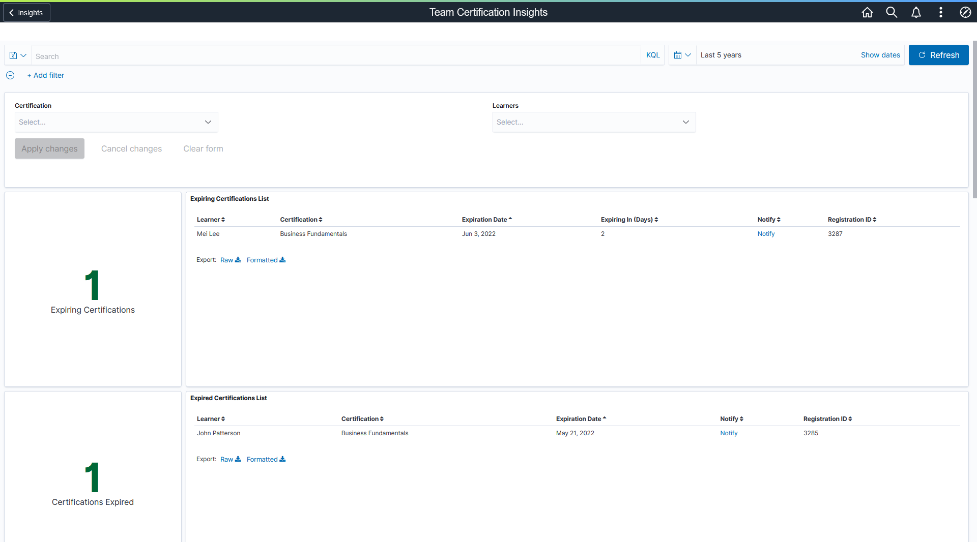
Expiring Certifications Visualizations
This group of visualizations display the certifications that are going to expire for the direct reports of the logged in user.
It includes:
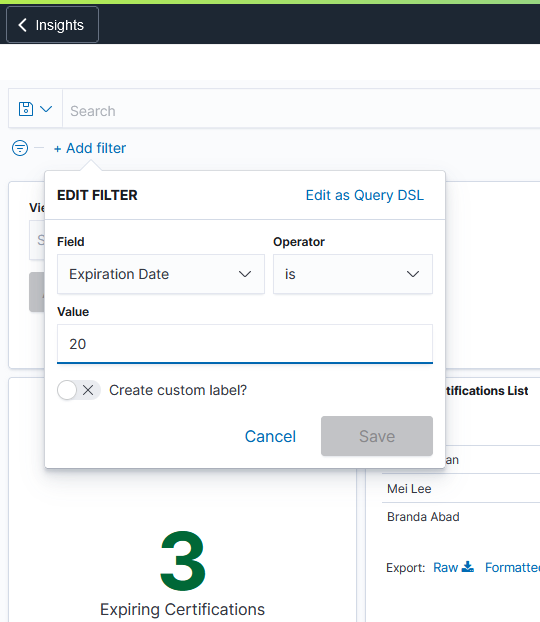
Metric Visualization – This visualization displays the number of certifications that are going to expire.
Expiring Certification List – This visualization displays the details of certifications that are going to expire.
By default, the expiry date is set as 15 days. You can change the default expiry date by modifying the filter values in visualizations.
This example illustrates the fields and controls for the Expiring Certifications Visualizations on the Team Certification Insights dashboard.
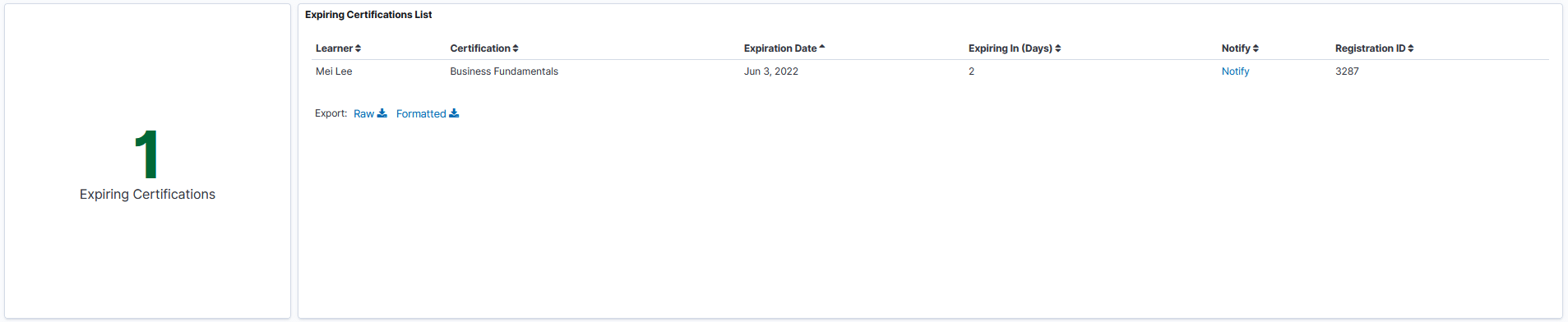
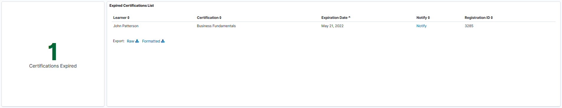
Expired Certifications Visualizations
This group of visualizations help the manager to view and analyze the certifications that are expired.
It includes:
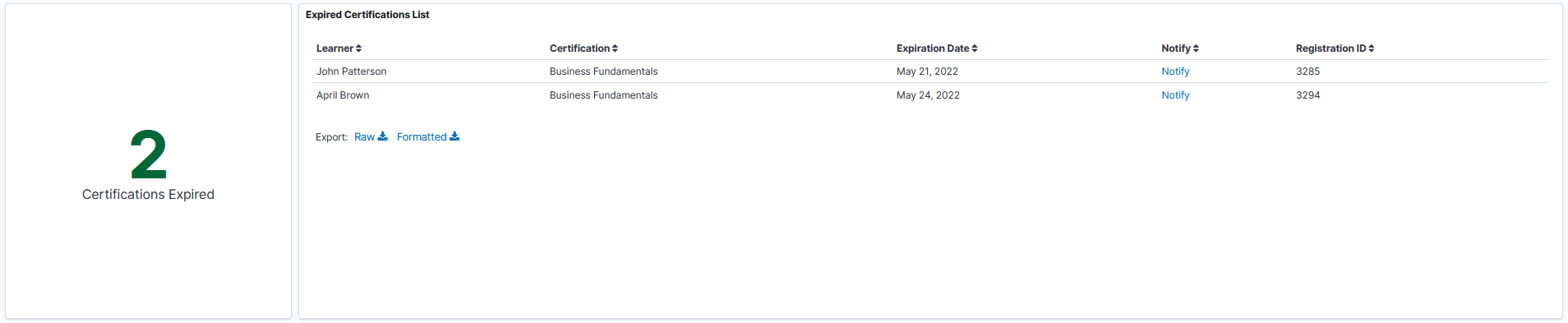
Metric Visualization – This visualization displays the count of certifications expired for the direct reports.
Expired Certification List – This visualization displays the details of certifications that got expired for the direct reports like learner’s name, certification name, expiration date etc.
This example illustrates the fields and controls for the Expired Certifications Visualizations on the Team Certification Insights dashboard.
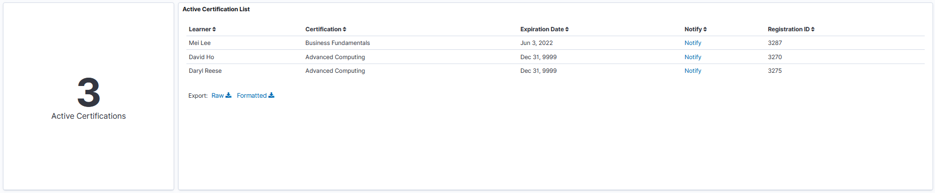
Active Certification Visualizations
This group of visualizations help the managers to view and analyze the details of active certifications. This helps the manager to get an idea of how many team members are certified.
It includes:
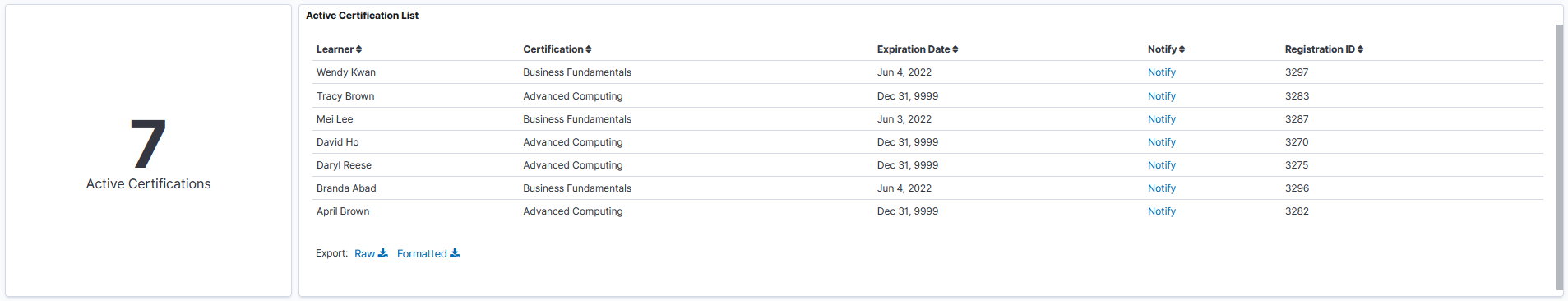
Metric Visualization – This visualization displays the count of active certifications.
Active Certification List – This visualization displays the details of active certifications like Expiration Date, Registration ID etc.
This example illustrates the fields and controls for the Active Certifications Visualizations on the Team Certification Insights dashboard.
In Progress Certification Visualizations
This group of visualizations help the managers to view and analyze the direct reports whose certifications are in progress.
It includes:
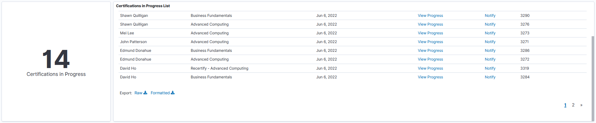
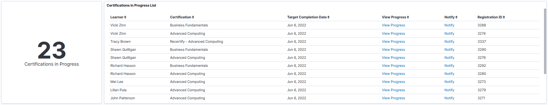
Metric Visualization – This visualization displays the count of certifications that are In Progress.
Certification In Progress List Visualization – This displays the details of ongoing certifications like the learner’s name, certification name, target completion date etc. Managers can also view the progress of certification and can notify the employees for program updates.
This example illustrates the fields and controls for the In Progress Certifications Visualizations on the Team Certification Insights dashboard.
Recertification In Progress Visualizations
This group of visualizations help managers to view and analyze the ongoing recertification details of employees.
It includes:
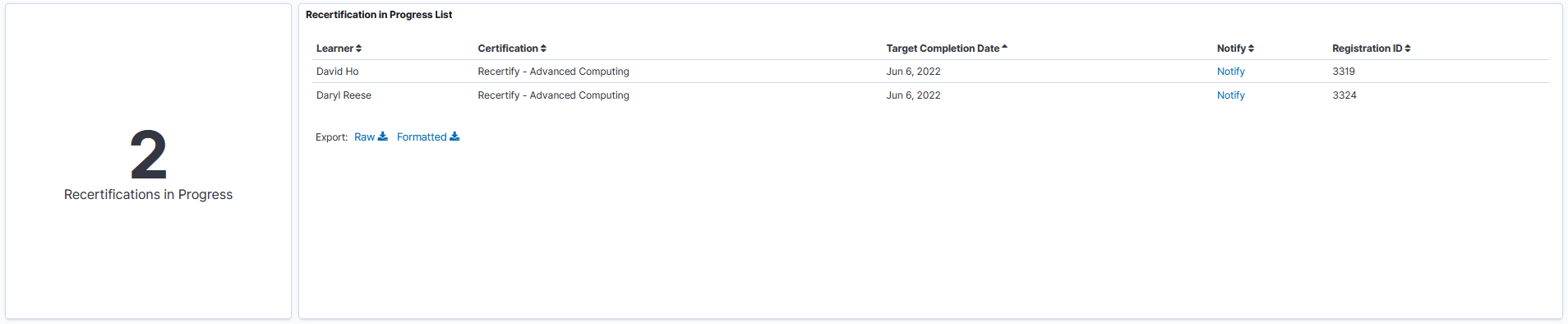
Metric Visualization – This displays the count of recertification in progress.
Recertification In Progress List – This displays the details of ongoing recertification like the learner’s name, certification name, target completion date etc.
This example illustrates the fields and controls for the Recertification In Progress Visualizations on the Team Certification Insights dashboard.
Use the Certifications by Manager insights to view and analyze the certification details of all managers (both direct and indirect) in the organizational hierarchy of the logged in user.
Navigation
Click the Team Certifications by Manager tile on the Insights home page.
This example illustrates the fields and controls on the Certifications by Manager dashboard.
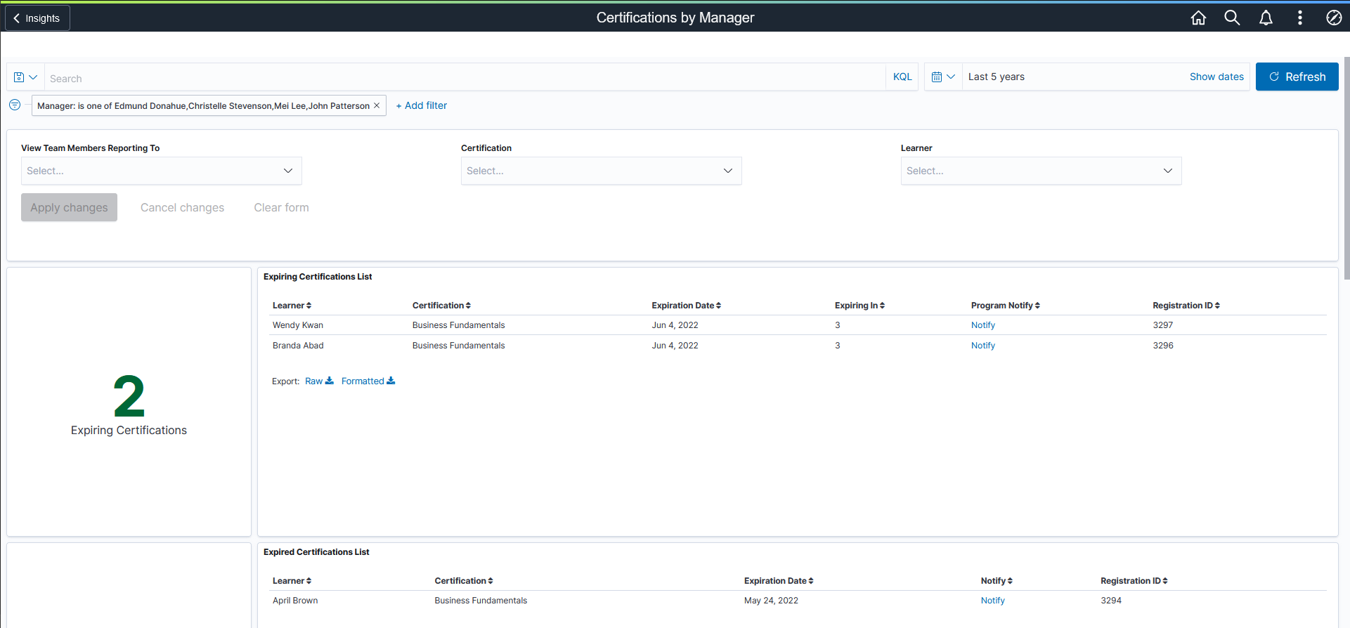
You can filter the visualization based on Reporting Managers, Certification and Learners. Visualizations on Dashboard react to the changes made in these filters. For more information on working with the data visualization tool and filters, see PeopleTools Search Technology, “Working with Insights Dashboards for PeopleSoft Application Data” documentation.
Expiring Certifications Visualizations
This group of visualizations display the certifications that are going to expire for all the managers (both direct and indirect) in the organizational hierarchy of the logged in user.
It includes:
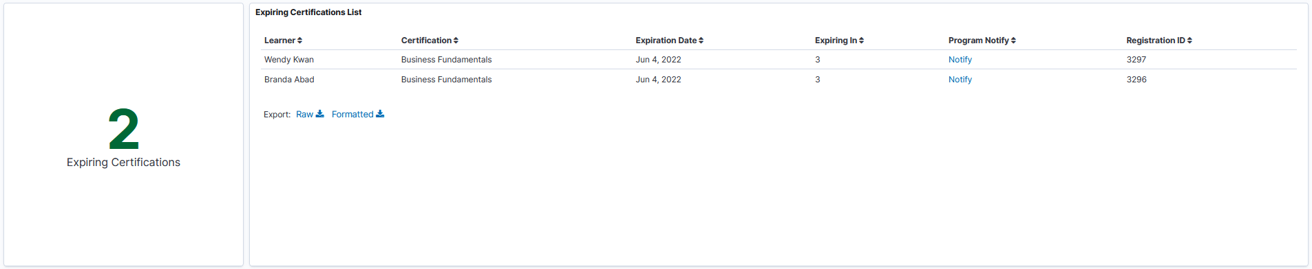
Metric Visualization – This visualization displays the number of certifications that are going to expire for the all the managers in the organizational hierarchy of the logged in user. By default, the expiry date is set as 15 days. You can change the default expiry date by modifying the filter values in visualizations.
Expiring Certification List – This visualization displays the details of certifications that are going to expire for the all the managers in the organizational hierarchy of the logged in user.
This example illustrates the fields and controls for the Expiring Certifications Visualizations on the Certifications by Manager dashboard.
By default, the expiry date is set as 15 days within the visualization. You can change the default expiry date by modifying the visualizations.
This example illustrates the fields and controls to filter the Expiring Certifications Visualizations.
Expired Certifications Visualizations
This group of visualizations help the manager to view and analyze the certifications that are expired.
It includes:
Metric Visualization – This visualization displays the count of certifications expired for all the managers in the organizational hierarchy of the logged in user.
Expired Certification List – This visualization displays the details of certifications that got for all the managers in the organizational hierarchy of the logged in user.
This example illustrates the fields and controls for the Expired Certifications Visualizations on the Certifications by Manager dashboard.
Active Certification Visualizations
This group of visualizations display the active certifications details of all the managers in the organizational hierarchy of the logged in user.
It includes:
Metric Visualization – This visualization displays the count of active certifications for all the managers in the organizational hierarchy of the logged in user.
Active Certification List – This visualization displays the details of active certifications like expiration date, registration ID etc. for all the managers in the organizational hierarchy of the logged in user.
This example illustrates the fields and controls for the Active Certifications Visualizations on the Certifications by Manager dashboard.
In Progress Certification Visualizations
This group of visualizations display the ongoing certifications for the all the managers in the organizational hierarchy of the logged in user.
It includes:
Metric Visualization – This visualization displays the count of ongoing certifications of all managers (both direct and indirect) in the organizational hierarchy of the logged in user.
Certification In Progress List Visualization – This displays the details of In Progress certifications like the learner’s name, certification name, target completion date etc. Managers can also view the progress of certification and can notify the team for program updates.
This example illustrates the fields and controls for the In Progress Certifications Visualizations on the Certifications by Manager dashboard.
Recertification In Progress Visualizations
This group of visualizations display the recertification details of all managers (both direct and indirect) in the organizational hierarchy of the logged in user. Recertification is required in cases where the employee need to attend the program all over again or need to attend certain sections of the course to complete the entire certification before it expires.
It includes:
Metric Visualization – This displays the count of ongoing recertification of all managers (both direct and indirect) in the organizational hierarchy of the logged in user.
Recertification In Progress List – This displays the details of In Progress recertification like the learner’s name, certification name, target completion date etc.