Viewing Recruiting Insights
Recruiters and recruiting managers can use the Recruiting Insights dashboards to view and analyze the job openings and job applications. Based on the user privileges and criteria, the recruiting administrators can gain insights into the recruiter data.
The Recruiting Insights dashboards are built on the PeopleSoft Insights platform, which relies on an underlying analytics engine and search engine. Recruiting data that is visible on the dashboard comes from the recruiting search indexes.
These videos provide an overview of the PeopleSoft Insights feature:
Video: Insights with PeopleSoft
Video: PeopleSoft HCM Insights
Video: Image Highlights, PeopleSoft HCM Update Image 34: HCM Insights
This topic provides an overview of how to set up the Insights Dashboard for Recruiting analytics and discusses the PeopleSoft Insights Dashboards for Recruiting.
For more information on Insights dashboards, see PeopleTools Search Technology, “Monitoring PeopleSoft Search Framework and OpenSearch” and “Working with Insights Dashboards for PeopleSoft Application Data” documentation.
Understanding PeopleSoft Insights
PeopleSoft Insights is an analytical engine that provides visual reports (visualizations) in the form of charts, tables, graphs and so on. The visualizations are based on queries that retrieve data from the PeopleSoft Search Framework.
For information on Insights dashboards, see:
PeopleTools Search Technology: “Monitoring PeopleSoft Search Framework and OpenSearch” and “Working with Insights Dashboards for PeopleSoft Application Data” documentation
|
Page Name |
Definition Name |
Usage |
|---|---|---|
|
HC_HRS_MY_ANALYTICS_FL_LINK (this is the cref for the tile) |
Access the Recruiting Insights home page for recruiting analytics. |
|
|
HC_HRS_MY_ANALYTICS_FL_LINK |
Access the collection of recruiting insights tiles. |
|
|
HC_HRS_APPLICATION_DBRD_FL (cref for the tile) |
Access the Application Details dashboard. |
|
|
HC_HRS_APPLICATION_DBRD_FL |
Review Insights visualizations related to the job applications based on your row level security. |
|
|
HC_HRS_RECRUITER_DBRD_FL (cref for the tile) |
Access the Recruiter Pipeline dashboard. |
|
|
HC_HRS_RECRUITER_DBRD_FL |
Review Insights visualizations related to the job openings based on your row level security. |
|
|
HC_HRS_RECRUITMENT_ADM_DBRD_FL (cref for the tile) |
Access the Recruitment Admin dashboard. |
|
|
HC_HRS_RECRUITMENT_ADM_DBRD_FL |
Review Insights visualizations related to the recruiter data based on your row level security. |
Before users can access the recruiting insights dashboards, the following steps should be performed:
Deploy and run the below search indexes.
(PeopleTools > Search Framework > Administration > Deploy Search Objects)
HC_HRS_APP_INDEX
HC_HRS_JOB_OPENING
HC_HRS_RCMNT_ALL
HC_HRS_RECRUITER_RCMNT_ALL
Deploy the below dashboards:
Application Details Insights
Application Details
Recruitment Admin Tile Dashboard
Recruitment Admin Dashboard
Recruiter Pipeline
Recruiter Pipeline Tile Dashboard
Application - External vs Internal
(PeopleTools > Search Framework > Administration > Deploy Insights Dashboards)
Assign the following user roles to users to access and view the recruiting dashboards:
Dashboard
Roles
Application Details
Recruiter Fluid
Recruiter Manager Fluid
Recruitment Admin Fluid
Recruiter Pipeline
Recruiter Fluid
Recruiter Manager Fluid
Recruitment Admin Fluid
Recruitment Admin
Recruitment Admin Fluid
For more information about the Deploy Insights Dashboards page, see PeopleTools Search Technology: “Working with Insights Dashboards for PeopleSoft Application Data”, Managing a Delivered Dashboard.
The field From Application Date in Build Search Index Settings page is used to configure defaults for Recruitment Indexes used in Recruiter and Recruiter Admin Dashboards.
For example, if you select the value Last 6 months, all applications updated in last six months are indexed.
Selecting ALL for From Application Date will index all applications. However, selecting this option may cause performance issues in the Recruitment Indexes. It is recommended not to use ALL for From Application Date if the volume of total applications is high (more than a million). But, if total number of applications in customer environment is less then ALL option can be used.
By default, this field is set as Last 6 months.
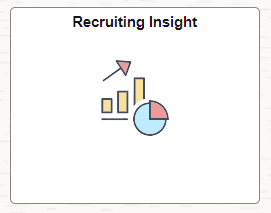
Use the Recruiting Insight tile to access the Recruiting Insight Home Page.
Navigation
The Recruiting Insight tile is available in the Fluid Recruiting home page.
This example illustrates the fields and controls on the Recruiting Insight tile.
Use the Recruiting Insight Home page (HC_HRS_MY_ANALYTICS_FL_LINK) to access the Recruiting Insights Dashboards.
Navigation
This example illustrates the fields and controls on the Recruiting Insight home page.
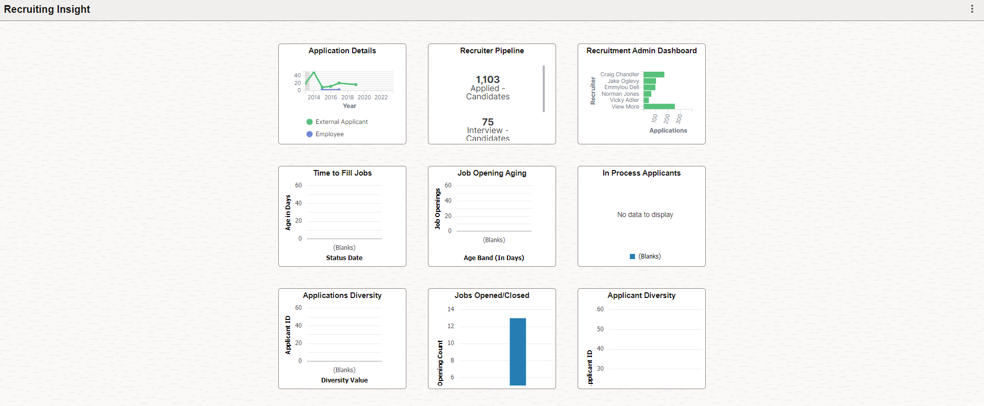
The Recruiting Insight Home Page delivers the following insights tiles through which you can access the Insights Dashboards:
Application Details tile
Recruiter Pipeline tile
Recruitment Admin Dashboard tile
These tiles are also available in the Fluid Recruiting home page.
Use the Application Details tile to access the Insights visualizations related to job applications based on your row level security.
Navigation
This example illustrates the fields and controls on the Application Details tile.
Select the Application Details tile to access the Application Details Dashboard.
Use the Application Details dashboard (HC_HRS_APPLICATION_DBRD_FL) to review the Insights visualizations related to job applications based on your row level security.
Select the Application Details Tile.
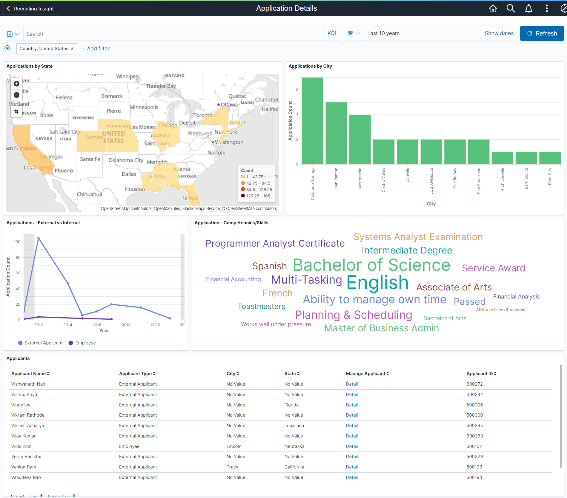
This example illustrates the Application Details dashboard.
Warning! PeopleSoft Insights dashboards may not render properly if you access them using unsupported platforms.
The Application Details dashboard provides you with different visualizations to analyze the job applications data. When you select filters or chart items, Insights dynamically updates all visualizations using the sources from the index.
Each visualization enables you to inspect the chart, table or map to view the details of that visualization. Pause over a visualization to have the have additional page elements appear, view numbers, or click items to add filters to your visualizations.
For more information on working with PeopleSoft Insights and filters, see PeopleTools: Search Technology, “Working with Insights Dashboards for PeopleSoft Application Data” documentation.
Delivered Application Details Visualizations
The Application Details dashboard provides this collection of visualizations:
|
Visualization |
Description |
|---|---|
|
Applications by State |
The Applications by State visualization shows the region map or the geographical distribution of applications on an interactive map. This shows the states where the applicants reside. You can use the Applications by State view to filter the data based on a state. For example if you click on California State, then the visualization in the other charts show the data only from applicants residing in California State. By default, the country filter is set to USA for Application by State visualization. To change the default view to a different country, the visualization needs to be modified and the corresponding filter needs to be added. |
|
Applications by City |
The Applications by City visualization shows a vertical bar graph of the number of applicants from each city. You can click on a city to filter the visualization for that city only. For example if we click on San Ramon, the rest of the charts show the data only from applications residing in San Ramon. |
|
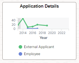
Applications – External vs Internal |
The Applications – External vs internal line graph shows a trend comparison between the number of applications received from external candidates compared to internal candidates over a period of time. Click on either of the line to filter the applications based on external applications or Internal applications. For example, if we click on the External graph, then the rest of the visualizations show the corresponding visualization of only external applicants |
|
Application – Competencies/Skills |
The Application – Competencies/Skills shows an interactive tag cloud visualization of the competencies and skills mentioned by the applicants. This tag cloud helps users to understand the more common or frequently mentioned competencies and skills across applications. Click on a word in the tag cloud visualization to filter only those applications that has a mention of that competency or skill. The other visualizations automatically show details of applications that contain the filtered competency or skill. For example, if you click on English, the visualization shows details of applicants that have this skill mentioned in their application. |
|
Applicants |
The Applicants section lists out all the applicants and their details in tabular form. You can find the detail of a particular applicant under the manage Applicant column. Click the Detail link against an Applicant in the Manage applicant column to open the Applicant details in the Manage Applicant page. |
Use the Recruiter Pipeline tile to access the Insights visualizations related to job openings based on your row level security.
Navigation
This example illustrates the fields and controls on the Recruiter Pipeline tile.
Select the Recruiter Pipeline tile to access the Recruiter Pipeline Dashboard.
Use the Recruiter Pipeline Dashboard (HC_HRS_RECRUITER_DBRD_FL) to access the insights visualizations related to job openings based on the logged in recruiter.
Select the Recruiter Pipeline Tile.
This example illustrates the Recruiter Pipeline Dashboard.
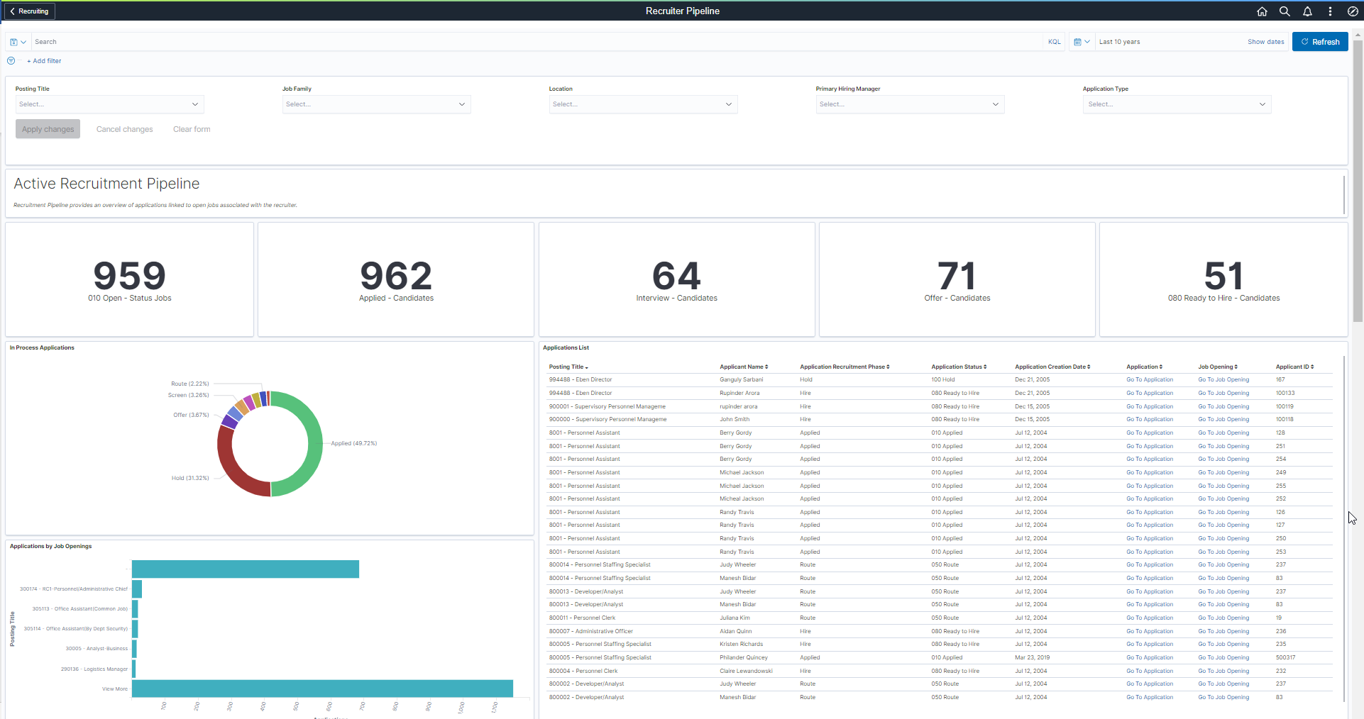
You can filter the visualizations based on Posting Title, Job Family, Location, Primary Hiring Manager, and Application Type.Visualizations on Dashboard react to the changes made in these filters. For more information, see PeopleTools Search Technology, “Working with Insights Dashboards for PeopleSoft Application Data”.
Active Recruitment Pipeline
This group of visualizations helps the Recruiter to view and manage their open backlog. These visualizations are independent of the selected date range.
It includes:
Metrics Visualizations
In Process Applications Visualization
Applications by Job Openings Visualization
Applications List
Note: The visualizations grouped under Active Recruitment Pipeline are not dependent on the selected date range. This allows all jobs that are open to be available for review.
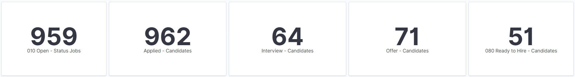
Metrics Visualizations
Metric visualization displays the count of:
Open Jobs: Count of open jobs (posted as well as non-posted) associated with the Recruiter.
Applied Jobs: Count of applicants in the applied phase associated with the Recruiter.
Interview: Count of applicants in the interview phase associated with the Recruiter.
Offer: Count of applicants in the offer phase associated with the Recruiter.
Ready to Hire: Count of applicants in the ready to hire status associated with the Recruiter.
By default, these metrics display both applications tied to a job opening and applied without a job. Use the Application Type filter to filter as needed.
Click on each metric value to add corresponding filters to the dashboard.
This example illustrates the Metric Visualizations.
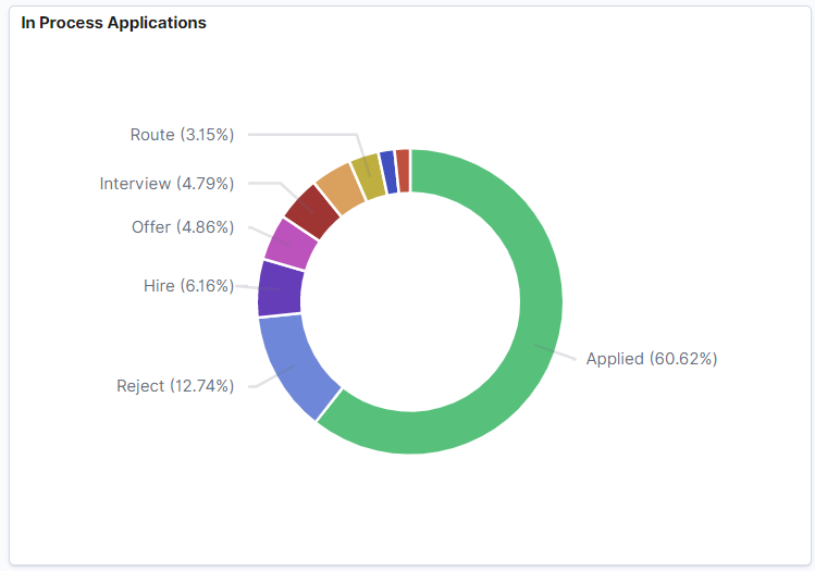
In Process Applications Visualization
In Process Applications visualization shows the applications that are under processing based on all recruitment phases.
This example illustrates the In Process Applications Visualization.
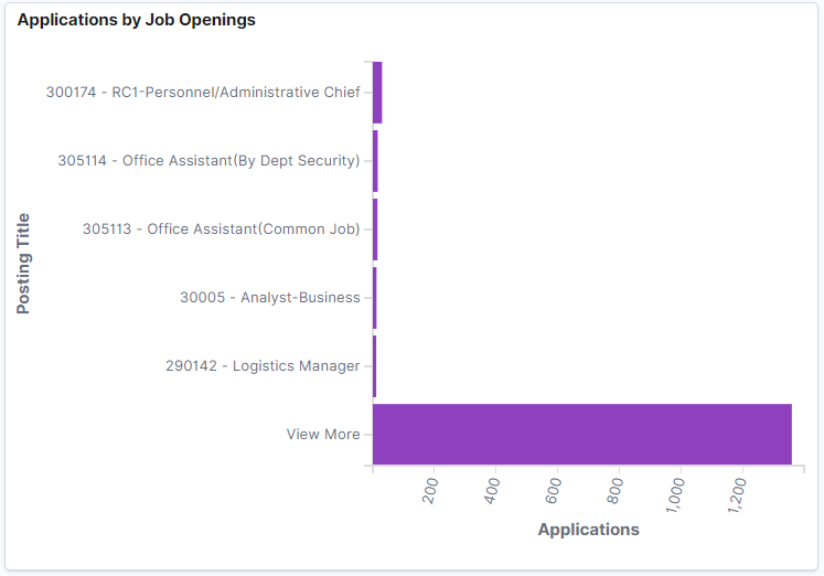
Applications by Job Openings Visualization
Applications by Job Openings visualization shows the number of applications received for each job title/job opening.
By default, six job openings with the greatest number of applications are displayed in the chart. You can view the rest of job openings by clicking View More.
This example illustrates the Applications by Job Openings Visualization.
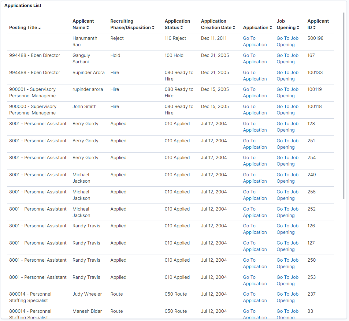
Applications List Grid
Application List displays all the job openings, applications received, and their details in tabular form, based on the applied filter. The recruiter can transfer directly to the Application page or the Job Opening page.
This example illustrates the Applications List Visualization.
Total Applications by Job Postings Visualization
This visualization helps the recruiter to view and analyze the applications based on total applications and days since the job was first posted. This is helpful in reviewing jobs that do not have any applications.
This example illustrates the Total Applications by Job Postings Visualization.
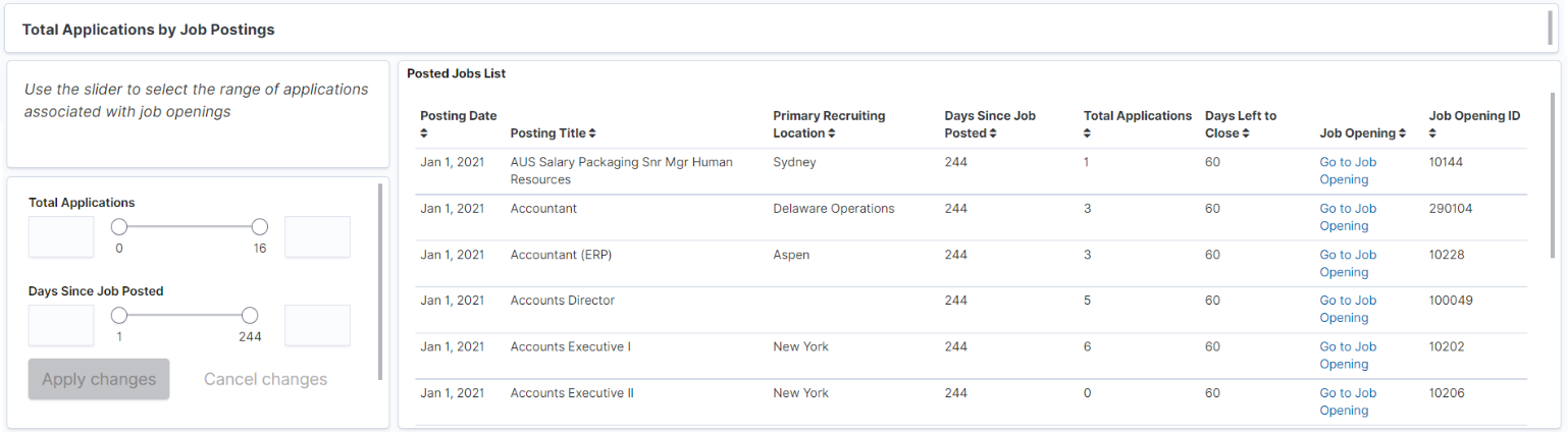
You can use the slider to filter the data based on the number of Total Applications received and Days Since Job Posted. The range of the slider is set according to minimum and maximum applications associated with job postings. The extreme values in the sliders for Total Applications and Days Since Job Posted are determined by the data present in applications. For example, if minimum value for Total Applications associated with a job is 0 and maximum value is 16 then 0 and 16 will be set as the extreme values for slider.
Once applied, the Posted Jobs List grid displays the associated job openings, and other details, based on the selected range of job applications. If the job opening has a close date, the grid will show the number of days left until it is closed.
Recruitment Metrics
This group of visualizations helps the Recruiter visualize historical data based on the selected date range for both open and closed jobs to understand recruitment trends.
Note: Please review your organization’s policy on Recruiters having access to Veteran Data. Each organization may be different.
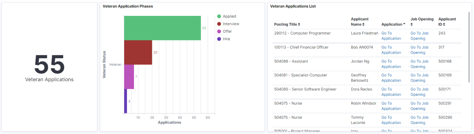
Veteran Applications Visualizations
Veteran’s data on the Recruiter Pipeline is represented by three visualizations:
Veteran Applications Metrics: Displays the count of veteran applications received for job openings associated with the Recruiter.
Veteran Application Phases: Displays how all veteran applications received for job openings associated with the Recruiter have progressed through various Recruiting Phases.
Veteran Applications List: Displays all the veteran applications received for the job openings associated with the Recruiter in a tabular form.
Note: Please review your organization’s policy on Recruiters having access to Veteran Data. Each organization may be different.
This example illustrates the Veteran Applications Visualization.
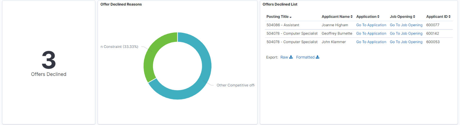
Offer Declined Reasons Visualizations
Offers Declined data on Recruiter Pipeline is represented by three visualizations.
Offers Declined Metrics: Displays the count of job offers declined for the applications on job openings associated with Recruiter.
Offers Declined Reasons: Displays the reasons given by the applicants for declining the offers.
Offers Declined List: Displays the offers declined in a tabular form.
This example illustrates the Offer Declined Reasons Visualization.
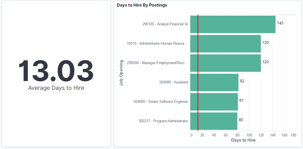
Days to Hire by Postings Visualization
Days to Hire by Postings visualization shows the average number of days to move a job application from the Applied to the Hire phase. Also, a bar chart visualizes the same data based on individual job openings associated with the recruiter.
Days to Hire by Postings may not show all Closed Jobs but instead shows a subset of closed jobs. Yet the red line is based across all closed Jobs to provide an accurate average.
This example illustrates the Days to Hire by Postings Visualization.
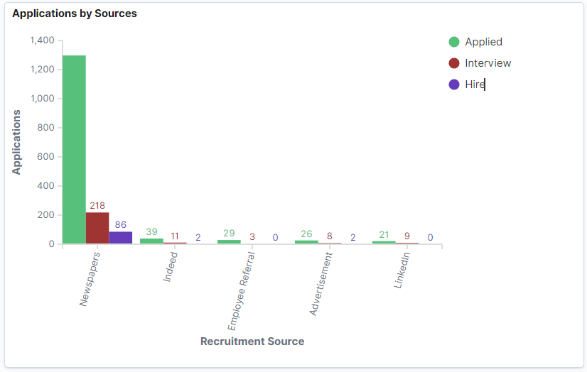
Applications by Sources Visualization
Application Sources visualization shows the Recruitment sources from which the recruiters receive the job applications (distributed across Applied, Interview, and Hire Recruitment Phases of Application).
This example illustrates the Applications by Source Visualization.
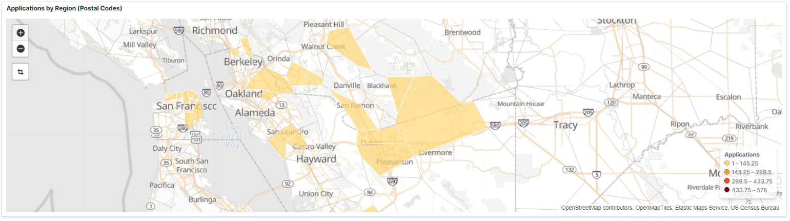
Applications by Region (Postal Codes) Visualization
Applications by Region visualization shows the job applications based on the regions (postal codes). The system uses the postal codes associated with the applicant's address to map the region. This visualization can also be created using Country, State, or County.
Note: This visualization is currently not available with the OpenSearch implementation.
This example illustrates the Applications by Region (Postal Codes) Visualization.
Use the Recruitment Admin Dashboard Tile to the Insights visualizations related to recruiter data based on your row level security.
Navigation
This example illustrates the fields and controls on the Recruitment Admin Dashboard tile.
Select the Recruitment Admin Dashboard tile to access the Recruitment Admin Dashboard.
Use the Recruiter Admin Dashboard (HC_HRS_RECRUITMENT_ADM_DBRD_FL) to access the insights visualizations related to the recruiter data based on your row level security.
Navigation
Select the Recruitment Admin Dashboard Tile.
This example illustrates the Recruitment Admin Dashboard.
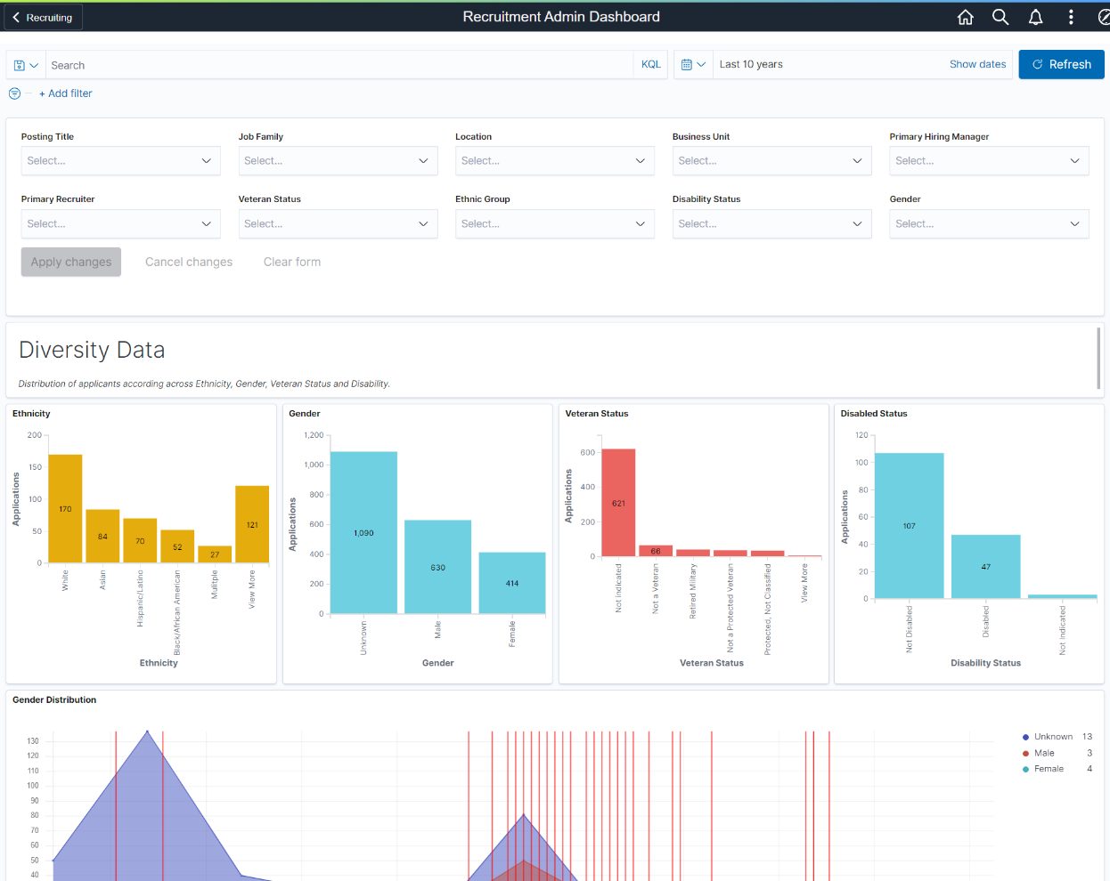
As a Recruitment Administrator, you can filter the data based on Posting Title, Job Family, Location, Business Unit, Primary Hiring Manager, Primary Recruiter, Veteran Status, Ethnic Group, Disability Status, and Gender. Visualizations can change based on the applied filter.
The visualizations on this Dashboard are grouped as:
Diversity Data Visualizations: This group of visualizations helps to analyze the job applications based on diversity data.
Recruiter Workload Visualizations: This group of visualizations helps to analyze the workload of each Recruiter.
Recruiter Data Visualizations: This group of visualizations helps to visualize the Applications progression and days to hire associated with each Recruiter.
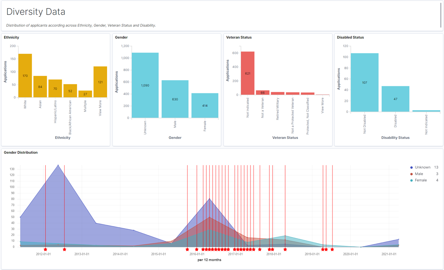
Diversity Data Visualizations
This group of visualization helps the administrator to understand the diversity of the people who applied for each job postings. It includes:
Ethnicity: The Ethnicity visualization shows a vertical bar graph of the number of applicants from each ethnic group.
Gender: The Gender visualization shows a vertical bar graph of the number of applicants from each gender.
Veteran Status: The Veteran Status visualization shows a vertical bar graph of the number of applicants for each veteran status.
Disabled Status: The Disabled visualization shows a vertical bar graph of the number of applicants for each disabled status.
Gender Distribution: The Gender Distribution visualization is a time series representation of applications by gender. This visualization also annotates the Veteran applications.
Note: Veteran Applications which are received on the same day or closer in time (within few days) are displayed in a single annotation. You can modify the annotation to display a rare event based on requirements. This can be done by editing the visualization and changing the Annotation tab.
This example illustrates the Diversity Data Visualizations.
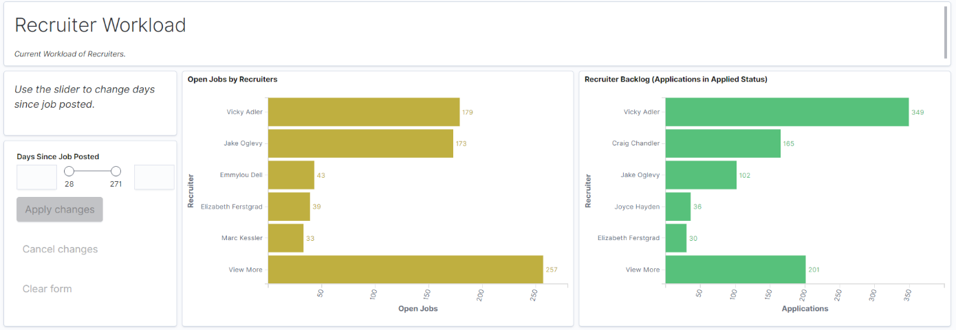
Recruiter Workload Visualizations
The Recruiter Workload visualizations help the administrator to understand the workload of each recruiter. It includes:
Days Since Job Posted: Use the slider to select the days (days since the job is posted). The other two visualizations are displayed based on this selection. The range of slider is set according to minimum and maximum applications associated with job postings. The extreme values in the sliders are determined by the data present in applications. For example, if minimum value for Total Applications associated with a job is 0 and the maximum value is 16 then 0 and 16 will be set as the extreme values for slider.
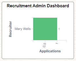
Open Jobs by Recruiters: Open Jobs by Recruiter shows the distribution of open job openings across Recruiters.
Recruiter Backlog (Applications in Applied Status): The Recruiter Backlog shows the distribution of applied applications across Recruiters. The visualizations displayed are independent of the time filter to show all open jobs.
This example illustrates the Recruiter Workload Visualizations.
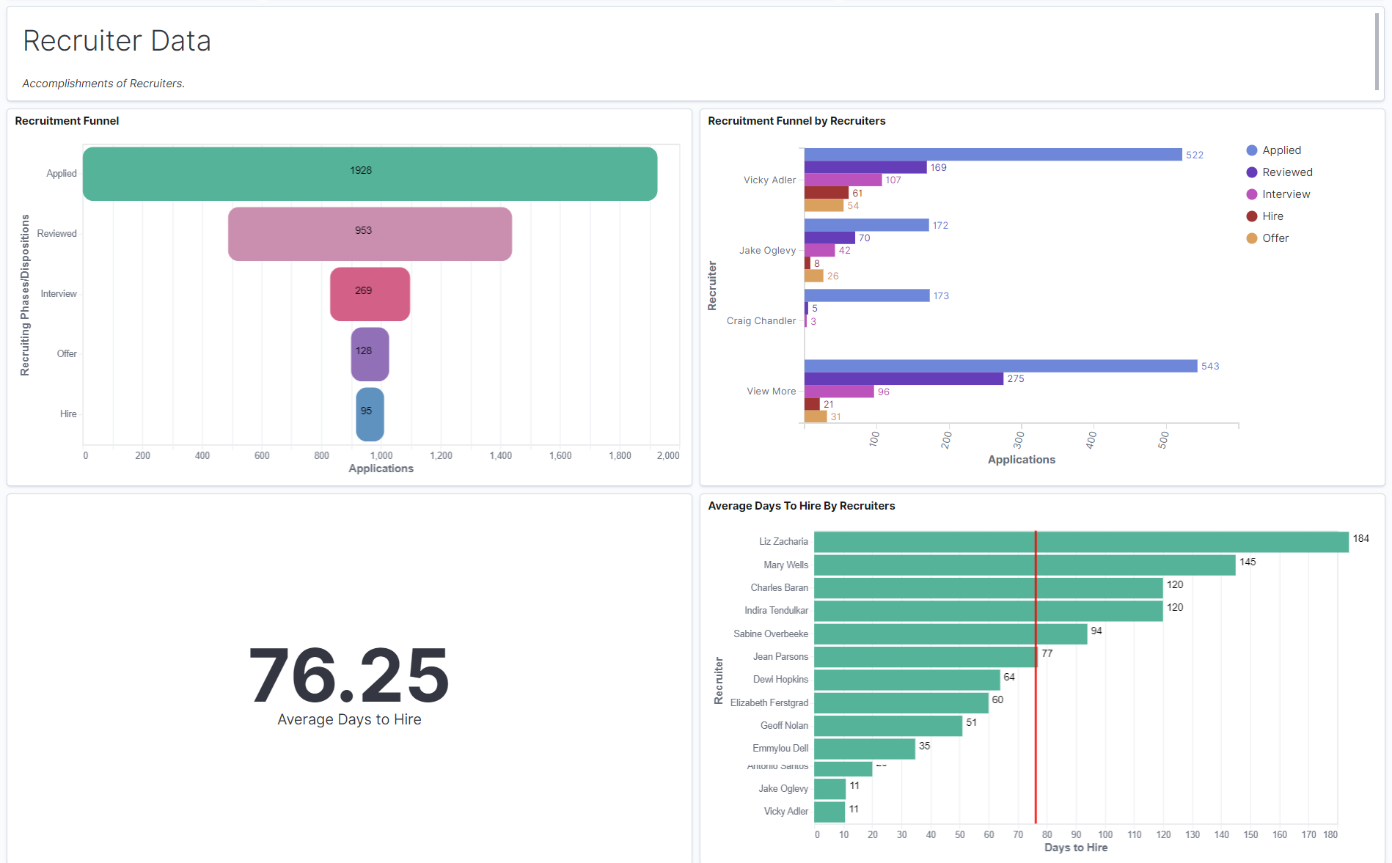
Recruiter Data Visualizations
Recruiter Data Visualizations help the administrator to analyze applications progression and days to hire for each recruiter. It includes:
Recruitment Funnel: Recruitment Funnel visualization shows the progress of applications across various recruitment phases.
Recruitment Funnel by Recruiters: Recruitment Funnel by Recruiter visualization shows the progress of job applications across various recruitment phases for each recruiter.
Average Days to Hire By Recruiters: Average Days to Hire visualization shows the average days to move job applications from the applied to hire phase. The bar chart represents the same data by each recruiter.
This example illustrates the Recruiter Data Visualizations.