Unifier User Interface
The user interface has both static and dynamic elements.
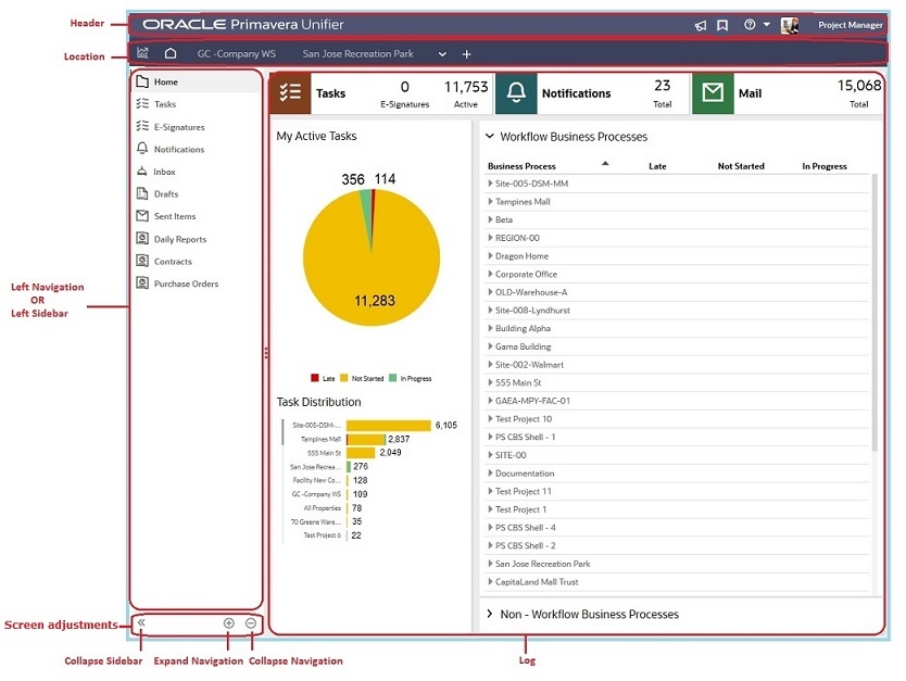
The following image displays the static elements of the user interface, and the explanation for each static element follows.
Unifier User Interface Header
The header section of the interface contains the following elements, from left to right:
- Unifier logo (Primavera Unifier): Displays the application name and environment.
- Announcements ( ): Enables you to view company-wide announcements. The announcements are sorted by Title, Date (listed by creation date in reverse chronological order), and Announced by.
When a new announcement record is unread, a red bubble count-indicator icon (
 ) appears on top of the Announcements icon and indicates the number of unread announcements.
When you click the Announcements icon, a grid appears that displays the announcements, with unread ones highlighted in red.
- Bookmarks ( ): Displays a list of your bookmarked pages. For details, see Bookmarks.
- View Help menu ( ): This menu contains a contextual menu that enables you to access the following:
- User Help: To access the User Help.
- Admin Help: To access the Administrator Help.
- uDesigner Help: To access the uDesigner Help.
- Unifier Library: To access the complete suite of documentation.
- Download Plugins: To access a Support window that has two tabs, Contact and Download.
Download (opens by default): In the Download tab, you can see the following plug-in and applications. These plug-in and applications are available to download. A link to the installation instructions is available, where applicable.
AutoVue WebStart
Follow the links within each option to proceed.
Customers are requested to use REST services. The Web Service Description Language (WSDL) document can be provided by making a Service Request.
- Company Help: If your organization provides company-specific help, you can access this option. If the URL provided by your Company Administrator is invalid, an error message is displayed.
- Contact Support: To access a Support window that has two tabs, Contact and Download.
Contact (opens by default): In the Contact Information section of the Contact tab, you can see the name, phone, and contact instructions of someone at your company that you can contact when you need help. For assistance, try this person first.
Note: This information is available only if your company administrator has provided internal support contact information.
In the eLearning section, you see the location (Access), name of the contact (Contact), and any instructions that you might need to access the eLearning materials.
Note: Your company may elect to provide access to the eLearning suite, where you can access interactive learning materials. Alternatively, your company may have its own customized support or training materials that can be accessed on an internal site/location. If your company administrator provides this contact information, it will be listed at the bottom of the window.
- About Unifier: Click to access the Version number, Copyright information, Software agreement details for Unifier, Cookie Policy, and Privacy Policy.
- Name of the user: Displays the name of the person who has signed in. If you click the name, you will be able to access the following features:
- Get Unifier Mobile App: Enables you to open a new window and proceed to download the Unifier Mobile Application. Follow the instructions on this window to get the app for both Android and iOS.
- Preferences: Displays the Preferences window, which contains multiple tab, including General, Security, Email Subscription, Region Format, Proxy, and More. For details, see Preferences.
- Change Password: Enables you to open the Change Password window. For details, see Change Password.
Note: The Change Password option is only visible for on-premises customers, not for cloud customers.
- Proxy For: Click to expand the menu and see the list of individuals who selected you as their proxy and sign in as that person's proxy. For details, see Proxy For.
- Last login: MM/DD/YYYY HH:mm AM/PM: Displays the date and time when you signed in last.
- Sign Out: Enables you to sign out of the system. For details, see Sign Out.
You may see the Upload Status icon ( ) appear next to the Announcements icon. This happens when there are documents pending to be uploaded. In general, when you go to the Document Manager grouping node (for example, Company Workspace or Administration tabs and then select Document Manager where you can upload multiple documents), you can see the Upload Status icon on top. The color of this icon changes depending on the upload status. You can click Clear to remove this icon.
Unifier User Interface Location Bar
The location bar at the top of the interface contains the following elements, from left to right:
Notes:
- One page or tab must always be present.
- On touchscreen-enabled devices, the close button (x) is displayed for every page or tab in the location bar at the top of the application, instead of being displayed only for the active page or tab.
- Analytics page or tab
- Home workspace
- Company Workspace page or tab
- Switch-to tab ( ) allowing you to switch to a different tab
- New tab ( ) to add a new tab (projects/shells) to the location area
Creating new tabs is useful when navigating to frequently used locations, such as the Company Workspace or projects/shells. You can create an unlimited number of tabs that can be rearranged by clicking and dragging, or removed by clicking the X that appears when hovering over a tab. You can remove all tabs except for the Home workspace and the Analytics tab.
When creating a new tab, the location launcher window displays three sections - Recent Locations (recently accessed locations), Key Locations (Company Workspace and single-instance shells), and Bookmarks (locations you have saved in Bookmarks). The height of the initial drop-down dynamically varies based on the number of items in Key Locations. Use the search bar to quickly find a location. Alternatively, click Open All Locations ( ) to see the log of all available locations to choose from.
You can also create multiple tabs representing the same location to quickly navigate to, or in, different areas within that location.
Tabs maintain their states if you switch tabs. For example: If you are working in Schedule Manager (User mode) and decide to switch to another tab and switch back, the system preserves your view and settings in the Schedule Manager node for when you return. Similarly, when you sign out and sign in again, you return to the tab that you were working with, before you signed out, with your settings preserved.
Note: First-time users see only the Home workspace. Returning users see all the tabs that were displayed in the previous version.
Unifier User Interface Left Navigation
The left Navigator (also known as the left Sidebar or left Navigation) lists all the nodes that are available for a company or project/shell.
Note: Your Navigator setup may differ, but the basic functionality will be the same.
Your company administrator can configure the User Mode Navigator to suit the company business needs, such as by creating additional nodes to store business process records, renaming nodes, and so on. To configure the navigator:
- Go to the Company Workspace tab and switch to Admin mode.
- In the left Navigator, select Configuration, and then select User Mode Navigator.
Every node, feature, and record can be accessed by way of the Navigator, which is always available in the left pane of the screen. The Navigator is similar to a folder system, much like a network drive. Each feature is stored in its own "functional node," similar to a folder, and some nodes may be stored in "grouping nodes" that organize functional nodes based on their properties. Each functional node is controlled by permissions. If you do not see a feature in the Navigator, contact your project/shell Administrator or Company Administrator to verify that you have been assigned the proper access permissions.
As you access different nodes on the left Navigator, the Navigator remains available on the left of the screen, while the content frame on the right changes.
Unifier User Interface Screen Adjustments
The screen adjustments section of the interface contains the following elements, from left to right:
- Collapse Sidebar
- Expand Navigation
- Collapse Navigation
Use the Expand Navigation or Collapse Navigation icons at the bottom of the Navigator pane to expand or collapse all the nodes (modules) in the Navigator.
Unifier User Interface Log
This right pane displays all the information pertaining to the nodes (or modules) that are available for a company or project/shell. The right pane houses the logs. Additional functions are available from the options and links at various parts of the logs.
On top, below the company and project/shell tabs, the locator links (breadcrumbs) are displayed. The locator links:
- Enable you to follow the path to the current location
- Always include home
Click the drop-down arrow of a locator link (breadcrumb) to reveal the direct children or sub-shells of that location.
Even if you do not have permission to access a shell, the shell name appears in the breadcrumb trail.
See the following topics for details on each static element, listed above.
The following topics display the dynamic elements of the Unifier user interface, and the explanation for each dynamic element follows.
Note: The following screen captures are examples of a typical Unifier dynamic user interface and might not be identical to the version that you are using.
In This Section
Last Published Thursday, February 19, 2026