Analyzing General Ledger Using PeopleSoft Insights
This topic displays and explains how to analyze General Ledger data using PeopleSoft Insights dashboards.
The PeopleSoft General Ledger delivers five Insights dashboards that help users with several business intelligence analytics.
Use these pages to analyze General Ledger using PeopleSoft Insights dashboards.
|
Page Name |
Definition Name |
Usage |
|---|---|---|
|
Analyze the trend of journal volume over time. |
||
|
Analyze the financial position of transactions within the selected time-frame. |
||
|
Analyze the financial performance of a business on yearly basis. |
||
|
Analyze departmental expense budgets. |
||
|
Analyze departmental expense budgets against revenue. |
Use the GL Operational Insights dashboard to analyze the trend of journal volume over time.
Navigation:
Select the GL Operational Insights tile.
This example illustrates the fields and controls on the GL Operational Insights Dashboard.
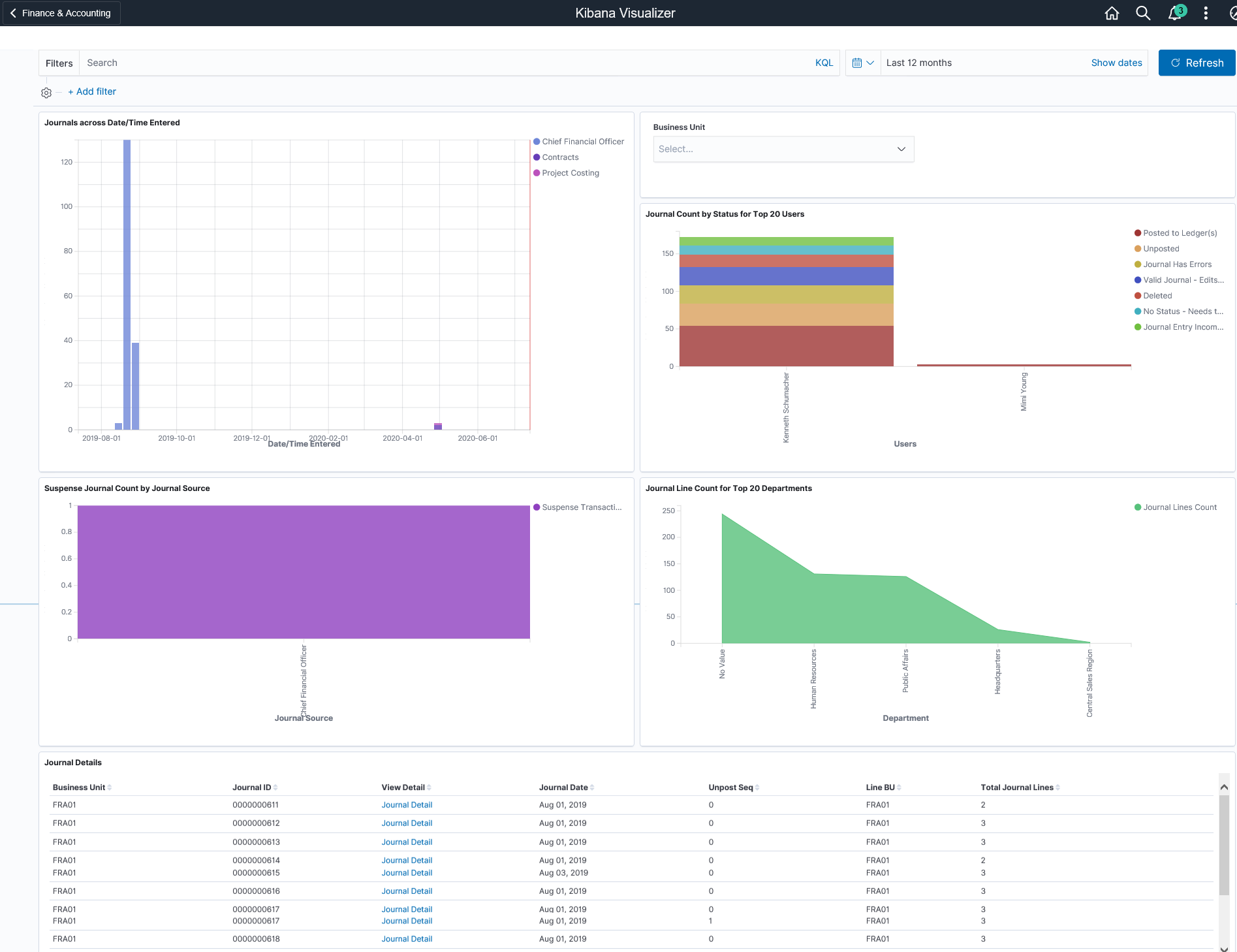
Users can filter data based on the header business unit. You can drill into the displayed data to the journal entry transaction for further analysis. The dashboard focuses on all journal transactions excluding the statistical journal entries that were created in the last 12 months.
Select a date and time for journal creation to view the data based on the given time range in the dashboard. Different visualizations that are part of this dashboard are:
Journals across Date/Time Entered - Provides insight on journal volume trend by journal source across time.
Journal Count by Status for Top 20 Users - Provides journal count based on journal status for the top 20 users.
Suspense Journals Count by Journal Source - Provides suspense journal details, and its count by journal source.
Journal Line Count for Top 20 Departments - Provides journal line count for the top 20 departments.
Each visualization can be viewed separately in full screen. Journal Details display data in a tabular format, and allows your to drill into to each journal entry transaction. Data can be downloaded as a CSV file.
Field or Control |
Description |
|---|---|
Filters |
Search for available filters or add additional filters by clicking the Add filter link. |
Timepicker |
Select required date range for the journal details to be displayed in the dashboard. |
Business Unit |
Select the business unit to filter the dashboard by header business unit. |

Use the Financial Position Trending dashboard to analyze the financial position of transactions within a selected time frame.
Navigation:
Select the Financial Position Trending tile.
This example illustrates the fields and controls on the Financial Position Trending.
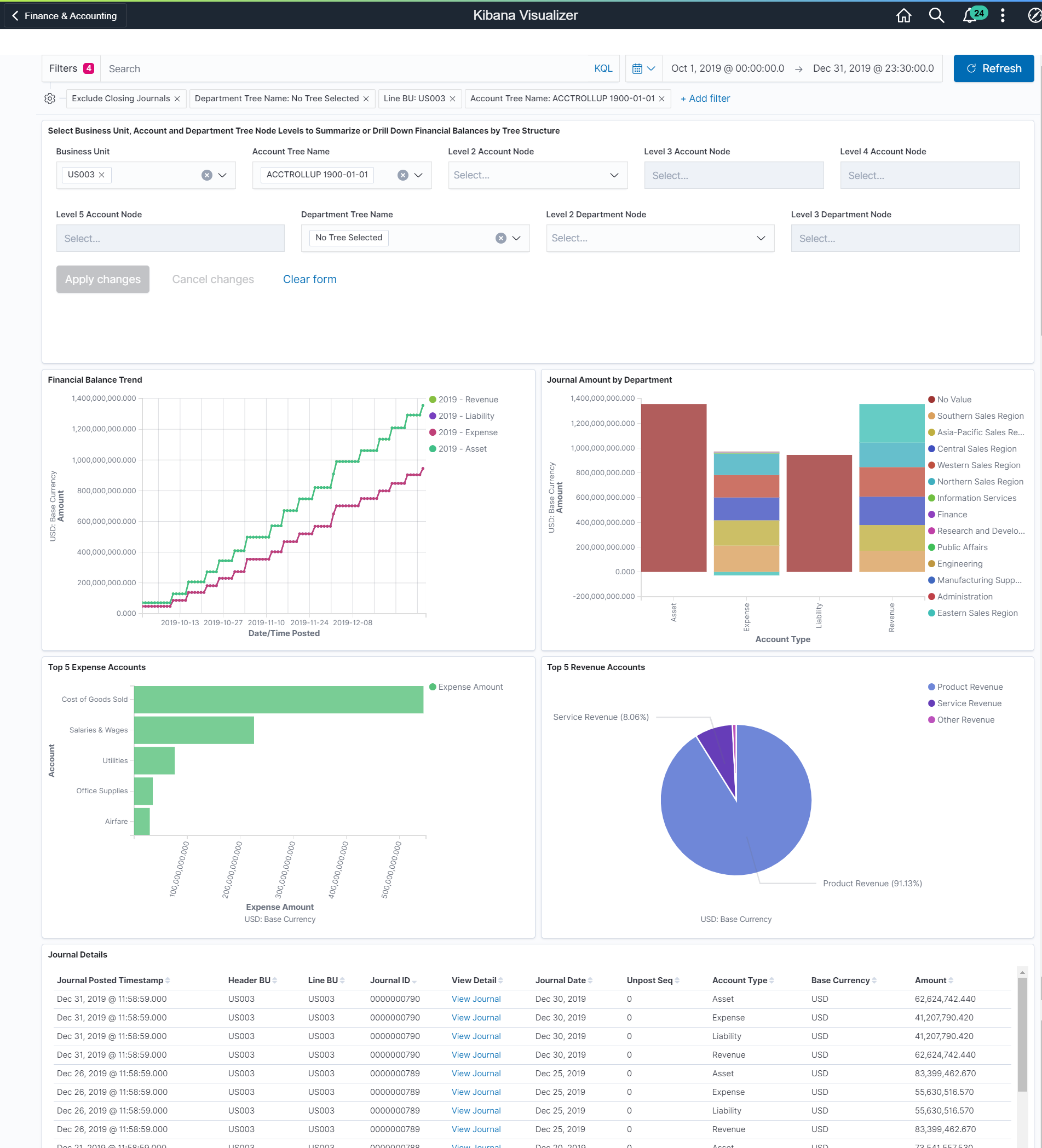
This dashboard provides a good visual understanding of trends and patterns for financial transactions and top performing accounts. Data can be drilled down to 5 levels of the account tree and 3 levels of the department tree You must run the Tree Flattener process (OI_TFLT) and setup the reporting tree using the Insights Reporting Tree Configuration Page, prior to indexing the journals to select ChartField tree structures on the Insights dashboard, as this process is used for the data drill down. See Tree Flattener Request Page for more information.
Data can be viewed on this dashboard by selecting the journal posted date/time. By default, the dashboard selects journals that are posted or unposted for the last 12 months. Use the Timepicker icon to change this to another journal posted timeframe. This dashboard only includes data for actual journals (Journal Generator default ledger group), Posted and Unposted journals, and excludes statistical journal entries. By default, the dashboard excludes closing journals that with an accounting period of 0 and 999.
Field or Control |
Description |
|---|---|
Filters |
Select Business Unit as a filter to render the dashboard based on a single base currency. Select Account Tree Name and Department Tree Name as filters to drill into the transactions based on tree structure. |
Following visualizations are part of this dashboard:
Financial Balance Trend - Provides activity trend for the journals posted over time by Account Type.
Journal Amount by Department - Provides details about the journals posted by Account Type and Department ChartField.
Top 5 Expense Accounts - Provides details about the top performing Expense accounts in the selected time range.
Top 5 Revenue Accounts - Provides details about the top performing Revenue accounts in the selected time range.
Journal Details - Displays the Journal details in tabular format and allows user to drill down transactions to the Journal Entry page.
Use the Financial Performance Analysis dashboard to analyze the financial performance of a business on yearly basis.
Navigation:
Select the Financial Performance Analysis tile.
This example illustrates the fields and controls on the Financial Performance Analysis Dashboard. You can find definitions for the fields and controls later on this page.

You can select base currency, ledger, or business unit to compare the financial balances among the different fiscal years selected. You can also select an account and department tree structure for comparison. You can drill into transactions up to 5 levels of account tree and 3 levels of the department tree node for further analysis.
This dashboard does not use a date/time range to filter the data. You can use the controls provided in the dashboard to slice and dice the ledger index. You must run the Tree Flattener process (OI_TFLT) and setup the reporting tree using the Insights Reporting Tree Configuration Page, prior to indexing the ledger to select ChartField Tree Structures on the Insights dashboard, as this process is used to enable the data drill down. See Tree Flattener Request Page for more information. Statistical journal entries are excluded from the index and closing journals are filtered in the dashboard.
Field or Control |
Description |
|---|---|
Filters |
Select Base Currency to render the dashboard for a single currency. Select Account Tree Name and Department Tree Name as filters to drill down the transactions based on tree structure. |
Following visualizations are part of this dashboard:
YOY Comparison - Provides Year Over Year performance comparison for the selected Account Type and Fiscal Year.
Top 5 Expense Accounts - Provides details about the top performing expense accounts in each fiscal year selected.
Top 5 Revenue Accounts - Provides details about the top performing revenue accounts in each fiscal year selected.
Ledger Details - Displays details about the ledger data selected on the dashboard in tabular format.
Use the My Budget dashboard to analyze departmental expense budgets.
Navigation:
Select the My Budget tile
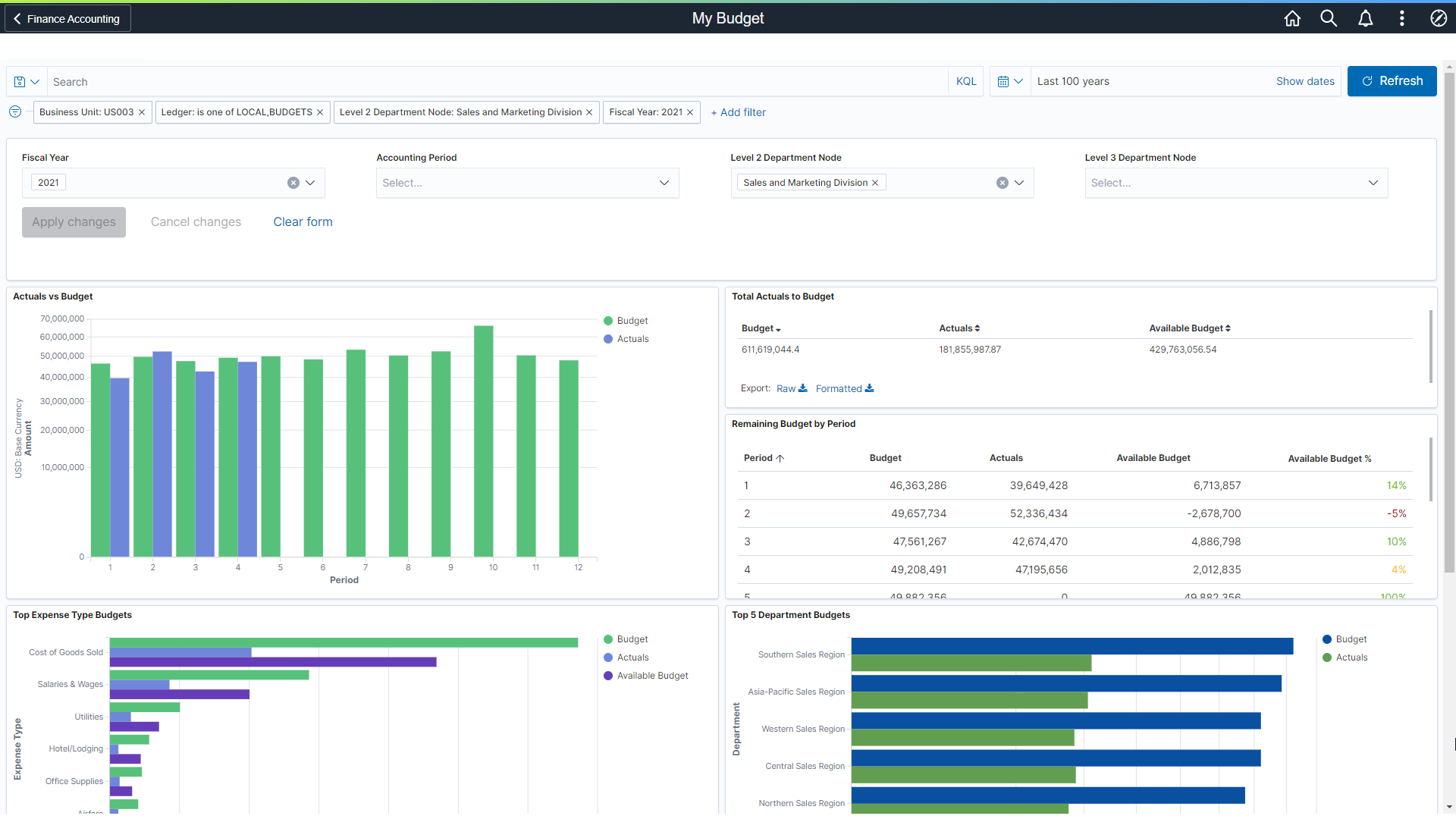
This example illustrates the fields and controls on the My Budget Dashboard (1 of 2).
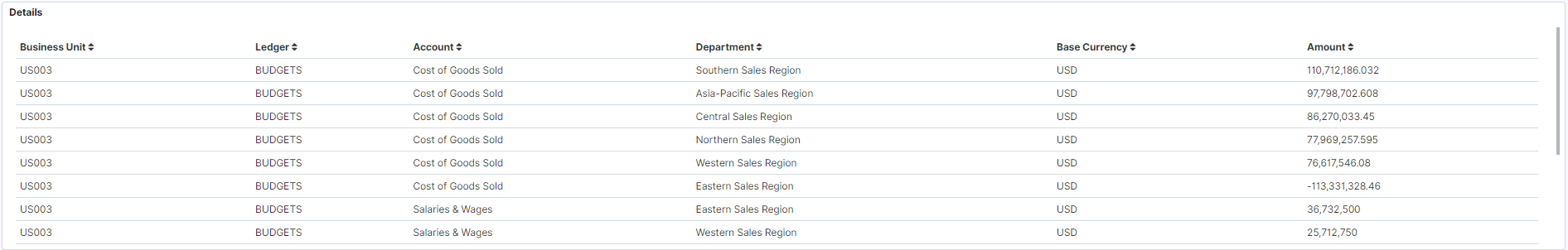
This example illustrates the fields and controls on the My Budget Dashboard - Details (2 of 2).
The My Budget dashboard focuses on expense budgets for a specific user. The intended user for this dashboard is someone who is responsible for departmental budgets. Use the Insights Preferences Page to create filter defaults for a specific user.
This dashboard does not use a date and time range to filter the data. Use the Tree Flattener Request Page to run the Tree Flattener process and set up reporting tree information using the Insights Reporting Tree Configuration Page.
Budget, actual expense, and available budget are displayed. Use the Fiscal Year and Accounting Period filters to determine a time period.
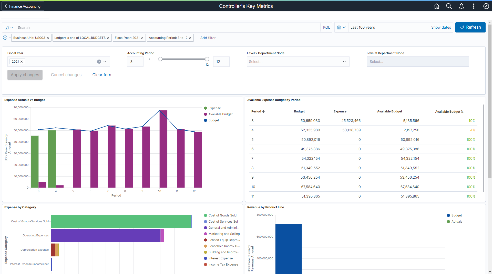
Use the Controller's Key Metrics dashboard to analyze departmental expense budgets against revenue.
Navigation:
Select the Controller's Key Metrics tile.
This example illustrates the fields and controls on the Controller's Key Metrics Dashboard (1 of 2).
This example illustrates the fields and controls on the Controller's Key Metrics Dashboard (2 of 2).
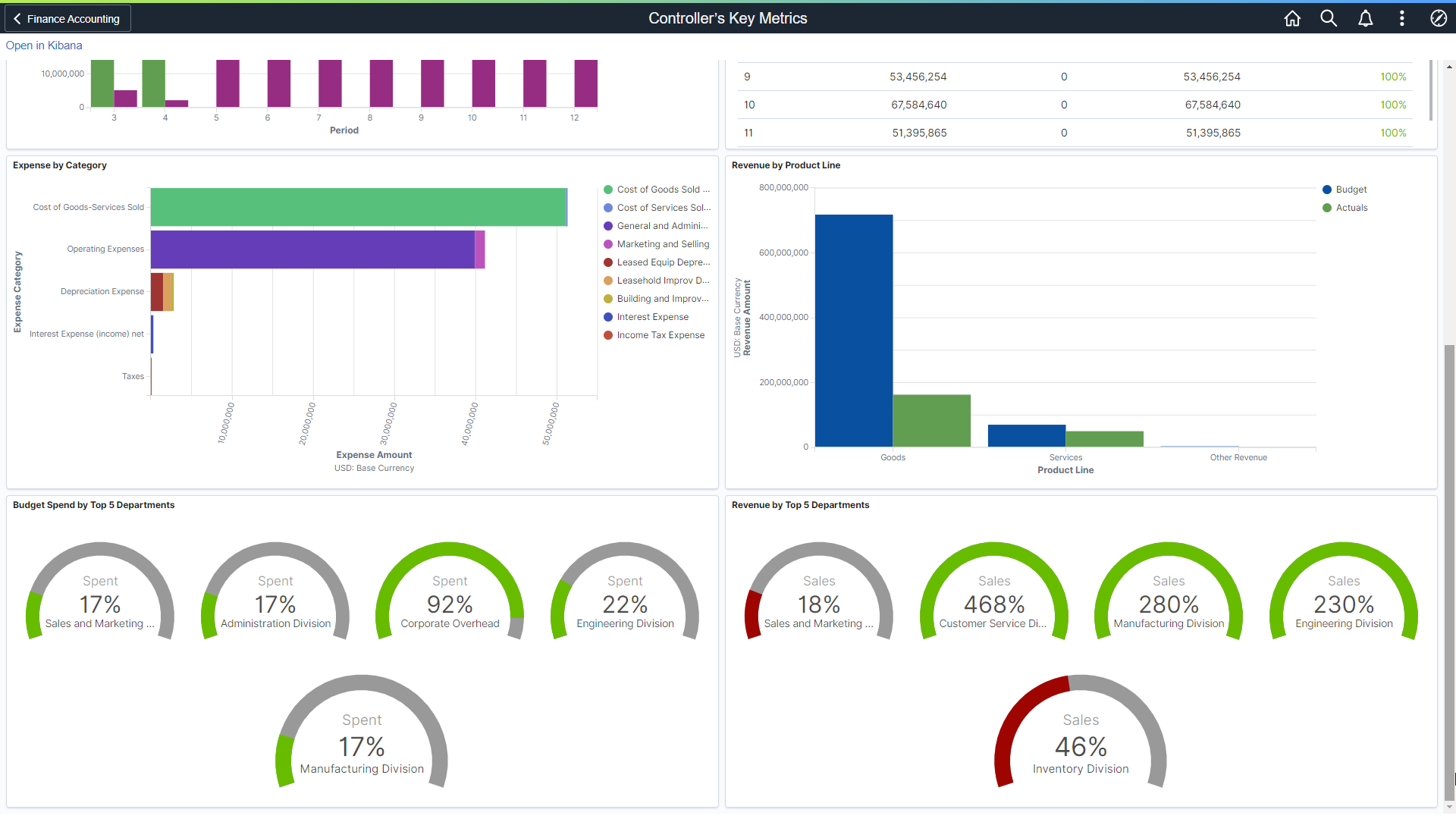
The Controller's Key Metrics dashboard focuses on expense budgets compared to revenue. The intended user for this dashboard is a high-level financial manager, director, or controller who doesn't need to see the detail. Use the Insights Preferences Page to create filter defaults for a specific user.
This dashboard does not use a date and time range to filter the data. Use the Tree Flattener Request Page to run the Tree Flattener process and set up reporting tree information using the Insights Reporting Tree Configuration Page.
Budget, actual expense, and revenue are displayed. Use the Fiscal Year and Accounting Period filters to determine a time period.
The threshold dials in the Budget Spend by Top 5 Departments and Revenue by Top 5 Departments sections compares revenue to budget. The yellow and red colors are intended to draw your attention to potential or existing issues. The colors of the dials indicate:
Budget Spend:
Green < 95%
Yellow >= 95%
Red >= 100%
Revenue
Green >= 99%
Yellow >= 95%
Red < 95%