Using PeopleSoft Classic Plus
PeopleSoft Classic Plus has replaced the traditional PeopleSoft Classic User Interface as the standard user interface for PeopleSoft applications. PeopleSoft Fluid, introduced in PeopleTools 8.54, has co-existed with the traditional classic user interface in all PeopleSoft applications and will continue to do so. The introduction of Classic Plus is a step toward unifying the look of all pages, the "classic plus" feature allows reworked classic components to be displayed in a Fluid-like manner.
Beginning with PeopleTools 8.56, the pages contained within specific PeopleTools classic components have been reworked and delivered with a "classic plus" setting enabled. Most PeopleSoft pages have been reworked and are delivered with a fluid-like style. This Fluid-like style, for Classic pages, is determined at the PeopleTools level, on the Branding System Options page.
Note: The page controls on Classic plus pages resemble the page controls on Fluid pages. However, because these components and pages remain as classic definition, certain aspects of the PeopleSoft Fluid User Interface experience are absent, such as dynamic responsive rendering across all supported device types.
Note: Oracle highly recommends that you adopt the Classic Plus styling across your organization's applications. The styling combines the styling of PeopleSoft Fluid User Interface and brings continuity across applications. If you choose to stay on the Classic style, you may end up having to review and customize delivered pages for future images.
If you have not yet enabled the PeopleSoft Fluid UI, you may want to wait to implement Classic Plus.
If you have already adopted the PeopleSoft Fluid UI we highly recommend you adopt the Classic Plus styling as soon as possible to further enhance your user experience with the new styling approach for all your PeopleSoft components and pages
|
Page Name |
Definition Name |
Usage |
|---|---|---|
|
EOCP_SETUP |
To enable or disable the Classic Plus user interface for Classic components. You can also view a list of the application components that are delivered as Classic Plus. |
The Classic Plus user interface is enabled for most Classic components when you take PeopleTools 8.56 and FSCM Image 26. However, PeopleSoft recommends PeopleTools 8.56.05 for the Classic Plus feature.
A Classic Plus Setup page is available to review the delivered products and components for Classic Plus. Some of the components also include recommendations regarding screen resolution and other factors that may guide you in adopting Classic Plus.
The Classic Plus Setup page is available for system administrators to view a list of application components delivered as Classic Plus. This page can also be used to enable or disable the Classic Plus user interface for multiple application components.
When the “Fluid like theme for Classic” theme type is enabled on the Branding System Options page, the pages in all components that have the component level theme type enabled are displayed with fluid-like styling, rather than the standard classic pages. These components include any component delivered with PeopleSoft applications that have also been reworked.
Enabling Classic Plus
To view pages in the Classic Plus theme, you must enabled Classic Plus at two levels:
Level One: PeopleTools level and is performed on the Branding System Options page.
This level must be ON if you want to if you want to enable or disable the Classic Plus theme at the component level.
Level Two: Component level and is performed on the Classic Plus Setup Page.
For more information on Classic Plus components and branding options, see the following PeopleTools documentation:
PeopleTools: PeopleTools Components Delivered as Classic Plus
PeopleTools: Configuring Branding System Options
Use the Classic Plus Setup page (EOCP_SETUP) to enable or disable the Classic Plus user interface for FSMC components. You can also view a list of the application components that are delivered as Classic Plus.
Navigation:
This example illustrates the fields and controls on the Classic Plus Setup page
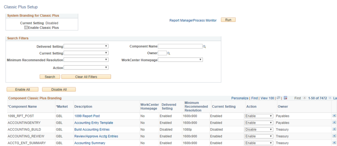
System Branding for Classic Plus
Field or Control |
Description |
|---|---|
Current Setting |
Displays the current Classic Plus configuration status at the system level (as given in the PeopleTools - Branding System Options page). If System Classic Plus branding is enabled, then the current setting is displayed as Enabled. If system Classic Plus branding is not enabled, then the status is displayed as Disabled. |
Disable Classic Plus / Enable Classic Plus |
Select to disable or enable Classic Plus at the system level. Note: This field is displayed based on the current system settings. For example, if the Classic Plus feature is enabled at system level, the field appears as ‘Disable Classic Plus' . |
Component Search Filters
Use this section to narrow your search results that appear in the Component Classic Plus Branding section.
Field or Control |
Description |
|---|---|
Delivered Setting |
Select Enabled to have the system display all the delivered Classic Plus pages. |
Component Name |
Select the component to display in the component list. |
Current Setting |
Select the current setting (Enabled or Disabled) to filter the component list. |
Owner |
Select the PeopleSoft application owner to filter the component list. For example: General Ledger, Expenses, Purchasing, and so on. |
Minimum Recommended Resolution |
Select a resolution to filter the component list. |
WorkCenter Homepage |
Select Yes or No to filter the component list. If you select Yes, then the component list displays components that have a WorkCenter landing page such as the AM WorkCenter, Receivables WorkCenter, Expenses WorkCenter, and so on. |
Action |
Select Enable or Disable to filter the component list. |
Enable and Disable All
Field or Control |
Description |
|---|---|
Enable All |
Click to enable the Classic Plus user interface for all components listed in the Component Classic Plus Branding section. After clicking this button, all values in the Action column of the Component Classic Plus Branding section are set to Enable. You must then click the Run button to process the changes made to the Action column. |
Disable All |
Click to disable the Classic Plus user interface for all components listed in the Component Classic Plus Branding section. After clicking this button, all values in the Action column of the Component Classic Plus Branding section are set to Disable. You must then click the Run button to process the changes made to the Action column. |
Component Classic Plus Branding
Field or Control |
Description |
|---|---|
|
Click to access grid actions such as:
|
|
Click to open a search prompt window. |
Description (link) |
Click the link to access the component. |
WorkCenter Homepage |
Select one of these options:
|
Minimum Recommended Resolution |
Select an option from these values:
When you manually add a row, the default value is Not Applicable. |
Action |
Select Enable or Disable to perform this action when you click the Run button. You can change the Current Setting value for one specific component by changing the value in the Action field, for that specific row. Then click the Run button to process the change. The process with change the setting for that component only. If you perform multiple searches and change the action for individual components, be sure to click the Save button before you click the Run button. This will save all components selected for each search. |
|
Click to add a new row to the grid. When you add a row, these field are open for you to complete:
When a row is added using this button, the system displays a delete row button to the right. |
 (grid action menu)
 (search)
 (add)
(add)