Using Control Charts
Control charts display standard and nonstandard statistical process control (SPC) control charts. The default control charts provided with the installation of Quality are the industrial-standard charts that are documented in most Quality references, and are categorized by variable and attribute type.
This table shows the use of variable data-control charts:
|
Equation |
Statistic |
|---|---|


where: 

|
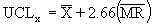
The 
/R chart, or average and range chart, is the most commonly used chart in SPC. Each point (k) on the 
chart consists of an average 
of individual 
measurements within a subgroup of a constant sample size (n). The R chart represents the range (R), which is the maximum, individual measurement in the subgroup, minus the minimum. |


where: 

|
The 
/s chart, or the average and standard deviation chart, is a variation of the 
chart typically used with subgroup sizes of greater than seven. Each point 
on the 
chart consists of an average 
of individual 
measurements within a subgroup of a constant sample size 
The s chart represents the standard deviation 
.within the subgroup of individual measurement. |


where: 

|
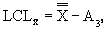
The X/MR chart, or individual and moving range chart, is typically used when measurements can't easily be formed into subgroups. Measurements may be expensive or destructive, or time periods between samples may be excessive. Each point
on the 
chart consists of an individual 
measurement. The MR chart represents the difference between the previous point and the current point (absolute value). |
This table shows the use of attribute data-control charts:
|
Equation |
Statistic |
|---|---|


where: 

|
The p chart displays the proportion of nonconforming items in a group of items being inspected. The plotted point (p) is the fraction of defective items found for each sample (n). The sample size (n) need not be constant; however, sample sizes that vary more than 25 percent may provide misleading results (as documented in most SPC references). |

where: 
|
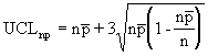
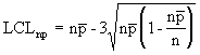
The np chart displays the nonconforming items in a group of items being inspected. It is similar to the p chart, but requires a constant sample size (n). The plotted point (np) is the number of defective items found for each sample (n). |


where: 
|
The c chart displays the number of defects found in a group of items being inspected. It requires a constant sample size (n). The plotted point (c) is the number of defects found for each sample (n). |


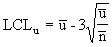
where: 
|
The u chart displays the number of defects found in a unit. Each unit is equal to the sample size, which may vary from group to group. This chart is similar to the c chart, but doesn't require a constant sample size (n). The plotted point (u) is the number of defects per unit (sometimes denoted as DPU). |