Designing Forms
This section describes designing forms using the Form Design Wizard component (FORM_DESIGN_WIZARD).
Note: Access to the Form Design Wizard component is limited to form designers and form administrators. In addition, only form owners can modify existing forms.
|
Page Name |
Definition Name |
Usage |
|---|---|---|
|
FORM_DSN_WZR_MAIN |
Define a form's basic information. |
|
|
FORM_DSN_WZR_INST |
Provide instructions for users that describe how to complete and submit a form. |
|
|
FORM_DSN_WZR_FLDS |
Define the fields that appear on the form. |
|
|
FORM_L_FLD_SEC |
Define additional requirements for fields. |
|
|
FORM_DSN_WZR_ATCH |
Associate file attachments with a form. |
|
|
FORM_DSN_WZR_PRTL |
Specify the menu location for a form. |
|
|
FORM_DSN_WZR_AW |
Assign the approval workflow required for a form. |
|
|
FORM_DSN_WZR_DONE |
Preview and activate or redesign a form. |
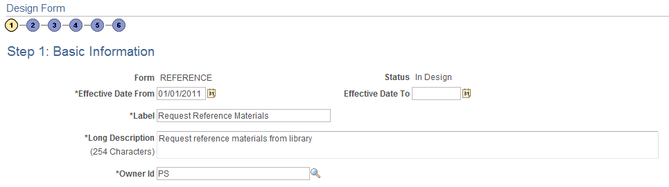
Use the Design Form Wizard - Step 1: Basic Information page (FORM_DSN_WZR_MAIN) to define a form's basic information.
Navigation:
This example illustrates the fields and controls on the Design Form Wizard - Step 1: Basic Information page. You can find definitions for the fields and controls later on this page.
Field or Control |
Description |
|---|---|
Form |
The unique identifier for the form. You specify this ID when you add a new form. |
Status |
Lists the current status of the form. The value for this field is automatically assigned. Values are:
|
Effective Date From |
Enter the date the form is first available for use. |
Effective Date To |
Enter the date the form expires. Leave this field blank if you intend to use the form indefinitely. |
Label |
Enter a label for the menu item that users will select to access the form. Names can contain only alphanumeric and underscore characters. |
Long Description |
Enter a description for the form. The description appears below the form's label when users access the published form. |
Owner Id |
Enter the User ID of the person who is the responsible for the form. Only this person can modify the form design. |
Use the Design Form Wizard - Step 2: Instructions page (FORM_DSN_WZR_INST) to provide instructions for users that describe how to complete and submit a form.
Navigation:
Click Next on the Design Form Wizard - Step 1: Basic Information page of the Forms Design Wizard.
This example illustrates the fields and controls on the Design Form Wizard - Step 2: Instructions page. You can find definitions for the fields and controls later on this page.
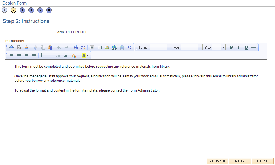
Enter instructions for completing the form using the HTML editor. Use the toolbar buttons to copy and paste, format text, and insert graphics or links.
Use the Design Form Wizard - Step 3: Form Fields page (FORM_DSN_WZR_FLDS) to define the fields that appear on the form.
Navigation:
Click Next on the Design Form Wizard - Step 2: Instructions page of the Forms Design Wizard.
This example illustrates the fields and controls on the Design Form Wizard - Step 3: Form Fields page. You can find definitions for the fields and controls later on this page.
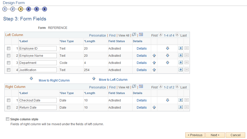
Insert rows within the Left Column and Right Column grids to define the fields that appear on the left and right columns of the form.
For each row, specify values for the following parameters to define the requirements for that field.
Field or Control |
Description |
|---|---|
Label |
Enter the label to use for this field. |
Use Type |
Select the field type, and field length, if required (depends on the Use Type). Values are: Code: Use to define a code field that allows the form user to select a response from a list of codes. Date: Use for dates. Number: Use for numeric entries (only positive values are allowed). Prompt: Defines a prompt field that allows the user to select data from existing PeopleSoft database tables. Section: Use to separate a form into sections. The section can include a header with instructive text, and an HTML editor is provided for you to define the section. Signed: Use for signed numeric entries (values can be positive or negative). Text: Use for text entries. Time: Use for time entries. Y/N: Use for yes/no responses. |
Length |
Select the field length. You can modify this field only for Number, Prompt, Signed, and Text fields; the remaining field types use a preset length. The syntax for numeric fields is X.Y, where the value before the decimal (X) is the number of integer digits allowed, the value after the decimal (Y) is the number of decimal places allowed. |
Field Status |
Indicates the status of the field, either Activated or In Design. |
Details |
Click to access the Form Fields Details page, where you define additional requirements for the field, including whether the field is required, and edits for the field when a user completes the form. |
|
Click the arrow icons to reposition a field. |
Move to Right Column |
Click to move selected fields to the right column. |
Move to Left Column |
Click to move selected fields to the left column. |
Single column style |
Select to create a form that contains a single column. Any fields that are defined in the right column will appear under the left column fields when you view the form. |
 and
and 
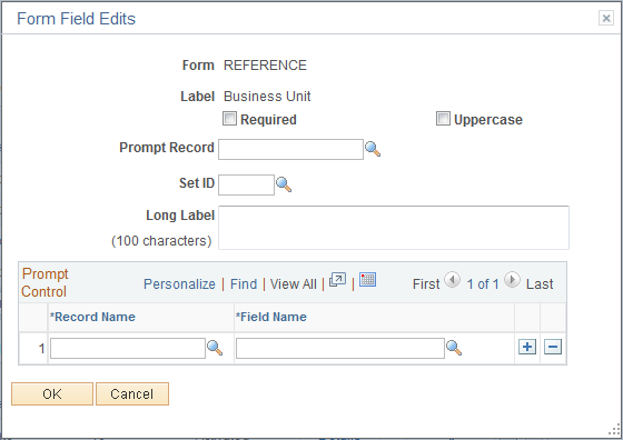
Use the Form Field Edits page (FORM_L_FLD_SEC) to define additional requirements for fields.
Navigation:
Click the Details link for a field on the Design Form Wizard - Step 3: Form Fields page.
This example illustrates the fields and controls on the Form Field Edits page example for a prompt field. You can find definitions for the fields and controls later on this page.
This example illustrates the fields and controls on the Form Field Edits page example for a code field. You can find definitions for the fields and controls later on this page.
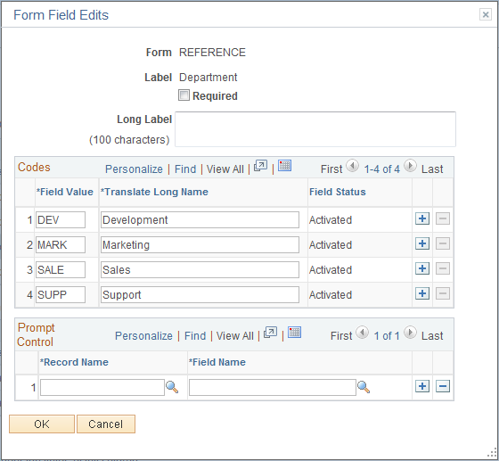
The fields that appear on this page differ depending on the field's Use Type. The examples provided show how the page appears for a Prompt field and a Code field. The following information lists all of the possible fields that can appear on this page.
Field or Control |
Description |
|---|---|
Required |
Select to require that a user enter a value in this field in order to save the form. |
Uppercase (available only when the Use Type is set to Prompt or Text). |
Select to have the system convert the field value to uppercase when the form is saved. Available for only Prompt and Text fields. Use this option for code values, such as department ID, for which it does not matter whether the user enters the value in uppercase or lowercase. |
Long Label |
Enter up to 100 characters as an alternate label for this field. If you enter a long label, then it will be appear on the form instead of the short label (the value specified in the Label field on the Design Form - Step 3: Form Fields page). |
Prompt Record and SetID (available only when the Use Type is set to Prompt) |
Select the record that contains the values to use for this field. For SetID based tables, specify the SetID from which to retrieve the values. To complete this field type, a form user can select one of the values from the prompt list, or they can enter a value by typing it into the field. The records that are available for selection are established by form administrators using the Define Prompt Records page. |
Prompt Control (available for all Use Types except Section) |
To use the value that a form user enters for this field as the key by which to filter the list of available values in one or more prompt fields elsewhere on this form, insert rows in the Prompt Control grid, and select the Record Name and Field Name for each of the form fields that will reference this field. For example, to limit the Project IDs available in a prompt field to only those that are associated with the business unit that the user has already selected while completing the form, when designing the form you would:
The records that are available for selection are established by form administrators using the Define Prompt Records page. |
Field Value and Translate Long Name (appear only when the Use Type is set to Code) |
Use to define the codes and their associated translate values that are valid for this field. The translate values appear in the drop-down list when the user completes the field. |
Use the Design Form Wizard - Step 4: Attachment Templates page (FORM_DSN_WZR_ATCH) to associate file attachments with a form.
Navigation:
Click Next on the Design Form Wizard - Step 3: Form Fields page of the Forms Design Wizard.
This example illustrates the fields and controls on the Design Form Wizard - Step 4: Attachment Templates page. You can find definitions for the fields and controls later on this page.
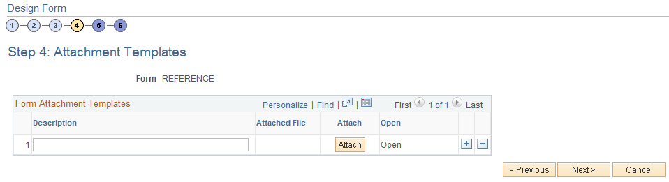
Field or Control |
Description |
|---|---|
Attach |
Click to attach a file. In the window that appears, click the Browse button to navigate to and select the file, then click the Upload button. |
Description |
Enter a description for the file. If you leave this blank, the file name is used. |
Attached File |
Displays the file name of the attached file. |
Open |
Click to open the attached file. |
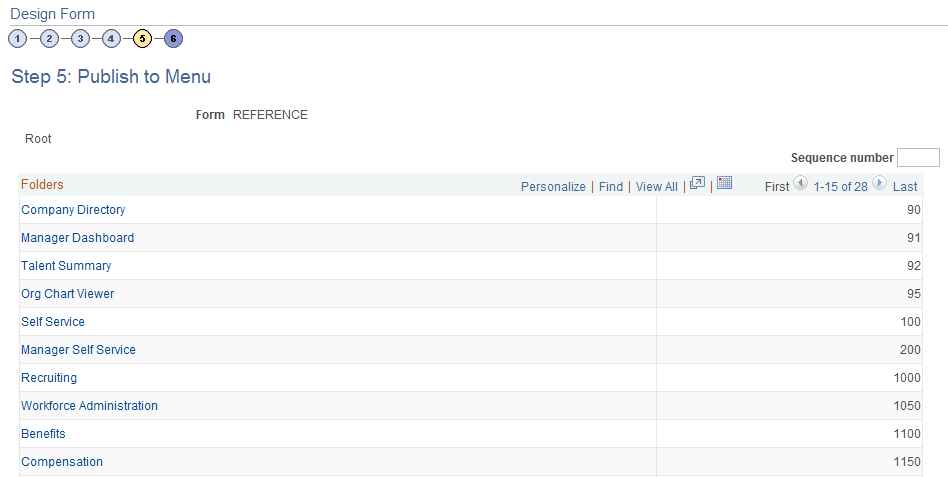
Use the Design Form - Step 5: Publish to Menu page (FORM_DSN_WZR_PRTL) to specify the menu location for a form.
Navigation:
Click Next on the Design Form Wizard - Step 4: Attachment Templates page of the Forms Design Wizard.
This example illustrates the fields and controls on the Design Form Wizard - Step 5: Publish to Menu page (1 of 2). You can find definitions for the fields and controls later on this page.
This example illustrates the fields and controls on the Design Form - Step 5: Publish to Menu page (2 of 2). You can find definitions for the fields and controls later on this page.
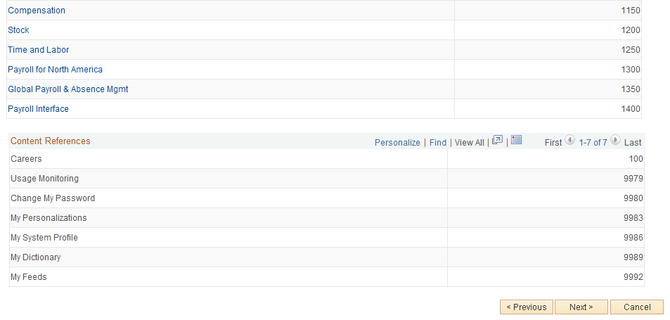
The menu hierarchy appears near the top of the page, below the form name; the highest level, Root, is equivalent to Main Menu in the menu hierarchy. Click the links to navigate to the level of the menu hierarchy in which you want the form to appear. Then, enter a value in the Sequence number to control the order in which it appears in the menu. In the example shown, the form will appear as the last item under Main Menu, Manager Self-Service, along with Review Forecasted Time and Travel and Expense Center.
Field or Control |
Description |
|---|---|
Sequence number |
Enter a value to specify the order within the menu that the form will appear. Items appear in ascending order. |
Folders |
This grid lists the folders at the currently selected menu level, and their associated sequence number. Click a folder to navigate to that folder level of the menu hierarchy. |
Content References |
This grid lists the available components at the selected level of the menu hierarchy and their associated sequence number. This is the level at which the form will appear in the menu. Note: Only the components that your assigned role permits you to access appear in the grid. |
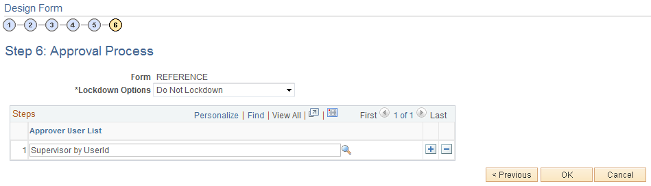
Use the Design Form Wizard - Step 6: Approval Process page (FORM_DSN_WZR_AW) to assign the approval workflow required for a form.
Navigation:
Click Next on the Design Form Wizard - Step 5: Publish to Menu page of the Forms Design Wizard.
This example illustrates the fields and controls on the Design Form Wizard - Step 6: Approval Process page. You can find definitions for the fields and controls later on this page.
Field or Control |
Description |
|---|---|
Lockdown Options |
Specify if a form instance can be modified after it has been submitted, and under what conditions. Values are:
Note: If a form is integrated with PeopleSoft applications, the form cannot be modified after it has been posted to PeopleSoft transactional tables. |
Approver User List |
Insert rows and select the Approver User Lists required for this form. Approver paths must be sequential, branching is not supported. |
Approver user lists are established using the User List Definition page ().
See Defining Users for Approval Framework
After you have specified all the required Approver User Lists, click OK. The system automatically creates the approval Process Definition ID using the same name as the form name.
The predefined form approval configuration supports the following notification events: Route for Approval, Route for Review, On Final Approval and On Final Denial.
Note: Oracle PeopleSoft delivers Notification Composer framework to manage the setup and administration of all notifications in one central location. Once you have adopted the Notification Composer feature, you must use it to create new notifications and manage your existing notifications. For more information about Notification Composer, see Understanding Notification Composer.
Use the Design Form Wizard: Complete page (FORM_DSN_WZR_DONE) to preview and activate or redesign a form.
Navigation:
Click OK on the Design Form Wizard - Step 6: Approval Process page.
This example illustrates the fields and controls on the Design Form Wizard: Complete page. You can find definitions for the fields and controls later on this page.
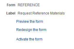
This page enables you to preview your form, modify it, if needed, and activate it when you've finalized the design by using the following links:
Field or Control |
Description |
|---|---|
Preview the form |
Click to preview the form. A preview of the designed form appears, as the user would see it when they complete the form. Navigate within the form to preview each page, and interact with the form fields to test them. Note: Enable Runtime" is necessary for ‘Preview the form’. |
Redesign the form |
Click to return to the Form Design Wizard component, where you can continue designing the form. |
Activate the form |
Click to activate and publish the form. A confirmation message appears. The form status updates to Activated. |