Analyzing Payables Using PeopleSoft Insights
PeopleSoft Payables delivers the following Insights dashboards:
Early Detection and Monitoring.
Trend Analysis.
AP Payment Metrics.
Use these pages to analyze Payables using PeopleSoft Insights dashboards.
|
Page Name |
Definition Name |
Usage |
|---|---|---|
|
To view the liability and payment exposures routed through vouchers. |
||
|
To view the liability exposure across financial periods by currency as well as the activity volume for the lines of business. |
||
|
To view the payment exposure by currency, term, and various payment methods for the lines of business. |
Use the Early Detection and Monitoring tile to access the Insights visualizer page to view the liability and payment exposures routed through vouchers.
Navigation:
This tile can be placed on any PeopleSoft Fluid Home page. For additional information about how to add a tile to a PeopleSoft Fluid Home page, see PeopleTools: Application User’s Guide, “Working With PeopleSoft Fluid User Interface”, Working With Fluid Homepages, Managing Tiles, Adding Tiles to a Fluid Homepage.
This example illustrates the fields and controls on the Early Detection and Monitoring tile.
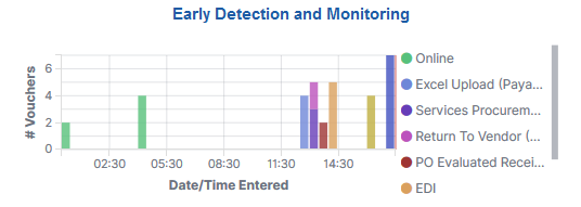
The Early Detection and Monitoring visualization helps you to view the liability and payment exposures that came in through vouchers created by batch processes and also that were manually entered. This dashboard is extremely time-sensitive. You must run incremental updates on the search index to synchronize OpenSearch with voucher information prior to your analysis.
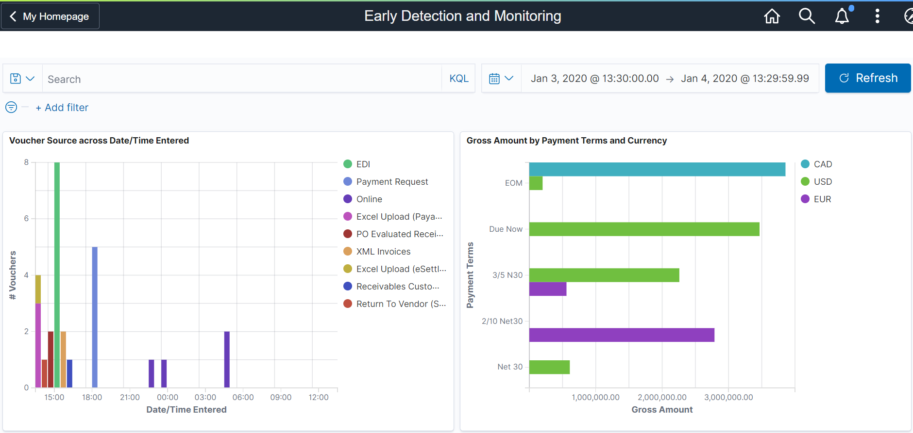
This example illustrates the fields and controls on the Early Detection and Monitoring - Visualizer page (1 of 2). You can find definitions for the fields and controls later on this page.
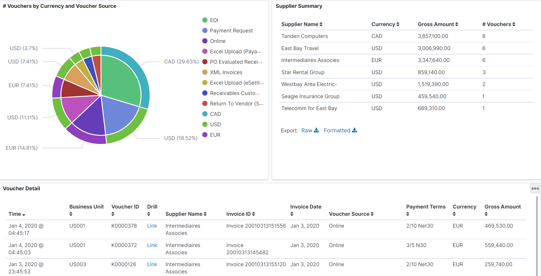
This example illustrates the fields and controls on the Early Detection and Monitoring - Visualizer page (2 of 2). You can find definitions for the fields and controls later on this page.
To see the results on the dashboard, select a time to view the data based on a time range. Incremental updates must be run on the search index so that the vouchers are added to the OpenSearch index, and they will show up on the Insights dashboards.
The Insights visualizer for Early Detection and Monitoring has the following details:
Field or Control |
Description |
|---|---|
Voucher Source across Date/Time Entered |
Provides the data for the vouchers entered by source and time period. |
Gross Amount by Payment Terms and Currency |
Provides the details about the vouchers booked by payment terms and currency. |
# Vouchers by Currency and Voucher Source |
Provides the details about the vouchers processed by source and currency. |
Supplier Summary |
Provides the details about the vouchers processed by Supplier, Currency, Amount and Count. |
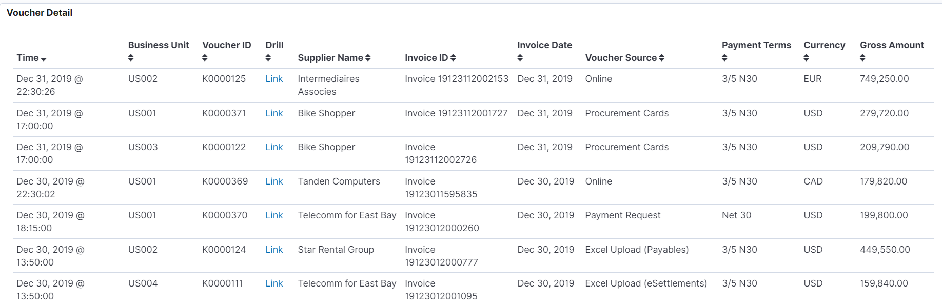
Voucher Detail |
Displays a grid with the voucher level details for all the vouchers in consideration. |
You can perform the following actions on the Early Detection and Monitoring - Visualizer page:
Apply a filter to the data (like currency code), or apply multiple filters (like currency code and payment terms).
Change the date range either using the Time picker or by selecting dates and times in a date histogram.
Drill from the Saved Search (on the grid) to view the voucher in the Document Status page.
View the visualization full screen.
Use the Trend Analysis tile to access the Insights visualizer page to view the liability exposure across financial periods by currency as well as the activity volume for the lines of business.
Navigation:
This tile can be placed on any PeopleSoft Fluid Home page. For additional information about how to add a tile to a PeopleSoft Fluid Home page, see PeopleTools: Application User’s Guide, “Working With PeopleSoft Fluid User Interface”, Working With Fluid Homepages, Managing Tiles, Adding Tiles to a Fluid Homepage.
This example illustrates the fields and controls on the Trend Analysis Tile.
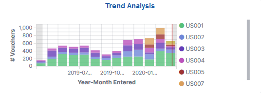
When you select the Trend Analysis tile, you can view the Trend Analysis dashboard on the Insights Visualizer page. The Trend Analysis dashboard is saved with a timeframe of Last 12 months. You can change the default timeframe of Last 12 Months to any other time frame by using the Timepicker icon.
This example illustrates the fields and controls on the Trend Analysis - Visualizer page (1 of 2). You can find definitions for the fields and controls later on this page.
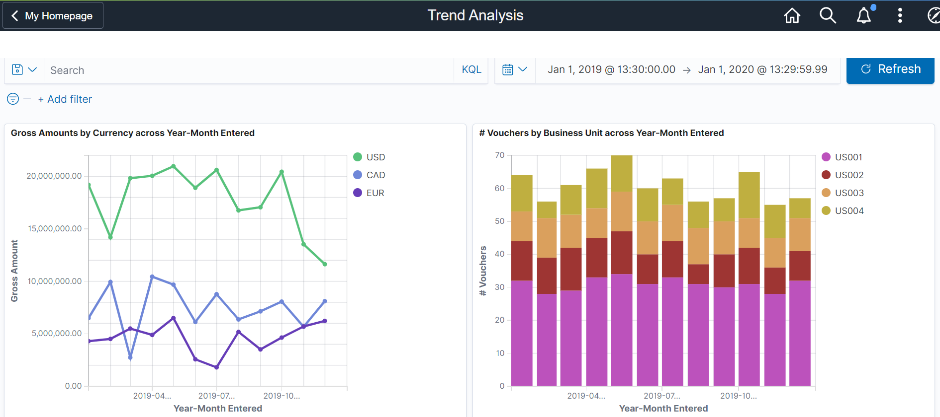
This example illustrates the fields and controls on the Trend Analysis - Visualizer page (2 of 2). You can find definitions for the fields and controls later on this page.
The Insights Visualizer for Trend Analysis has the following details:
Field or Control |
Description |
|---|---|
Gross Amounts by Currency across Year-Month Entered |
Provides an activity trend for the vouchers entered over financial time periods, and the Gross Amount by currency. |
# Vouchers by Business Unit across Year-Month Entered |
Provides the details about the number of vouchers entered by lines of business over a time period of months and years. |
Voucher Detail |
Displays a grid with the voucher level details for all the vouchers in consideration. |
Use the AP Payment Metrics tile to access the Insights visualizer to view the payment exposure by currency, term, and various payment methods for the lines of business.
Navigation:
This tile can be placed on any PeopleSoft Fluid Home page. For additional information about how to add a tile to a PeopleSoft Fluid Home page, see PeopleTools: Application User’s Guide, “Working With PeopleSoft Fluid User Interface”, Working With Fluid Homepages, Managing Tiles, Adding Tiles to a Fluid Homepage.
This example illustrates the fields and controls on the AP Payment Metrics Tile.
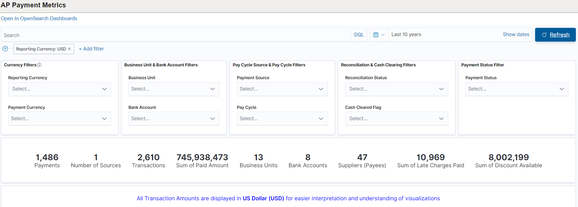
When you select the AP Payment Metrics tile, you can view the AP Payment Metrics dashboard. The AP Payment Metrics dashboard is saved with a time frame of Last two years. You can change the default time frame to any other time frame by using the Timepicker icon.
The visualizations and data displayed on the AP Payment Metrics dashboard can be filtered based on the delivered AP Payment Metrics Filters, such as Business Unit, Bank Account, Payment Source, Pay Cycle, Payment Status, Reconciliation Status, Reporting Currency and Payment Currency. Multiple filter values can be selected.
Data can also be filtered by selecting any categorical data within a visualization (for example, an individual bar in a bar graph). In addition, you can search for available filters or add additional filters.
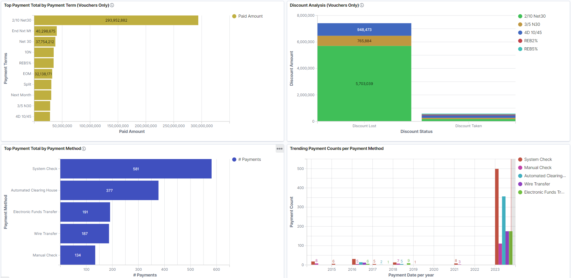
This example illustrates the fields and controls on the AP Payment Metrics page (1 of 5). You can find definitions for the fields and controls later on this page.
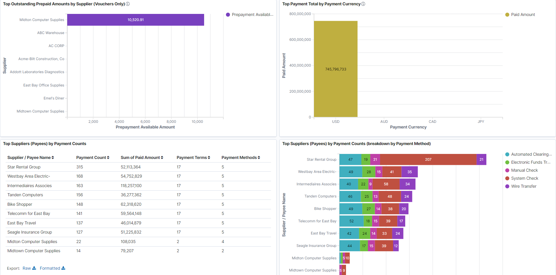
This example illustrates the fields and controls on the AP Payment Metrics page (2 of 5). You can find definitions for the fields and controls later on this page.
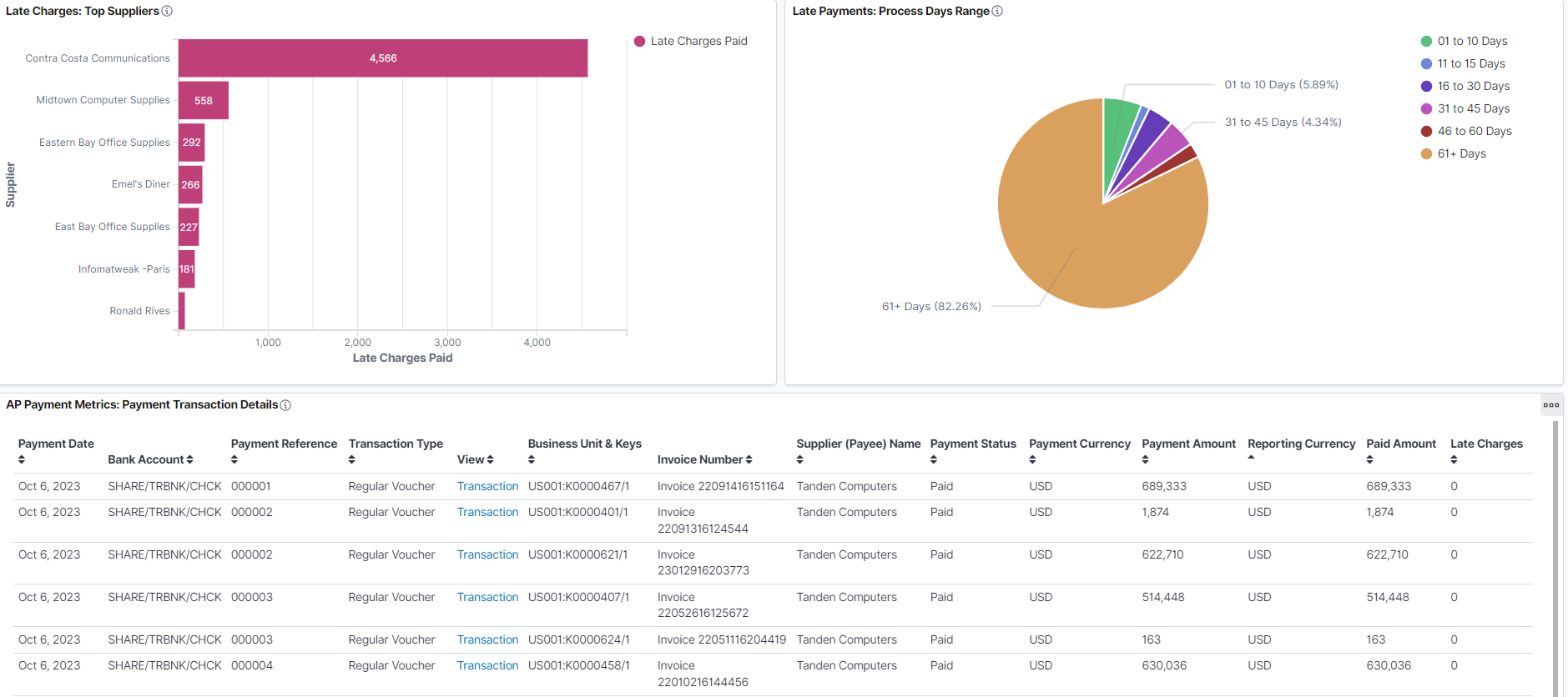
This example illustrates the fields and controls on the AP Payment Metrics page (3 of 5). You can find definitions for the fields and controls later on this page.
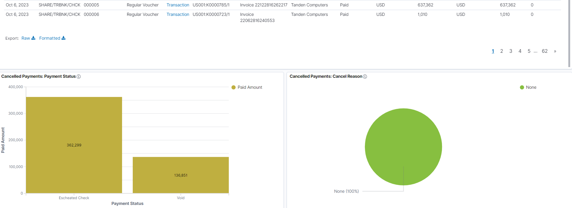
This example illustrates the fields and controls on the AP Payment Metrics page (4 of 5). You can find definitions for the fields and controls later on this page.
This example illustrates the fields and controls on the AP Payment Metrics page (5 of 5). You can find definitions for the fields and controls later on this page.
Note: All transaction amounts are converted to Insights reporting currency for better interpretation and understanding of visualizations. The Insights reporting currency is configured on the Installation Options - Payables Page.
The visualizations for AP Payment Metrics has the following details:
|
Field or Control |
Description |
|---|---|
|
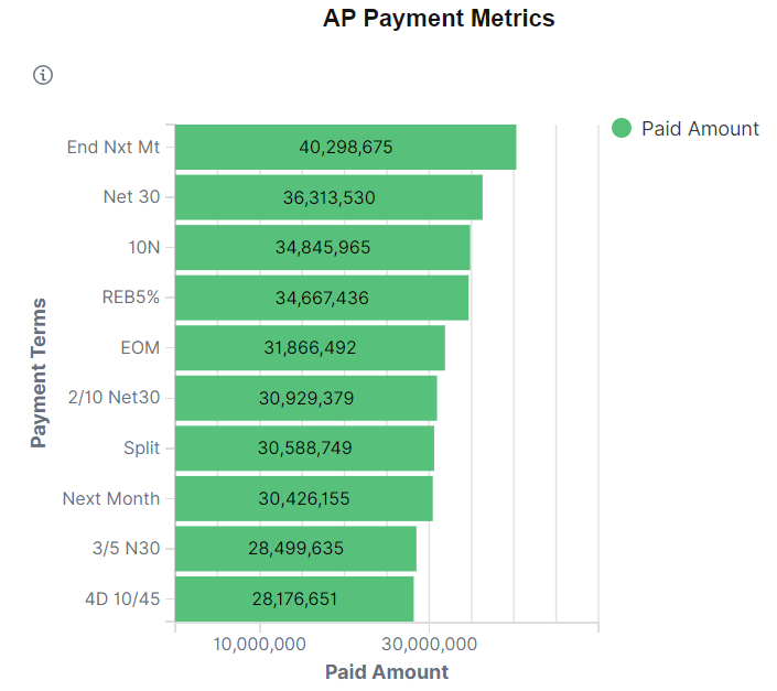
Top Payment Total by Payment Term |
Provides the visualization of total payment made in various payment terms. |
|
Discount Analysis |
Provides the visualization amount for discount loss and discount taken. |
|
Top Payment Total by Payment Method |
Provides the visualization of total payment made using various payment methods. |
|
Trending Payment Counts per Payment Method |
Provides the visualization of payment counts made using various payment methods. |
|
Top Outstanding Prepaid Amounts by Supplier |
Provides the visualization for sum of all outstanding prepayment amount for prepaid voucher by the supplier. |
|
Top Payment Total by Payment Currency |
Provides the visualization of total payment made in various currency codes. |
|
Top Suppliers by Payment Counts |
Provides the list of top suppliers by payment counts. |
|
Top Suppliers by Payment Counts (breakdown by Payment Method) |
Provides the visualization of top suppliers by payment counts. |
|
Late Charges: Top Suppliers |
Provides the visualization of highest amount of late charges paid by various suppliers. |
|
Late Payments: Process Days Range |
Provides the visualization of late payments based on number of days. |
|
AP Payment Metrics Details |
Displays a detailed list of payments data shown in the visualizations. Use the Transaction hyperlinks to view further details about the payment and modify the information as needed. |
|
Cancelled Payments: Payment Status |
Provides the visualization for cancelled payments for various payment statuses. |
|
Cancelled Payments: Cancel Reason |
Provides the visualization for cancelled payments based on a cancel reason. |