Understanding the Characteristics of Fluid Applications
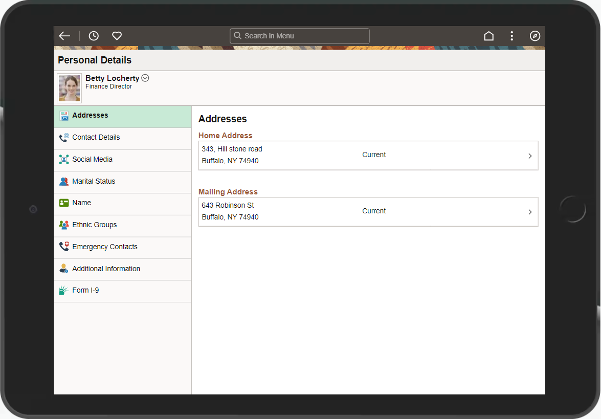
A PeopleSoft system recognizes the device used to access it, and renders fluid pages so that the application appears naturally, as expected by the user of a certain device type. For example, the following shows a PeopleSoft fluid application page appearing on a browser on a laptop or a tablet device.
This example shows a fluid page displayed on a tablet in landscape mode.
If you access that same page using a cell phone and view it in landscape mode, it would appear similar to the following example.
The following example shows how a fluid page may appear on a smart phone in landscape mode.
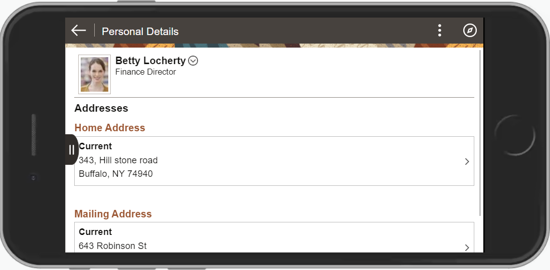
Notice that the page shrinks to fit the screen size of the device. Which controls are displayed in the banner varies depending on the width of the browser window. As the width decreases, controls are moved from the banner to become links in the Actions menu. The user can use typical gestures, such as swiping (on homepages only), to scroll through the fluid page.
If you access the same page using a mobile phone and view it in portrait mode, you will notice additional changes as the page further adapts and responds to the adjusted screen display. All controls except for the Back button have been moved into the Actions menu. The PeopleSoft Fluid User Interface is adaptive in that the system detects the device and generates the page rendering appropriate to that device, and it is responsive in that the CSS defined for the application responds to user actions on the client device, such as changing from portrait to landscape mode.
Note: The PeopleSoft Fluid User Interface adaptive qualities require a server trip, while the responsive qualities do not.
The following example shows a fluid page displayed on a smart phone in portrait mode.
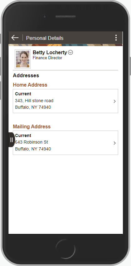
Notice that the system further shrinks the page, while maintaining the fundamental structure.