About Chart Applets
A chart applet is a type of applet that graphically displays data from a business component in various formats that allow the user to analyze trends, compare categories, and examine other relationships in the data. Note the following about charts:
-
You can include any data in a business component in a chart. Aggregated data based on period, multiple attributes, a particular attribute, multiple value fields, a selected record, calculated field or ranges can all be displayed in chart format.
-
The data in a chart applet reflects the current query for the business component. The following aggregated functions are supported when building your query: MIN, MAX, SUM, AVG, COUNT, and GROUPBY.
-
You can click in the chart to update it with modifications to the query.
-
The JavaScript D3.js (Data Driven Documents) charting engine renders charts in the UI.
The following figure shows a chart applet in a view.
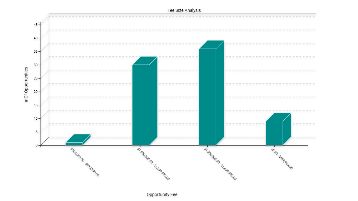
This view is named Opportunity Fee Size Analysis. The object definition for this view is named FINCORP Deal Chart View - Fee Size Analysis. It includes a list and a chart applet. It lists opportunities in the list applet and aggregates them by size in the FINCORP Deal Chart View – Fee Size Analysis chart applet. The chart applet in this view displays the data in the three dimensional bar chart format, by default. The user can choose different chart types from the Type list that Siebel CRM displays in the chart applet. To modify the size of the legend for a chart applet, the user can right-click the legend, and then choose one of the menu items. For more information, see Types of Charts and Considering Factors That Affect Chart Performance.