About Product Themes
Product themes specify the style used to group items together on selection pages. You define which items appear on a page by defining groups in the User Interface view and adding products to the groups. Each group is displayed on a separate selection page.
Three basic product theme types are provided.
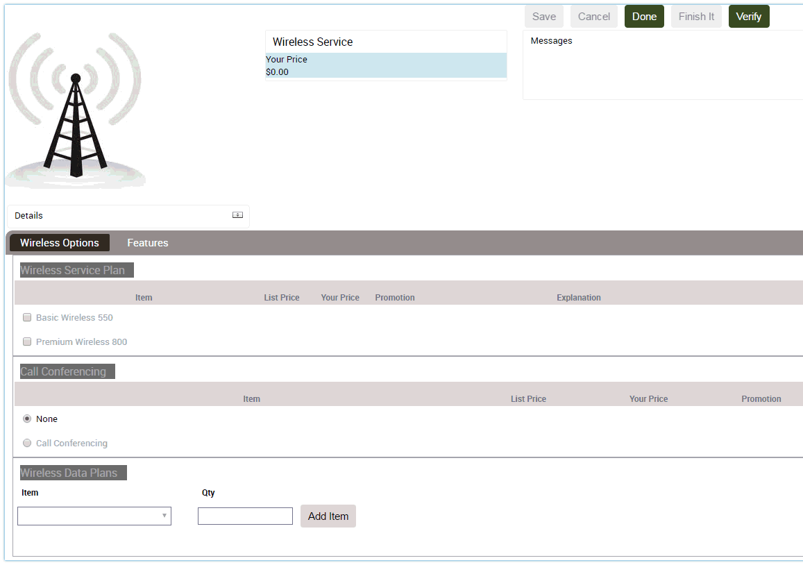
Tab Product Theme
The items in each group are displayed on a separate page, as shown in the following figure. The Wireless Options group and the Features group each have a tab, and the user can move between pages by clicking the tab. A standard group of buttons, Save, Cancel, Done, and Finish It display in the header bar.
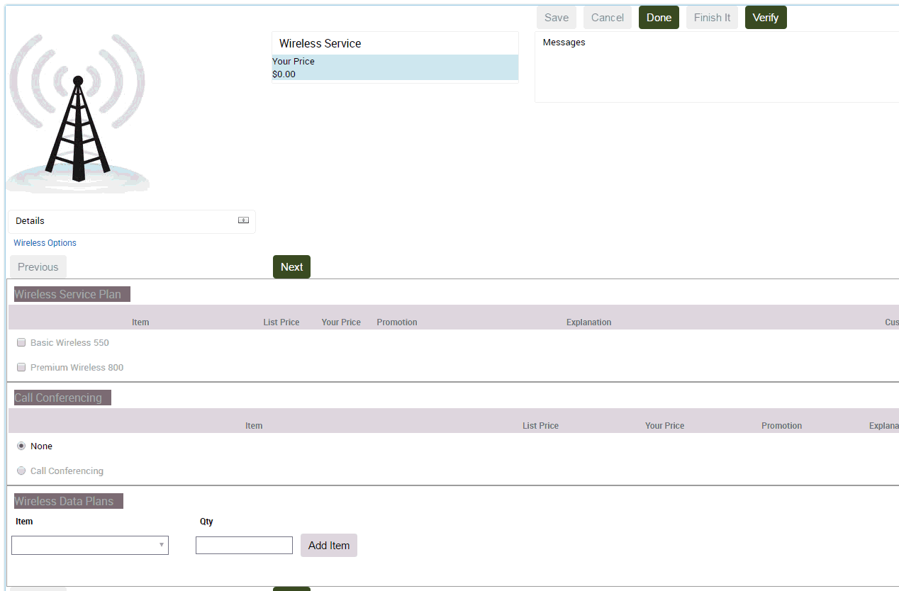
Wizard Product Theme
The items in each group are presented on separate pages, as shown in the following figure. The Wireless Options group is displayed by itself as the first page in the sequence. A standard group of buttons, Save, Cancel, Done, and Finish It display in the header bar. Previous and Next buttons, located within the page, allow the user to move between pages.
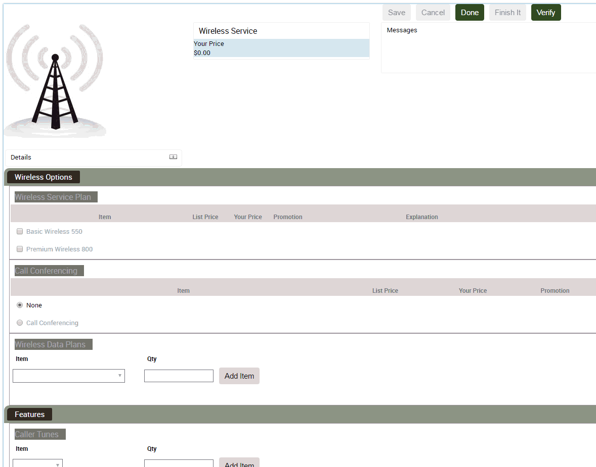
Single Page Product Theme
All the groups in the customizable product are presented on a single selection page, as shown in the following figure. The tab pages used in the Tab theme and Wizard theme are stacked vertically one beneath the other to form the selection page. A standard group of buttons, Save, Cancel, Done, and Finish It display in the header bar.