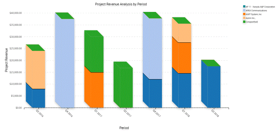
Example of a Chart That Includes Three Axes
The following figure displays the Project Revenue Analysis chart, which is an example of a chart that includes three axes. In this chart, Siebel CRM does the following:
-
Plots the amount of revenue on the Y data values axis (Project Revenue)
-
Displays quarters on the X category axis (Q3 2021, Q4 2021, Q1 2022, Q2 2022, Q3 2022, Q4 2022)
-
To identify a different project, Siebel uses each bar color for Z, series, and axis.
In a chart that contains two Y axes, the first Y-axis refers to the vertical axis in the first quadrant of the chart, and the second Y-axis refers to the vertical axis in the second quadrant of the chart.