Smartphone UX for Siebel Mobile
As of Siebel CRM 20.9 Update, an enhanced Smartphone UX for smartphone devices (iOS and Android ) is available for Siebel Mobile applications.
Siebel Open UI provides a specialized PHONE theme for smartphone devices where list applets are transformed to Tile visualization mode with infinite scrolling navigation and navigation defaults to Side Menu mode. The enhanced UX for smartphone devices also employs some specialized out-of-the-box context renderers to optimize the layout (of mobile applications) on client devices to ensure the optimal usage of available real estate.
Siebel on Phone supports Redwood Theme out of the box and it only supports Portrait mode.
You enable the Smartphone UX for mobile applications by setting the AutoTileType component parameter to PHONE, for example, as follows:
// change param AutoTileType=PHONE for comp <application_object_manager>_<language>
change param AutoTileType=PHONE for comp ServiceMObjMgr_Enu
You must restart the component after modifying the AutoTileType component parameter for the changes to take effect on smartphone devices. Modifying the AutoTileType component parameter will not change the look and feel of the application on desktop or tablet devices.
The URL must not be used for same user across tab and phone devices, you will experience look and feel issues.
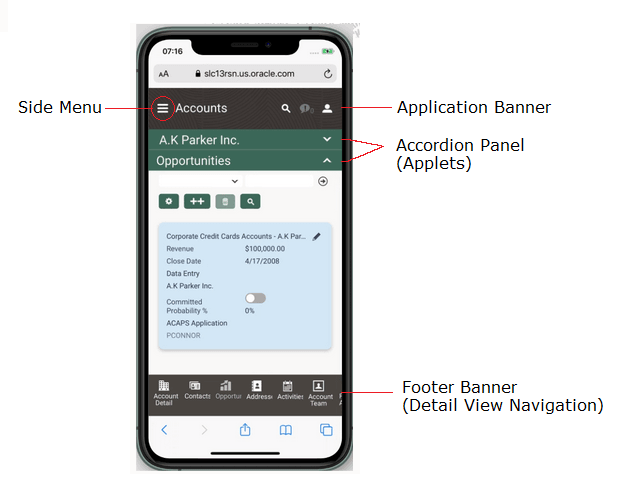
The Smartphone UX PHONE theme for Siebel mobile applications contains the following elements, shown in the following image, and these elements persist for all views:
-
Application banner. This appears across the start of each page in the Smartphone UX PHONE theme and contains the following options: Side Menu, Search, Settings.
-
Accordion panel. This displays context information according to the selection that you make from the Side Menu and the information is displayed in accordion format. In the example shown in the following image, the accordion panel contains the following applets: Account record (for A.K. Parker Inc.) and Opportunities. You expand (or close) each applet in the accordion panel to view more (or less) information on your smartphone.
-
Footer banner. This displays the detail view navigation options according to the selection that you make from the Side Menu. In the example shown in the following image, Accounts is selected from the Side Menu and the footer banner contains the following detail view navigation options: Account Detail, Contacts, Opportunities, Address, Activities, and Account Team. Click Address, for example, to navigate to the address information for the selected account (A.K. Parker Inc. in this example).
Redwood is the the default Smartphone UX PHONE theme for Siebel mobile applications.
The Smartphone UX feature is supported by the following Siebel Mobile applications:
-
Siebel Mobile application for Siebel Sales
-
Siebel Mobile application for Siebel Field Service
-
Siebel Mobile application for Siebel eClinical
For more information about the Smartphone UX feature and Auto Tile Visualization, see Configuring Siebel Open UI.