Designing Sections and Tiles
You continue to use the PIA pages to create sections and tiles and the process has not changed. Advanced sectionalized homepage development provides you greater control and flexibility in designing the sections and tiles on your homepage or dashboard.
Sections are an important construct in advanced sectionalized homepage development. This topic briefly describes the process of creating sections and points you to existing documentation. Additionally, this topic describes the various visual forms for sections and points to the styles and CSS variables delivered for this purpose.
Creating a Section
You can create a section either using the Section Assignments tab on the Content Ref Administration page or you can create section templates and import them.
Refer to the following topics for more information on creating sections: (Fluid only) Creating Sections on Fluid Homepages and Managing Section Templates and Sections.
Designing Visual Forms of Sections
You use the delivered styles and CSS variables applicable at the level of a section to add granular styling to the section. The styles and CSS variables are described in the preceding topics. Based on your business requirements, you can style sections to span the entire width of the homepage or specify a fixed width for the section, which can grow vertically as you add tiles in the section, or you can lay the sections side-by-side.
Additionally, you can design each sections to be unique in its look and feel by applying specific background color, border, icon, and so on.
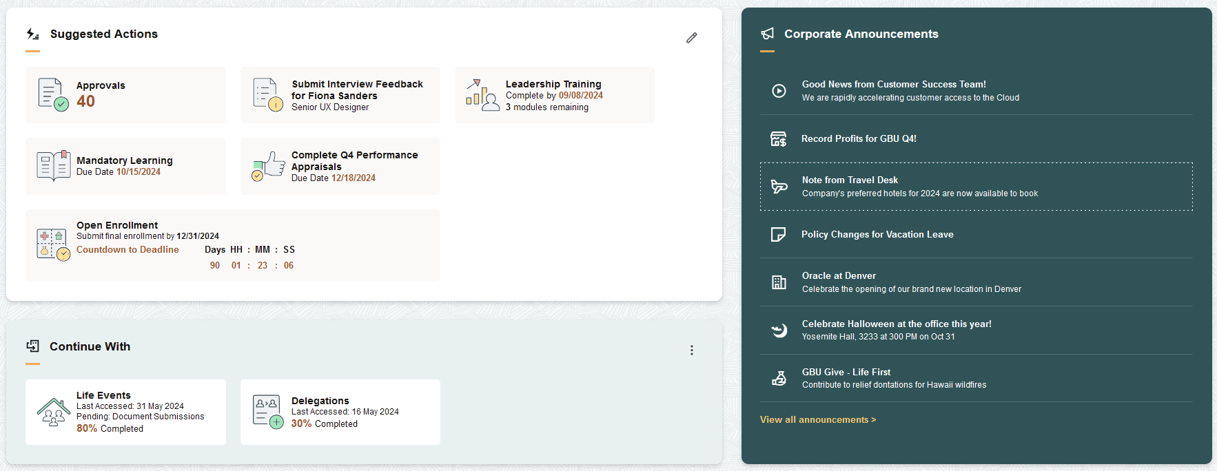
The following example shows some of the visual forms of sections.
This example illustrates some of the visual forms of sections.
This topic briefly describes the process of creating tiles and points you to existing documentation. In addition to creating tiles using the tile wizard or creating tile definitions manually, you can create tiles dynamically and load them into a section.
Creating Tiles Statically
You can create a tile using the Tile Wizard or you can manually create tile content references.
Refer to the following topics for more information on creating tiles: Using Tile Wizard and Creating and Maintaining Tile Definitions Manually.
Creating Tiles Dynamically
You can create tiles dynamically and load these tiles into a section using the delivered base class: PTNUI:Dynamic:DynamicLoader. As these tiles are dynamically created, they do not have a tile content reference.
Typically, you would create tiles dynamically in this manner:
Create an application class, which is an extension to the base class PTNUI:Dynamic:DynamicLoader.
Use the LoadSection method to load a section.
Use the CreateTile or CreateTileUsingTab methods to define a tile.
Use the AddTileToSection method to add the tile to the section.
The following code snippet creates a standard tile with title and image:
method LoadSection
   /+ Extends/implements PTNUI:Dynamic:DynamicLoader.LoadSection +/
   Local PTNUI:Model:Tile &oTile;

   &oTile = %This.CreateTileUsingTab("", "Team Calendar");
   &oTile.RowNum = %This.GetNextRowNumber();
   &oTile.GltImageName = Image.TEAM_CALENDAR;
   %This.SetupFluidTarget(&oTile, GenerateComponentContentURL(%This.Tab.PortalName, %This.Tab.NodeName, MenuName.MYMENU, %Market, Component.MYCOMPONENT, Page.MYPAGE, %Action_UpdateDisplay));

   %This.AddTileToSection(&oTile);
end-method;
For a detailed description of the DynamicLoader class and its methods, see DynamicLoader Class Methods.
PeopleTools supports creating different presentations of tiles.
You can create the following tiles:
Tile presented as a button.
Tile presented as a link.
Standard tile.
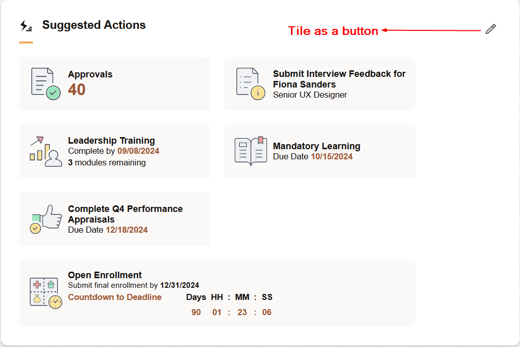
Tile Presented as a Button
This is a special tile that can be configured as a button instead of the default rendering as a link. You must ensure that it is the first tile in a section for tab ordering. You can use the tile to open a modeless window, which enables users to configure or personalize the section. Special styling is applied to the tile to make it appear in the upper-right corner of a section.
Special properties must be applied to a tile for the tile to behave as a button. These properties are applicable to both statically defined tiles and dynamically generated tiles.
To configure a tile as a button, complete these steps:
If you're using an application class to dynamically create the tile by extending the DynamicLoader class, set the following properties:
Use the Tile.IsButtonRole property and set it to True.
Use the Tile.IsNotTile property and set it to True.
Use the Tile.StyleClasses property and specify the psc_section-action-button attribute.
Use the Tile.UseAltText property and set it to True. If you are using only an image for the button, ensure that the alternate text and title are populated with the text of the tile label.
If you are creating a statically defined tile, in the tile definition, select the following check boxes on the Fluid Attributes tab:
Identify Tile as a Button
Use Alternate Text on Tile Image
Update the homepage content reference to include the psc_section-action-button value for the PS_STYLECLASSES attribute in the Section Attributes area on the Section Assignments page.
The following sample code shows the properties for the tile.
&oTile = %This.CreateTileUsingTab("", "Edit Suggested Actions");
   &oTile.RowNum = 1;
   &oTile.GltImageName = Image.MYIMAGE;
   &oTile.UseAltText = True;
   &oTile.IsButtonRole = True;
   &oTile.IsNotTile = True;
   &oTile.DisplayIn = %GroupletActionInModal;
   &oTile.StyleClasses = "psc_theme-tile-transparent;psc_section-action-button";
   &oTile.IncludeSourceInUrl = True;
   %This.SetupFluidTarget(&oTile, GenerateComponentContentURL(%This.Tab.PortalName, %This.Tab.NodeName, MenuName.MYMENU, %Market, Component.MYCOMPONENT, Page.MYPAGE, %Action_UpdateDisplay));
   %This.AddTileToSection(&oTile);
The sample PeopleCode creates a tile presented as a button:
Example of a tile displayed as a button.
See Applying Styles from Delivered Style Sheets and Styling Homepages and Dashboards Using CSS Variables for information on styles and CSS variables that can be applied to sections and tiles.
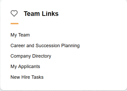
Tile Presented as a Link
You can create a tile to display as a link (hyperlink). Special properties have to be applied to the tile to behave as a link. These properties and styles are discussed in preceding topics.
At the tile level, use the psc_tile-simple-link style class to convert a tile to a hyperlink.
At the section level, use the psc_section-link-collection style class, which converts all tiles in the section into a collection of links displayed vertically.
Use the Tile.IsNotTile property and set it to True.
The following sample code creates a tile that is presented as a link. At the section level, the psc_section-link-collection style class is applied which presents the tiles as links.
&oTile = %This.CreateTileUsingTab("", "My Team");
   &oTile.RowNum = %This.GetNextRowNumber();
   &oTile.IsNotTile = True;
   %This.SetupFluidTarget(&oTile, GenerateComponentContentURL(%This.Tab.PortalName, %This.Tab.NodeName, MenuName.MYMENU, %Market, Component.MYCOMPONENT, Page.MYPAGE, %Action_UpdateDisplay));
   %This.AddTileToSection(&oTile);
Example of tiles displayed as links.
See Applying Styles from Delivered Style Sheets and Styling Homepages and Dashboards Using CSS Variables for information on styles and CSS variables that can be applied to sections and tiles.
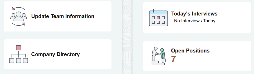
Standard Tiles
Standard tiles are tiles with image and text or tiles with live data. However, the visual presentation of these tiles can be changed by applying appropriate styles. For example, tiles can be displayed as a collection with a separator line, a tile can span the width of a section; a tile can display secondary text in addition to the main text.
See Applying Styles from Delivered Style Sheets and Styling Homepages and Dashboards Using CSS Variables for information on styles and CSS variables that can be applied to sections and tiles.
Example of standard tiles.
Grouplet-based tile styling provides the ability to apply new styling to tiles created in pre-8.62 releases such that the styling affects only the content of the tile without modifying the tile content reference (CREF). The grouplet-based styling requires a change only to the grouplet component content or grouplet iScript content. The grouplet-based styling does not require any modifications to the tile CREF, so Applications do not need to redeliver tile CREFs when they implement advanced sectionalized homepage.
Note: The grouplet-based styling is applicable only within the context of advanced sectionalized homepage, that is, the psc_hpmodel-A style must be implemented.
When grouplet-based styling is implemented, two types of tiles are automatically supported without requiring any modifications by Applications.
Tile grouplet content containing only an image (not the image defined in the tile CREF definition).
Tile grouplet content containing an image and a live data count.
However, these tiles are automatically supported only if the tiles are delivered with a specific structure and styling used in the pre-8.62 implementation of tile content. The following structure and styling is expected:
|
Type of Tile |
Structure and Styling |
|---|---|
|
Image only grouplet |
|
|
Image and live data count grouplet |
|
All other tile structures and styling require modification for the grouplet-based styling to render correctly on the pre-8.62 tiles. Application developers must consider the following aspects of the tiles and apply the styles appropriately.
Identify that this tile conforms to a general standard tile content, that is, the tile has an image, tile label, and one or more lines of content.
Ignore the layers of structure of the tiles, such as group boxes and HTML areas.
Identify the lines of content data directly to be displayed within the tile. Optionally, use new styles to control the rendering of the lines of content.
|
Style Name |
Typical Structure Usage |
Description |
|---|---|---|
|
psc_tile-standard |
Top-level Group box |
Identifies that this tile has been tested by the application and works per standards defined by these styles. Do not use this style if the tile does not conform to tile standard content (for example - no image) |
|
psc_tile-structure-ignore |
Top-level Group box |
Ignore the current structure (a groupbox) and all groupbox and HTML structures found within this structure. This styling uses display:contents which makes the CSS grid layout focus on only the important parts of the tile content (tile image, tile label, lines of data). This is the most commonly used style. |
|
psc_tile-groupbox-ignore |
Any group box level |
Not necessary whether psc_tile-structure-ignore is used on an ancestor element. Allows ignoring of only groupbox structures from this element down to expose the data. Typically used for tiles requiring custom changes due to the structure, meaning that psc_tile-structure-ignore could not be used. |
|
psc_tile-htmlarea-ignore |
Any HTML Area level |
Not necessary whether psc_tile-structure-ignore is used on an ancestor element. Allows ignoring of only HTML area structures from this element down to expose the data. Typically used for tiles requiring custom changes due to the structure, meaning that psc_tile-structure-ignore could not be used. |
|
psc_tile-ignore |
Any Container level |
Applies to only a single element to be ignored for layout purposes (does not affect any children elements) |
|
psc_tile-img-swap-dim |
Image Control having psc_tile-img |
Typically, tile images use the width as the major width allowing the height to be derived (allowing aspect ratio to be maintained). Typical tile image is 60x60 pixels so it actually does not matter. This style says to use the height instead of the width for the dimension. |
|
psc_tile-data |
Edit or Text Control |
Indicates that this structure includes the live data information to be displayed as a line of data. |
|
psc_tile-data-1 through psc_tile-data-6 |
Used in conjunction with psc_tile-data level |
Indicates the line of information. Do not duplicate information as these tiles are used to properly center the tile image vertically. |
|
psc_tile-emphasis-text psc_tile-label-emphasis-text psc_tile-value-emphasis-text |
Tile line data |
Shows the appropriate data with emphasis (typically the live data count coloring). Notice the first style applies to all contents of the control. The next two styles apply to either the label or value of the display-only textual data field. |
|
psc_tile-emphasis-large-text psc_tile-label-emphasis-large-text psc_tile-value-emphasis-large-text |
Tile line data |
Same as previous row except larger text. |
|
psc_tile-less-emphasis-text psc_tile-label-less-emphasis-text psc_tile-value-less-emphasis-text |
Tile line data |
Shows the appropriate data with less emphasis but not normal text (typically bolded). Notice the first style applies to all contents of the control. The next two styles apply to either the label or value of the display-only textual data field. |
|
psc_tile-normal-text psc_tile-label-normal-text psc_tile-value-normal-text |
Tile line data |
Shows the appropriate data with normal text. Notice the first style applies to all contents of the control. The next two styles apply to either the label or value of the display-only textual data field. |
|
psc_tile-secondary-text psc_tile-label-secondary-text psc_tile-value-secondary-text |
Tile line data |
Shows the appropriate data with smaller font as with secondary data. Notice the first style applies to all contents of the control. The next two styles apply to either the label or value of the display-only textual data field. |
From PeopleTools 8.62.02, a section automatically adjusts to narrow browser windows (browser window widths below a given breakpoint) to handle small form factor sizes without having to adapt based on being identified as a small form factor at login. The breakpoint for section adjustment is set to occur below 453 pixels.
Section adjustment or compression below 453 pixels includes the following changes:
All sections behave as full-width sections. Full-width sections have the following characteristics:
Sections do not have rounded corners (squared corners).
Sections do not have shadows.
Sections span entire width of the homepage.
Homepage gutter is set to 0 pixels.
Internal spacing of section is reduced; adjusts the section action button spacing if it exists.
Section gaps are reduced.
Note: You can disable the auto-adjustment feature by applying the psc_section-compression-none style at the homepage level (in the PS_STYLECLASSES homepage attribute properties of the homepage content reference definition).
Some reasons why you may decide not to use the auto-adjustment feature:
453 pixels is not the desired breakpoint for your landing page implementation.
The behavior performed by the auto-adjustment feature is not the desired behavior. Behaviors may not work as expected because default styling of sections, gaps, spacing or padding, or tile collections were not used.
Implementors did not use styling provided by PeopleTools to layout the landing page in which case all auto-adjustment needs to be owned by the implementor.
You may have your own design for responsiveness, which conflicts with the auto-adjustment behaviors.