Viewing Data in Original Layout Grids
Original layout grids offer several functional benefits that scroll areas do not. This section discusses how to work with original layout grids.
If the number of columns in a grid precludes you from viewing all of the grid data simultaneously without the page being cluttered, developers might design the grid so as to group and separate columns with tabs. This section discusses:
Grid tabs
Cell navigation
Grid Tabs
Grid tabs enable you to view groups of data columns simultaneously with little or no scrolling of the entire page to the right.
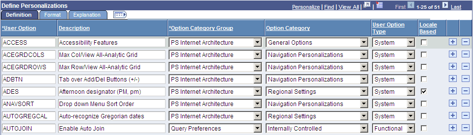
In this example, you see the Define Personalizations grid and the Definition, Format, and Explanation tabs. Notice the Show All Columns button to the right of the Explanation tab.
This example illustrates the Define Personalizations grid showing three tabs.
To view all columns without tabs:
Click the Show All Columns button just below the navigation header of the grid.
Showing all columns can expand the width of the web page so that a browser scroll bar appears at the bottom of the browser window.
Alternatively, some grids may have an Expand All button to the right of the tabs, which enables you to expand the grid columns to the right so that no tabs appear.
You use the browser scroll bar to scroll left and right to view the data columns.
Note: When in the expanded view, you cannot freeze columns because the entire grid moves with the page.
To restore the grid to its original state, click the Show Tabs button.
Cell Navigation
In original grids, you can navigate through cells in these ways:
Press Tab to move one field or page element to the right.
Movement continues from row to row and outside the grid.
Press Shift + Tab to move one field or page element to the left.
Movement continues from row to row, into the column headers, and outside the grid.
You can only move and freeze columns by using the Personalize link.
Only application developers can resize columns in an original layout grid by accessing the grid properties in Application Designer.
You can change the sort order of a grid column directly on a transaction page. Sorts persist only as long as you are on a page. You can toggle between ascending and descending order by repeatedly clicking the column header. The last column header that you click becomes the primary sort for the grid. Grids enable you to have primary, secondary, and tertiary sorts. Original layout grids have no visual cue to indicate the sort order.
Note: Sorting is disabled on columns consisting of radio button fields.
You can also change the sort order by using the Personalize link. This type of sort persists until you change it by using the Personalize link again.
See Personalizing Grids.
You can remove user-specific settings such as sorts and column changes, which restores the default grid settings. To remove user-specific grid settings:
Click the Personalize link.
On the Personalize Column and Sort Order page, click the Delete Settings link.
Note: If no Delete Settings link is available, click the OK button to restore the default settings.
On the Delete Settings page, click the Delete button.
On the Personalize Column and Sort Order page, click the OK button to restore the default settings.
Some grids enable you to download grid data to a Microsoft Excel spreadsheet. The download feature extracts all active, non-hidden rows, regardless of whether the rows are visible on your screen.
To download grid data, click the Download button in the navigation bar of the grid.
Depending on your browser setting, a download dialog window may open and prompt you to save the downloaded spreadsheet.
Note: Ensure that you disable any pop-up blockers in your browser.
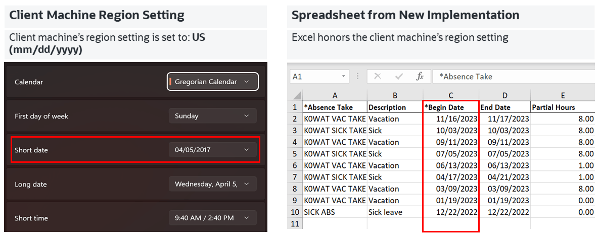
Date and DateTime data are downloaded in the canonical format and Excel honors the regional settings of the user's machine while displaying Date and DateTime.
Note: The system downloads all field types (columns) with the exception of images. Hyperlinks are downloaded as quoted text of the field labels, even though the labels may contain numeric values. If any numeric calculations are to be performed based on hyperlink, you must manually convert the text strings to numeric values after downloading the spreadsheet.
Subscribe to the following technical bulletin on My Oracle Support for the latest information: PIA Grids Download to Excel Functionality (Doc ID 2988403.1).
Note the following characteristics when you download the grid data as a Microsoft Excel (.xlsx) file:
The downloaded Excel file name follows this format: PS_<Component>_<TimeStamp>.xlsx.
Date and DateTime values are exported in a canonical format, which aligns with the regional settings of the user's machine.
Dates in the Excel file use the short Date format (regional settings of the user's machine).
DateTime in the Excel file uses the Custom format. The date part uses short date format and the time part uses the long time format (regional settings of the user's machine).
Character fields are exported as-is, even if they contain numeric values. Leading zeros are preserved.
If a DateTime field in the grid includes timezone information, it is exported as a DateTime value without the timezone; the date and time information is retained, but milliseconds are not displayed.
Currency symbols, thousand separators, and decimal separators are preserved.
The following screenshot highlights the regional settings in the downloaded spreadsheet (xlsx).
Client machine regional setting supported in spreadsheet
The download to Excel feature requires the fontconfig package.
See PeopleSoft 9.2 Application Installation for your database platform, "Completing the Installation," to install the fontconfig package.
Fallback Mechanism
If you encounter any issues preventing the use of the .xlsx file, you can use the .xls format as a fallback by running the following SQL statement:
UPDATE PS_PT_DWLD_XLS SET PT_PROPERTYVALUE = ‘Y’ WHERE PT_PROPERTYNAME = ‘PT_DWNLDEXCEL_XLS’;For information on the .xls format, refer to the Download to Excel (.xls extension) section on this document PIA Grids Download to Excel Functionality (Doc ID 2988403.1).
You might also encounter grids that you can collapse or expand. Click the right-pointing triangle in front of the grid heading to expand a grid that is hidden from view (collapsed).
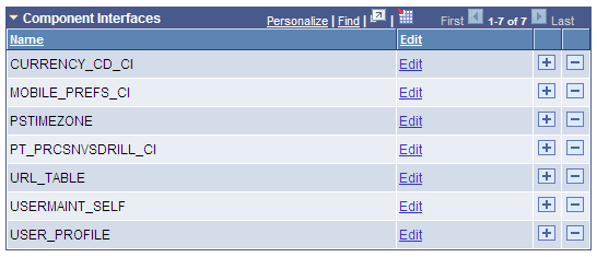
These examples show both the collapsed and expanded states of the Component Interfaces grid:
This image illustrates the Component Interfaces grid in the collapsed state.

This image illustrates the Component Interfaces grid in the expanded state.
Note: Application developers set whether the initial state of the grid is collapsed or expanded in Application Designer.
Some grids enable you to zoom the grid to a modal window. When you click the Zoom icon, the grid and its data appear in a modal window over the main page, which is grayed out.
While in the modal window, you can work with the grid just as you would if the grid were on the primary page, for example, you can insert and delete rows. You must return to the primary page to save any changes to your data.
To return to the primary page, click the Return button at the bottom of the grid in the modal window.
Note: You can disable the Display in Modal Window functionality for a grid by changing its properties in Application Designer.
See Using Grids