Group Customer Navigation
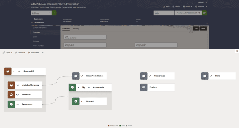
The Oracle Insurance Group Policy Administration application now includes a new feature called Group Customer Navigation. This feature visually presents a graphical overview of the elements of a group customer, depicts their relationships, indicates the setup status of each element, and offers users an intuitive interface to navigate and access group customer information.
Key Features
-
Graphical Overview: Visualize all components and relationships within a group customer, making complex structures easy to understand.
-
Status Indicators: Clearly see the status of each element—such as Active, Inactive, or Pending—through color-coded nodes for quick identification of items needing attention.
-
Brown: Pending and draft
-
Green: Active
-
Grey: Inactive
-
-
Direct Navigation: Jump directly to any component’s detailed screen by clicking the navigation icon within each node, reducing the need to search or navigate through multiple menus.
-
Expand/Collapse Controls: Use Expand All and Collapse All buttons to view details at different levels. Click the Show Hidden button to reveal nodes you’ve chosen to hide.
-
Hide/Show Elements: Temporarily hide elements and their related sub-items from the diagram for a focused view.
-
Hover Information: Hovering over any component node provides additional, context-sensitive information (including, for Plan and Class Groups, the count and status of associated time slices).
-
Zoom and Pan: Adjust the diagram’s level of detail and navigate large group structures with built-in zoom controls.
How to Use
Enable the Navigation Button
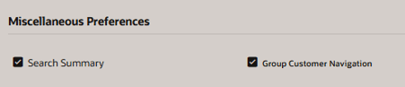
By default, the floating navigation button is off. Enable the Group Customer Navigation option from the Miscellaneous Preferences under User Menu. A green floating button  is enabled on the Customer overview page.
Access the Diagram
Click the green floating button to view the Group Customer Navigation drawer.
Explore the Structure
The Group Customer Navigation component has the below buttons.
-
Expand All button: Expand all the nodes of the component.
-
Collapse All button: Collapse all the child nodes of the component.
-
Show Hidden button: Unhide all the hidden nodes of the component.
-
More menu button: Provides the option to navigate to the below screens.
-
Relationship
-
Quote
-
Phone numbers
-
Alternate screen
-
Activities
-
Comments
-
Note: If your user lacks permission for specific screens, those navigation options will appear disabled with a Page not authorized message on hover.