Viewing Current Headcount Insights
Administrators can use the Current Headcount Insights dashboard to evaluate the various headcounts within their organization for all active workers. Based on user privileges and criteria, administrators can analyze headcount numbers by various metrics, work-related statuses and distributions, and more.
The Current Headcount Insights dashboard is built on the PeopleSoft Insights platform, which relies on an underlying analytics engine and search engine. Current headcount data that is visible on the dashboard comes from the Workforce Metric Search index HC_HR_WF_METRIC.
This topic provides an overview of how to set up the Insights dashboard for current headcount analytics and discusses the PeopleSoft Insights dashboard for workforce headcount.
Understanding PeopleSoft Insights
PeopleSoft Insights is an analytical engine that provides visual reports (visualizations) in the form of charts, tables, graphs and so on. The visualizations are based on queries that retrieve data from the PeopleSoft Search Framework.
These videos provide an overview of the PeopleSoft Insights feature:
Video: Insights with PeopleSoft
Video: PeopleSoft HCM Insights
For information on Insights dashboards, see:
PeopleTools Search Technology: “Monitoring PeopleSoft Search Framework and OpenSearch” and “Working with Insights Dashboards for PeopleSoft Application Data” documentation
|
Page Name |
Definition Name |
Usage |
|---|---|---|
|
N/A |
View a count of active workers and access Insights visualizations related to the current workforce headcount. |
|
|
HC_HR_WF_HEADCOUNT_FL |
Review workforce headcount analytics using Insights visualizations. |
Before administrators can access the visualizations for current headcount data, the following steps should be performed:
Deploy the HC_HR_WF_METRIC (Workforce Metric) index.
()
Build the following indexes.
HC_HR_JOB_DATA (which is the source for the metric index)
HC_HR_WF_METRIC
Important! You need to run a full index on HC_HR_JOB_DATA before you run the full Index for HC_HR_WF_METRIC.
()
Deploy the Workforce Headcount Tile and Current Headcount Insights dashboard.
()
Note: The full index must be run before the dashboard can be deployed.
Assign the HR Analytics Administrator role to users that should be granted access to view the Current Headcount Insights dashboard.
This section lists the common elements and controls that are used in Insights analytics.
For more information on working with PeopleSoft Insights and filters, see PeopleTools: Search Technology, “Working with Insights Dashboards for PeopleSoft Application Data” documentation.
Search and Filter Options:
Note: Filtering options apply to all visualizations, which allows users to drill down on all the charts at once.
|
Field of Control |
Definition |
|---|---|
|
Search field |
Enter a query to filter data, if applicable. |
|
|
Enter criteria to filter data on the visualizations. You can apply filters in a number of ways:
Added filters are displayed next to the + Add filter link for reference. For example, when you click a chart item, the filter is automatically added to your filters list. |
|
Regulatory Region, Company, Business Unit, Department, Location, Job Title, HR Status, Payroll Status, Organizational Relationship, Employee Type, and Gender fields |
Select to filter headcount data by regulatory region, followed by company, then by business unit, and so on. |
 (Change all filters) icon and
 Visualization Options:
When you pause over a visualization, the Options and Legend icons (if applicable) are displayed on the top right and bottom left corners respectively. Use them to inspect the chart or table and view the details of that visualization and toggle the legend display.
|
Field or Control |
Definition |
|---|---|
|
|
Select the Options icon to select one of these options:
|
|
|
Select this icon to hide or display the legend for the chart, if available. You can select an item in the legend to change its color, or add it as a filter (if applicable). |
|
Chart items (bar, pie slice, and so forth) |
Pause over a chart item, such as a bar item or pie slice, to view a summary of details for that item. Select a chart item to add a filter for it to apply to all visualizations. |
 (Options) icon
 (Toggle legend) icon
Use the Current Headcount Insight tile to view a count of active workers and access Insights visualizations related to the current workforce.
You can add the Current Headcount Insight tile to a homepage through personalizations.
This example illustrates the fields and controls on the Current Headcount Insight tile.
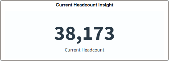
The tile displays the Current Headcount metric by default, which shows the dynamic headcount of persons who currently have an active HR status.
Select this tile to access the Current Headcount Insights Dashboard.
Use the Current Headcount Insights dashboard to review workforce headcount analytics using Insights visualizations.
Navigation:
Select the Current Headcount Insight item from the Workforce category in the left panel on the Insights Catalog (see Insights Catalog Tile).
Select the Current Headcount Insight Tile you added to a homepage.
Note: You must be assigned the HR Analytics Administrator role to view this dashboard.
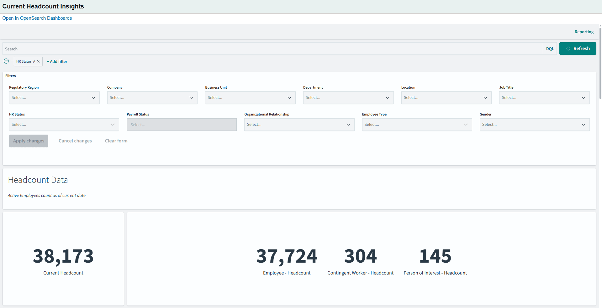
This example illustrates the fields and controls on the Current Headcount Insights dashboard (1 of 4).
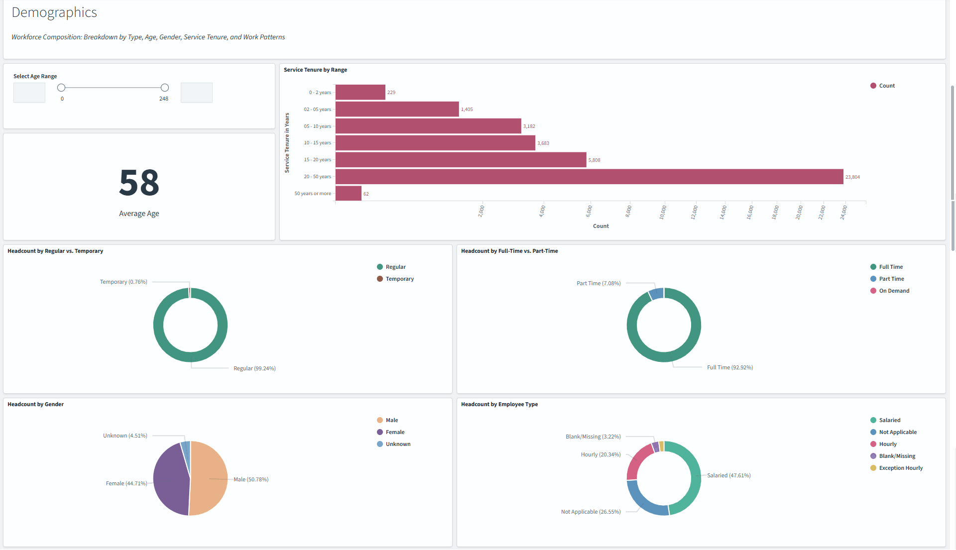
This example illustrates the fields and controls on the Current Headcount Insights dashboard (2 of 4).
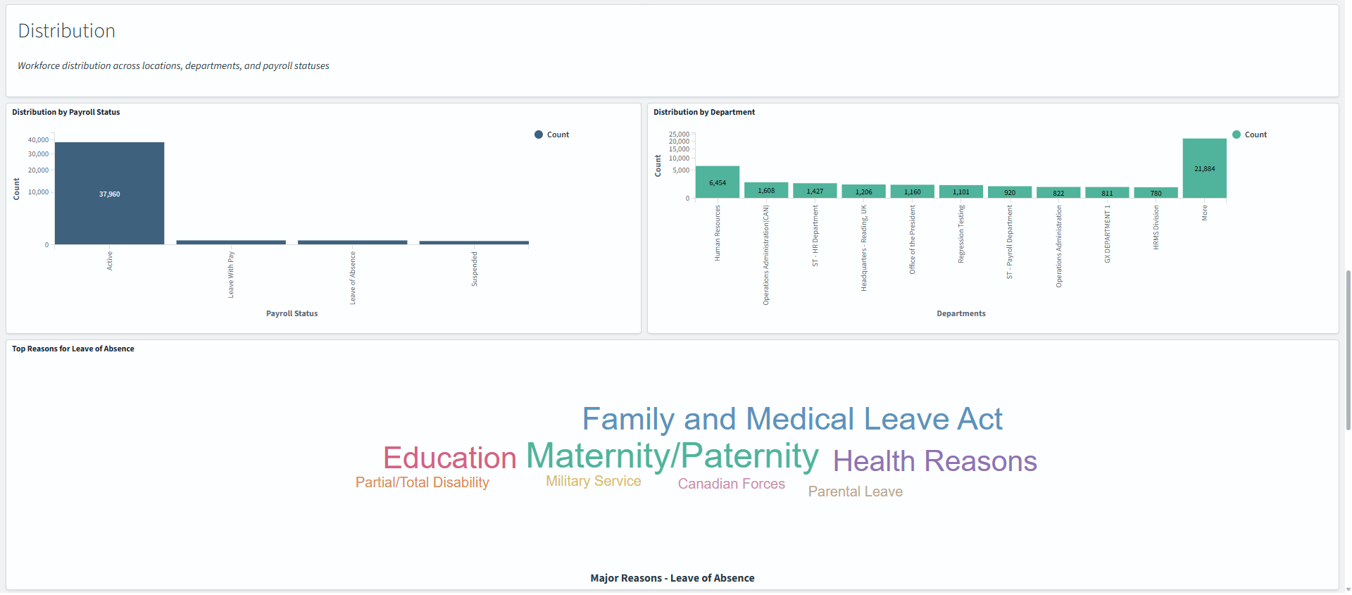
This example illustrates the fields and controls on the Current Headcount Insights dashboard (3 of 4).
This example illustrates the fields and controls on the Current Headcount Insights dashboard (4 of 4).
Warning! PeopleSoft Insights dashboards may not render properly if you access them using unsupported platforms.
The Current Headcount Insights dashboard provides you with different visualizations to analyze the current workforce headcounts based on your user access. The data displays number counts that include active employees, contingent workers, and persons of interest and the results are based on your filter settings. Each visualization enables you to inspect a number, chart, table, or map to view the details of that visualization. Pause over a visualization item, like a bar or location, to have additional page elements appear, view numbers, or select items to add filters to your visualizations.
Headcount Data Visualizations
The Headcount Data section of the dashboard provides you with the following collection of interactive visualizations to view and analyze current headcounts.
|
Visualization |
Description |
|---|---|
|
Current Headcount |
This metric displays the headcount for all person's currently with an Active HR status. |
|
Organizational Relationship Headcount:
|
This panel displays the number counts for each organizational relationship (employees, contingent workers, and person's of interest with a job) with an HR status of Active. |
Demographics Visualizations
The Demographics section of the dashboard provides you with the following collection of interactive visualizations to view and analyze current headcounts.
|
Visualization |
Description |
|---|---|
|
Select Age Range |
This visualization enables you to specify a range of ages to determine headcount by age groups. Enter numbers, use the up of down buttons, or move the slide bar to indicated a minimum and maximum age. |
|
Average Age |
This metric displays the average age of all currently active workers. |
|
Service Tenure by Range |
This bar graph displays the current tenure of workers. The information uses the last hire date to determine this information. |
|
Headcount by Regular vs Temporary |
This metric shows the total headcount and percentages of active regular and temporary staff. |
|
Headcount by Full-Time vs Part-Time |
This metric shows the total current headcount and percentages between active full-time, part-time, and on demand staff. |
|
Headcount by Gender |
This metric shows the current headcount and percentages between male, female, and unknown genders. |
|
Headcount by Employee Type |
This metric displays the total headcount and percentage of hourly, salaried, exception hourly, and so forth of workers with an active HR status. |
Distribution Visualizations
The Distribution section of the dashboard provides you with the following collection of interactive visualizations to view and analyze current headcounts.
|
Visualization |
Description |
|---|---|
|
Distribution by Payroll Status |
This bar chart displays the current worker count based on payroll status (Active, Leave With Pay, Leave of Absence, and Suspended) out of the total headcount. |
|
Distribution by Department |
This bar chart shows administrators the top 10 departments by current headcount to which they have access. Select the More bar item to see the next 10 departments. |
|
Top 10 Reasons for Leave of Absence |
This tag cloud visualization displays the top 10 reasons workers are on a leave of absence. The bigger the font size, the larger the number of persons associated with the leave reason. |
|
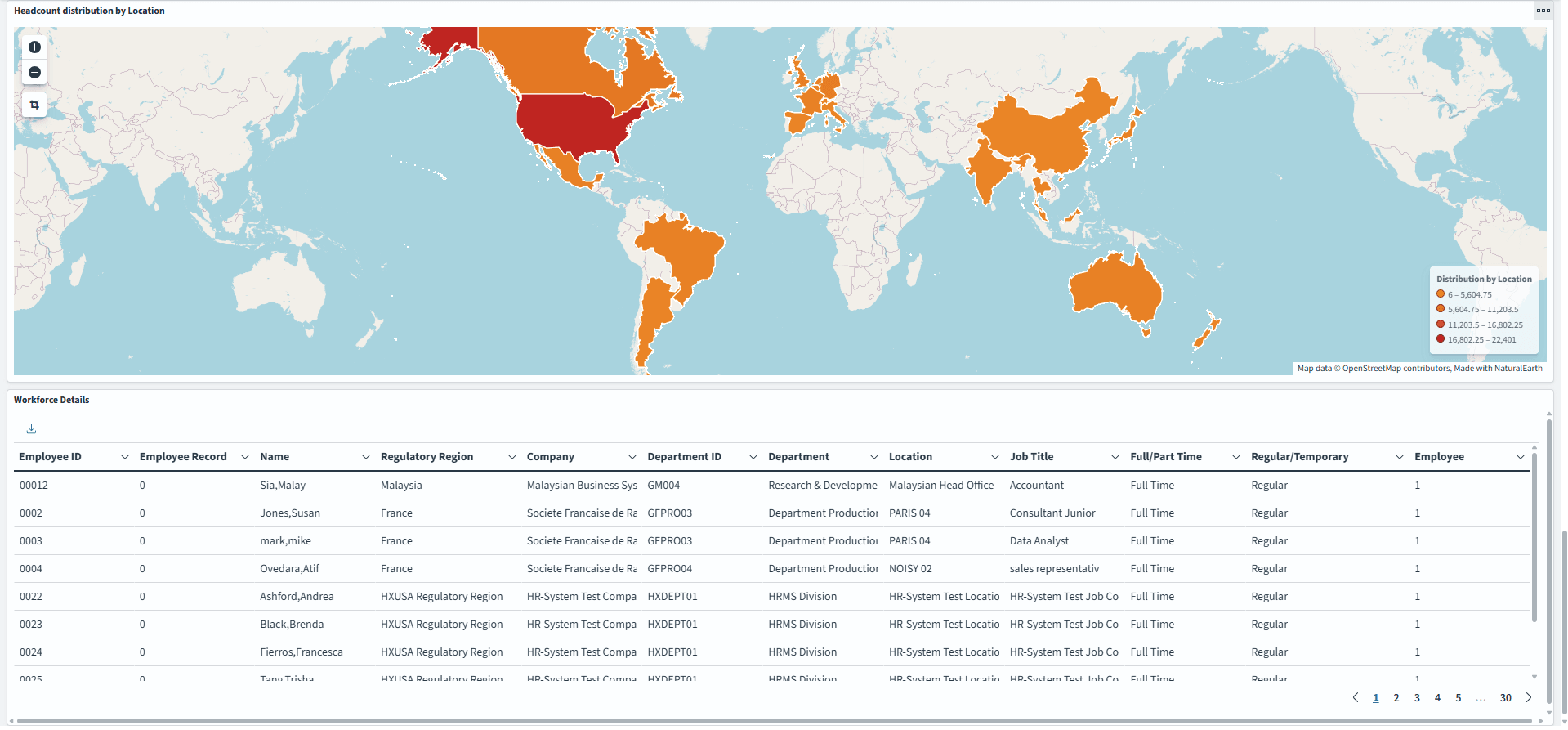
Headcount distribution by Location |
This map displays the current headcount by country and is based off of the person's job location. |
Workforce Details Grid
This grid displays a detailed grid of employee's that meet the visualization specifications.
|
Field or Control |
Description |
|---|---|
|
Sort column heading |
Select a column heading to sort grid rows by the column value in ascending or descending order. |
|
|
These filter icons appear when you pause next to a field value. These icons are available for all column values in the grid and provide a quick way to add filters to the analytics. Select the Filter for value (+) icon to add the shown field value as a filter to all visualizations. For example, if you select to filter for a Department value, all visualizations will refresh to show employees for that department. Select the Filter out value (-) icon to remove the shown field value from the filter process for all visualizations. For example, if you select to filter out the Human Resources value in the Department column, visualizations will refresh to show information for all departments except Human Resources. Filters can be removed from the Filters area at the top of the page. |
|
|
Select to export data from the grid into a .csv file format. |
 (Filter for value) and (Filter out value)
icons
(Filter for value) and (Filter out value)
icons (export) icon