Defining Toolbar Buttons
To define toolbar buttons, use the Toolbar Button Definition (RB_TB_BUTTON_DEFN) component.
This section discusses how to set up custom buttons and define them.
|
Page Name |
Definition Name |
Usage |
|---|---|---|
|
RB_TB_BUTTON_DEFN |
Define buttons for a toolbar. |
Before defining a new button to perform an application-specific action, check if it already exists as a system-delivered button by searching for it on the Toolbar Button Definition page. Button IDs that start with RB_ and PT_ are included in the system for delivered functionality, such as Save (PeopleTools-related) and Clone for cases and orders (component-related). You can give buttons alternate labels for application-specific usage when you define a toolbar.
Buttons that perform custom actions use application classes to execute the action. To create a custom button:
On the Toolbar Button Definition page, define the button.
On the Toolbar Definition page, add the button to the appropriate toolbar.
Implement the class method, which is specified in the button definition, in your application class.
This task is not necessary when creating buttons that perform standard PeopleTools actions or when modifying the appearance of delivered buttons.
Please refer to the following documentation for more information on application classes.
See PeopleTools: PeopleCode API Reference.
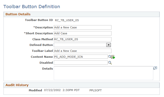
Use the Toolbar Button Definition page (RB_TB_BUTTON_DEFN) to define buttons for a toolbar.
Navigation
Image: Toolbar Button Definition page
This example illustrates the fields and controls on the Toolbar Button Definition page.
|
Field or Control |
Definition |
|---|---|
| Toolbar Button ID |
Displays the unique identifier of the toolbar button. This ID is referenced in PeopleCode to manipulate button properties. |
| Class Method |
Enter the method name of the extended application class (the class that extends RB_TOOLBAR:Toolbar), which contains the PeopleCode that executes when a user clicks the button. This value does not contain spaces or special characters. Note: If you specify a value in this field, leave the Defined Button field blank. |
| Defined Button |
Select a button value if the button is mapped to a PeopleTools-delivered action. Values are Add, CTI Phone Launch, Correction, Next Page In Component, Next in List, Previous Page In Component, Previous in List, Refresh, Related Links, Return to List, Save, Spell Check, Update/Display, and Update/Display All. These actions are the same as the similarly named PeopleTools buttons that normally appear at the bottom of a page. Note: If you specify a value in this field, leave the Class Method field blank. |
| Toolbar Label |
Enter the default button label, which is used as a tool tip for the button at runtime. |
| Content Name |
Select the default icon that appears when the toolbar button is active. Select image definitions from the PeopleSoft image catalog. To use a custom graphic, you must add it to the catalog first. |
| Disabled |
Originally used to specify the default icon that appeared when the toolbar button is inactive. Note that inactive toolbar buttons are now hidden rather than displayed: therefore the Disabled image is not used. |
| Details |
Enter a detailed description, such as usage and comments, about the button. |
For more information on using and creating image definitions for buttons, refer to PeopleTools: PeopleSoft Applications User's Guide and PeopleTools: PeopleSoft Application Designer Developer's Guide