Viewing CRM Charts
This topic discusses how to view the CRM chart pagelets.
Use these pagelets to review metrics related to your call center and order capture operations:
Image: Examples of CRM charts 1 through 3CRM Charts 1-3
This example illustrates the fields and controls on the Examples of CRM charts 1 through 3CRM Charts 1-3 .
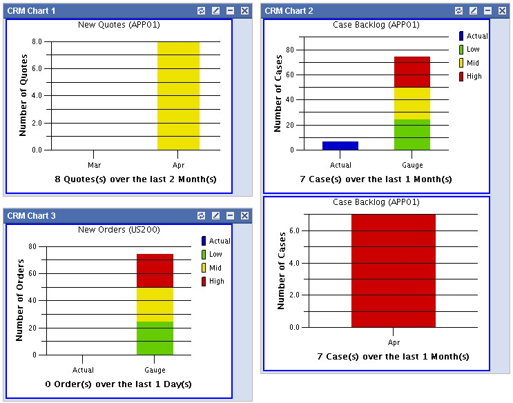
All of the pagelets present data in bar charts:
A detail bar chart displays a bar for each included time period.
A summary bar chart displays one bar for the actual data and another bar for a gauge.
The gauge is divided into low (green), middle (yellow), and high (red) zones for easy evaluation of the chart data. Users set low, middle, and high ranges when they personalize the page.
The pagelets also display the following text information:
The chart name (for example, Case Backlog) appears at the top of the pagelet.
The business unit appears in parentheses after the chart name.
A text summary of the number of cases and the included time period appears under the bar graph.