Configuring how each Hyperlink or Refinement action column displays

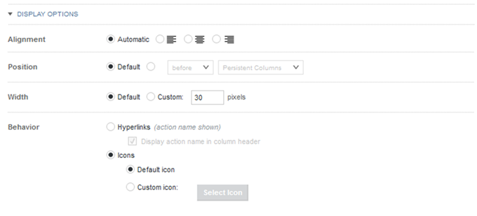
The configuration dialog for each Hyperlink or Refinement action column in a Results Table contains a Display Options section. This section is collapsed by default, and is the same for each action. It determines how the column displays in the table.
In the Display Options section, to configure the display for an action column:

  1. To expand or collapse the section, click the section heading.
    Display options for an action column
  2. Under Alignment, click a radio button to indicate how to align the action icon or hyperlink within the column.
  3. By default, action columns display at the far left of the table, in front of the persistent columns. Under Position, to change the column location:
    1. Click the radio button for the custom location.
    2. From the location list, select whether to display the column before or after the selected column set.
    3. From the column sets list, select the column set to display the action column in.

      The list includes all of the column sets in the table, plus an entry to display the column in the persistent columns.

  4. Under Width, to have the width set automatically, click Default.

    To set a specific width, click Custom. In the field, type the default width in pixels.

  5. Under Behavior, configure how to display the action column to end users.

    To display the action name as a hyperlink:

    1. Click Hyperlinks.
    2. To also display the action name in the column heading, check the Display action name in column header check box.

    To display a clickable icon:

    1. Click Icons. This is the default.

      When you display an icon in the action column, the column heading is empty.

    2. To display an icon other than the default, click Custom icon.
    3. To select the custom icon, click Select Icon.

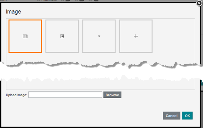
      The image selection dialog displays. The dialog lists any images that have been uploaded for any Results Table component in the current project.


      Image selection dialog for a Results Table action column

      The list does not include images from other component types or projects.

    4. To search for and select a new image file to upload, click Browse.

      Studio supports the .gif, .jpeg/.jpg, .bmp, and .png file types.

    5. After you select the file, to clear the current selection, click Cancel.
      Image file selected on the Results Table image selection dialog
    6. To add the image to the list, click Upload.
    7. To select an image to use for the action, click the image in the list, then click OK.

      If the image is too large, Studio crops it.

    8. To change to a different image, click the edit icon next to the selected image.
      Selected icon for a Results Table action column
    9. To remove the selected image, click the delete icon.