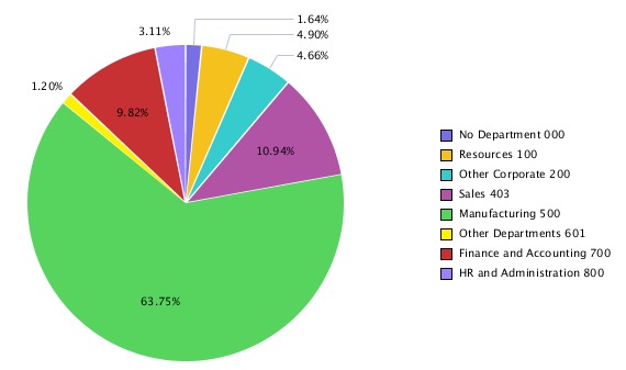
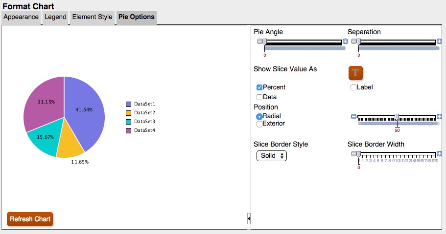
In this example, “Show Point Values” is set to “Percent”, which shows a percentage data point for each slice of the pie.
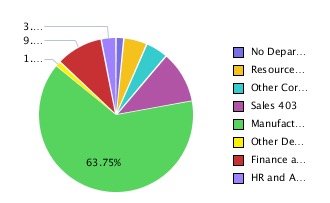
The data points are cut off or not visible for some slices. In addition, the legend text is cut off.
By increasing the size of the chart on the report canvas, the entire legend and all data points are displayed.