HTML Structure and Styles for Typical Design Patterns
The following examples make use of Involver's default styles and can be used to easily lay out typical design pattens.
Media Unit
Left aligned image or video with associated left aligned text block. (A very common design pattern.)

HTML Structure:
This structure consists of a wrapping block-level element containing two inner block-level elements aligned next to each other.
<div class="media-unit">
    <div class="image-unit">
        IMG TAG or VIDEO EMBED goes in here
    </div>

    <div class="text-unit">
        <p>Associated text goes in here. Use normal semantic markup such as header and p tags.</p>
    </div>
</div><!-- /.media-unit -->
To reverse the layout (align image to right instead of left add "reverse-media-unit" classname to the "media-unit" containing element (you don't need to contain it with a div, below example is used within a list):
<ul class="data-list">
    <li class="media-unit reverse-media-unit">
        <div class="image-unit">
            <img src="" alt="">
        </div>

        <div class="text-unit">
            <h3>Title</h3>
            <p>This is a description of a cool image.</p>
        </div>
    </li>
</ul>
Plain Lists
To remove bullets or numbering, margin and padding from lists you can add the class name "data-list" to ul or ol tags. These are also removed by default from ordered lists within form tags and "block-list".
Block Lists
Useful for lists of images, video thumbnails, etc. This will line up all the list items in a row and add default left and bottom margins. The default width of items is 31.3% but you can add CSS to overide this for custom widths. It's designed to work with list items of varying heights so you should not specify the heights in most cases. (You can also override the default margins to customize if you wish.)
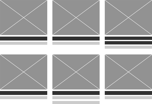
HTML Structure:
<ul class="block-list">
    <li>Content such as image and text here</li>
    <li>Content such as image and text here</li>
    <li>Content such as image and text here</li>
<li>Content such as image and text here</li></ul>
IMPORTANT: There should be no spaces before the closing ul tag. This is to prevent a Safari bug with spacing from occurring in certain instances.
Justified Block List
To make the list items automatically space themselves out to fill the full available area you can add the class name "justified-block".
(NOTE: if the last row only has 2 items instead of 3, they will still be spaced apart to fill the full available area which means there will be a blank gap in between.)
<ul class="block-list justified-block">
    <li>Content such as image and text here</li>
    <li>Content such as image and text here</li>
    <li>Content such as image and text here</li>
<li>Content such as image and text here</li></ul>
Custom CSS Example:
Line up 4 items in a row instead of 3 by adding a custom width:
.block-list li {width: 23%;}
Flexible Simple Columns
2 Columns
These are equal width by default (based on percentages so will adjust to fit width of container). Add your own styles to create various custom widths.
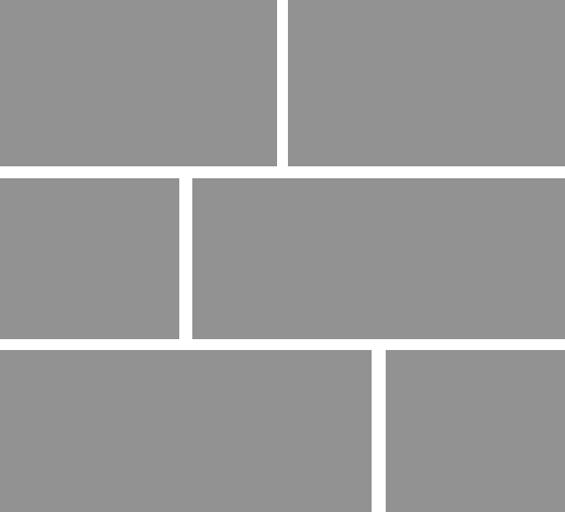
HTML Structure:
<div class="col-wrapper">
    <div class="col">
        CONTENT HERE
    </div><!-- /.col -->

    <div class="col last-child">
        CONTENT HERE
    </div><!-- /.col -->
</div><!-- /.col-wrapper -->
Custom CSS Example:
Add a custom width and custom margin for the first column (2nd column will automatically fill remaining space.)
.col
{width: 360px;
margin-right: 10px;}
 05_diagram-media-unit.png (image/png)
04_diagram-block-list.png (image/png)
2cols-var-widths.png (image/png)
05_diagram-media-unit.png (image/png)
05_diagram-media-unit.png (image/png)
04_diagram-block-list.png (image/png)
2cols-var-widths.png (image/png)