Link Visualization
Link lets you perform advanced analysis of log records by combining individual log records from across log sources into groups, based on the fields you’ve selected for linking. You can analyze the groups by using the same fields as the ones you used for linking or additional fields for observing unusual patterns to detect anomalies.
Link command can be used for a variety of use-cases. For example, individual log records from business applications can be linked to synthesize business transactions. Groups can also be used to synthesize user sessions from web access logs. Once these linked records have been generated, they can be analyzed for anomalous behavior. Some examples of this anomalous behavior can include:
-
Business Transactions that are taking unusually long to execute or are failing.
-
User sessions that are downloading large amounts of data than normal.
Tip:
To use the Link feature, users need to have a good understanding of their log sources. The Link feature relies on a field or a set of fields that are used to combine individual log records. To generate meaningful associations of log records, it is important to know the relevant fields that can be used for linking the log records.-
Link Trend
-
Generating charts with virtual fields
-
Using SQL statement as a field of analysis
-
Generating charts for multiple fields and their values
-
Second level aggregation
-
Time analysis
-
Navigation functions
Analyze the Log Records Using Link
You can use the example of the log records from the log source
SOAOrderApp
for an order flow application, to apply the steps
discussed below. Note that the following steps introduce you to the basic features
of link. After familiarizing with the steps, here are some of the simple features
you can use for convenience and better experience with link:
-
Open the navigation menu and click Observability & Management. Under Logging Analytics, click Log Explorer.
-
Select Link (
) from the Visualize panel.
By default, Log Source is used in the Group By field to run the
link
command. This displays the groups table. See Groups Table.For example, the following groups table is displayed for
SOAOraderApp
: -
By default, the Group Duration column is not included in the groups table. To include it, click Options > Hide/Show Columns > Check Group Duration.
-
To analyze the fields that are relevant to your analysis, drag and drop one or more fields to Group By, remove Log Source which is the default field in Group By, and click the check mark to run the Link query. You can view the updated groups table.
-
To include more columns in the table, drag and drop the fields of interest into the Value section. This is equivalent to the
stats
command. You can add alias to any of the fields by editing the query and usingas
to display the field with a new alias. For example,stats avg('Elapsed Time (Real)') as 'Avg Time'
. -
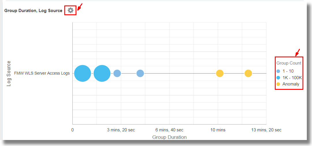
To visualize the groups and to analyze the log records using a bubble chart, click Analyze > select any two fields for analysis. For example, select
Group Duration
andLog Source
. The same action can also perform using theclassify
command.You can view the groups represented in the bubbles in the chart.
This analyzes the groups for the values of the fields, and creates bubbles representing the groups in the commonly seen ranges. The majority of the values are treated as the baseline. For example, a large bubble can become the baseline, or a large number of smaller bubbles clustered together can form the baseline. Bubbles that are farthest from the baseline are typically marked as anomalies. Generally, these bubbles represent the behavior that is not typical.
For the latest information displayed in the Analyze Chart, see Information Displayed in Analyze Chart.
Note
When you run thelink
command, the group duration is shown in a readable format in the bubble chart, for example, in minutes or seconds. However, if you want to run awhere
command after thelink
command to look for transactions that took more than the specified number of seconds (say, 200 seconds), then the unit that you must use is milliseconds.The next step may be to further examine the anomalies by clicking individual bubble or multi-select the bubbles. To return to the original results after investigating the bubble, click the Undo (
) icon.
You can toggle the display of the groups on the bubble chart by clicking on the value of the Group Count legend that's available next to the chart. This can be used to reduce the number of bubbles displayed on a densely packed chart.
From the order flow application:-
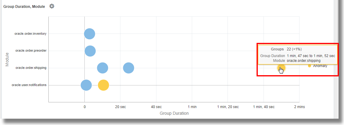
We’ve selected the fields Module and Context ID to group the log records. This groups the log records based on the context ID of each record and the specific module from shipping, notifications, inventory or preorder that was used by the application in the log record.
The chart displays the bubbles that group the log records based on their values of Context ID and Module. The blue bubbles represent most of the groups that form the baseline. Notice the two anomaly bubbles that appear on the chart against the modules for shipping and notifications. The bubble on the extreme right of the chart represents the groups that’re taking a longer duration to execute the module as compared to other groups. On hovering the cursor on the bubble, you can observe that the bubble consists of 22 groups that make for less than a percent of the total number. The bubble corresponds to the
oracle.order.shipping
module and has the group duration of1 min, 47 sec to 1 min, 52 sec
.For the latest information displayed in the Analyze Chart, see Information Displayed in Analyze Chart.
-
To view the details of the groups that correspond to the anomaly, select the anomaly bubble in the chart.
-
In the next tab, a histogram chart is displayed showing the dispersion of the log records.
-
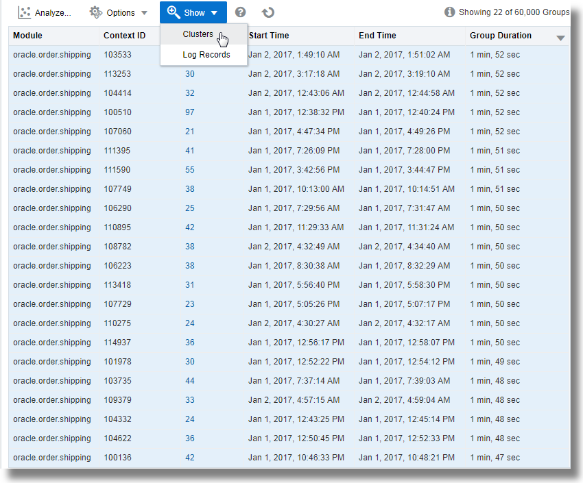
A groups table listing each of the 22 groups and the corresponding values of the fields is also available for the analysis.
-
-
View the anomaly groups in clusters: First select all the rows in the table by clicking on the first row, hold Shift key on your keyboard, and click on the last row in the table, next click the down arrow next to Show, and select Clusters.
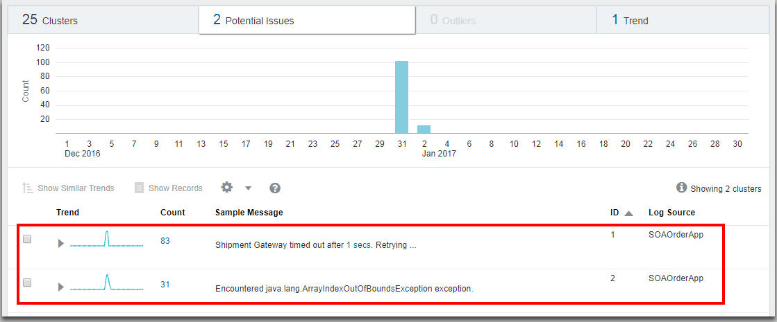
This displays the clusters. Click on the Potential Issues tab.
This lists the groups of log records and the sample messages indicating the anomaly. The issues point at Shipment Gateway time out and java.lang.ArrayIndexOutOfBoundsException exception for the cause of delays in executing the shipping module in the specific groups.
-
-
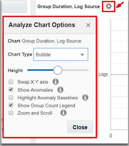
For more options to view the groups, click the Chart Options
icon on the top left corner of the visualization panel. See Analyze Chart Options.
-
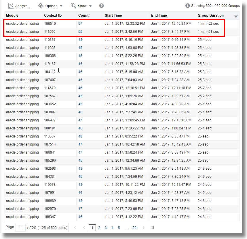
Study the groups table to understand the groups and the values of the fields in each group. See Groups Table.
In line with the observation in the bubble chart of the
SOAOrderApp
log records, from the groups table, notice that the top two groups are taking1 min, 52 sec
and1 min, 51 sec
to complete the execution. This is very high compared to the group duration of the other groups. -
Click the Search and Table Options
icon:
-
Click Hide/Show Columns and select the columns that you want to view in the table.
-
Click Alias Options, and rename the groups and log records to create custom dashboards.
-
Click Search Options:
-
Select the Show Top checkbox, and identify the number of log records to view for the specified field.
-
Select the Include Nulls check box to view those log records that may not have all the Group By fields.
-
Under Analyze Chart Behavior on Selection,
-
To view the filtered group table for the groups in the selected bubble, click the Filter Only - filter group table only option.
-
To view the filtered group table and the re-classified bubble chart for the groups in the selected bubble, click the Drill Down - filter group table and re-classify bubbles option.
Note
The filtered selection is not supported in the saved searches. However, you can open the saved search and apply the same filter selection again. -
-
-
-
To change the fields analyzed from the group data, click the Analyze
icon and select fields that have multiple values with high cardinality. By default, the first field selected for Group By is analyzed with the group duration to generate the analyze chart and the groups table. Click OK.
This displays a new chart based on the fields selected in the Analyze command.
-
To view the log records in the histogram visualization, click the histogram tab. The histogram chart displays the log records over time. Click the down arrow next to the Chart options
icon and select the type of visualization to view the data from the log records and groups on separate histograms, if necessary. See Histogram Chart Options.
To generate charts for multiple fields and their values, see Generate Charts for Multiple Fields and their Values.
You can save your custom query for the analysis of the log records using the Link feature to the saved searches and dashboard. See Save and Share Log Searches.
For the syntax and other details of the commands used in the link visualization, see the following:
Use the Getting Started Panel
For example, if you select EBS Concurrent Request Logs - Enhanced log source from the available sample link command and run it, you can obtain the following information:
-
Requests that have already completed execution within the selected time window
-
Currently running requests that show anomalous run times
-
Ability to create an Alert to identify specific requests that took anomalous run time to complete, or still running but with anomalous run time
Analyze Chart Options
Analyze Chart Option | Utility |
---|---|
Chart Type |
Select from the bubble, scatter, tree map, and sunburst type of charts to view the groups. By default, a bubble chart is displayed.
|
Height |
Increase or decrease the height of the chart to suit your screen size. |
Swap X Y axis |
You can swap the values plotted along the x and y axes for better visualization. |
Show Anomalies |
View the anomalies among the groups displayed on the chart. |
Highlight Anomaly Baselines |
If you’ve selected to view the anomalies, then you can highlight the baselines for those anomalies. |
Show Group Count Legend |
Toggle the display of the Group Count legend. |
Zoom and Scroll |
Select Marquee zoom or Marquee select to dynamically view the data on the chart or to scroll and select multiple groups. |
Information Displayed in Analyze Chart
Analyze chart for Link visualization is a bubble chart that shows the anomalies in the patterns.
Each row in the Link table represents a unique group. The size of the bubble represents the number of such groups that are contained in the bubble. The position of the bubble is determined by the values of the fields that are plotted along the x and y axes. Hover the cursor over a filter legend to view the following information:
-
Clusters: Number of bubbles in the chart for this legend value
-
Groups: Total number and percentage of groups across all the clusters
-
Average Cluster Range: Each bubble (cluster) represents a range of values. An average is computed for each bubble which shows the minimum and maximum averages across all the bubbles for this value. This is applicable only for numeric values.
-
Minimum Value: Lowest absolute value across all the bubbles for this legend range.
-
Maximum Value: Largest absolute value across all the bubbles for this legend range.

Histogram Chart Options
Histogram shows the dispersion of log records over the time period and can be used to drill down into a specific set of log records.
More Topics:
You can generate charts for the log records, groups and numeric display fields. Select a row to view the range highlighted in the histogram.
The following chart options are to view the group data on the histogram:
Histogram Chart Option | Utility |
---|---|
Chart Type |
Select from the following types of visualization to view the group data:
|
Show Combined Chart |
This option combines all the individual charts into a single chart. |
-
You can modify the Height and Width of the charts to optimize the visualization and view multiple charts on one line.
-
When viewing multiple charts, you can deselect the Show Correlated Tooltips check box to show only one tooltip at a time.
-
When using the log scale, the Bar or Line With Marker type of chart is recommended.
Example: For generating a chart for the numeric eval
command, let's consider the example query:
*
| rename 'Content Size' as sz
| where sz > 0
| link 'Log Source'
| stats avg(sz) as 'Avg Sz', earliest(sz) as FirstSz, latest(sz) as LastSz
| eval Delta = LastSz - FirstSz
| eval Rate = Delta / 'Avg Sz'
Here, the log source is the field considered for Group
By
. The chart is generated for Delta
,
Rate
, and Avg Sz
after the computations
performed as specified in the eval command. The resulting Line With Area
charts for the above fields are displayed as below:

Compare Link Metrics Across Time
Use the compare
command to compare metrics generated in
link analysis to the previous time windows.
Following example query compares the data transfer between two IPs across previous four days by using the compare command:
'Log Source' = 'OCI VCN Flow Unified Schema Logs'
| eval 'Bytes Transferred' = unit('Content Size Out', byte)
| link Time, 'Source IP', 'Destination IP'
| stats sum('Bytes Transferred') as 'Transfer Size'
| compare fields = 'Transfer Size' timeshift = -1day count = 4
The resulting histogram chart that indicates the comparison:

Combine and Stack Histogram Charts
You can combine and stack charts using the Show Combined and Show Stacked options in link.
For example, the following query shows the trend of logs with various values for the Problem Priority field, in a stacked chart:
*
| link Time, Entity
| addfields
[ 'Problem Priority' != null | stats count as Issues ],
[ 'Problem Priority' = Low | stats count as 'Issues - Low Priority' ],
[ 'Problem Priority' = Medium | stats count as 'Issues - Medium Priority' ],
[ 'Problem Priority' = High | stats count as 'Issues - High Priority' ]
| fields -Issues, -'Issues - Low Priority', -'Issues - Medium Priority', -'Issues - High Priority'

Groups Table
The groups table displays the result of the analysis by listing the groups and the corresponding values for the following default fields:
More Topics:
Column | Details |
---|---|
Field (s) |
The field that’s used to analyze the group |
Count |
The number of log records in the group |
Start Time |
The start of the time period for which the logs are considered for the analysis |
End Time |
The end of the time period for which the logs are considered for the analysis |
Group Duration |
The duration of the log event for the group |
Add URLs to Link Table
You can create links using the url
function of the
eval
command.
Additional Topics:
In the following query, the values for Search 1
, Search
2
, and Search 3
are assigned URLs:
'Log Source' = 'Database Alert Logs'
| link cluster()
| where 'Potential Issue' = '1'
| nlp keywords('Cluster Sample') as 'Database Error'
| eval 'Search 1' = url('https://www.google.com/search?q=' || 'Database Error')
| eval 'Search 2' = url('https://www.google.com/search?q=' || 'Database Error', Errors)
| eval 'Search 3' = url(google, 'Database Error')

In the above analysis:
-
Search 1
,Search 2
, andSearch 3
are now clickable Fields. Click the link to view the search results for those keywords. -
Search 2
does not display the entire URL. Instead, the second parameter in theurl
function is used to give the URL a different name, for example,Errors
. -
Search 3
is similar toSearch 1
, but the short-cutgoogle
is used to generate the URL. Instead of using the whole URL, you can use similar short-cuts.
Use URL Short-Cut with Custom Name
Consider the following example where a name is provided for the short-cut:
'Log Source' = 'Database Alert Logs'
| link cluster()
| where 'Potential Issue' = '1'
| nlp keywords('Cluster Sample') as 'Database Error'
| eval 'Search 1' = url('https://www.google.com/search?q=' || 'Database Error')
| eval 'Search 2' = url('https://www.google.com/search?q=' || 'Database Error', Errors)
| eval 'Search 3' = url(google, 'Database Error')
| eval 'Search 4' = url(google, 'Search Using Google', 'Database Error')
| eval 'Search 5' = url(duckduckgo, 'Search Using DuckDuckGo', 'Database Error')

In the above example, Search 4
is similar to Search
3
but only differs in the name given to the short-cut in Search
4
. The short-cut google
has the name Search
Using Google
which is displayed in the table. In Search
5
, the short-cut duckduckgo
has the name
Search Using DuckDuckGo
which is displayed in the table. For a
full list of Oracle-defined short-cuts available with the url
function, see Oracle-Defined url Short-Cuts.
Use the CVE Short-cut to Link to CVE Databases
Use the cve short-cut in the url
function to create a link to
the CVE repository.
'Log Source' like '%Access Logs%'
| link 'Client Host Continent'
| addfields [ jndi | stats count as 'JNDI Count' ],
[ URI like '%context.get(%com.opensymphony.xwork2.dispatcher.httpservletresponse%' | stats count as 'GetContext Count' ]
| eval 'Threat ID' = if('JNDI Count' > 0, 'CVE-2021-44228',
'GetContext Count' > 0, 'CVE-2013-2251',
null)
| eval Description = if('JNDI Count' > 0, 'Log4j Vulnerability - ' || 'Threat ID',
'GetContext Count' > 0, 'Struts Exploit - ' || 'Threat ID',
null)
| eval CVE = url(cve, Description, 'Threat ID')
| fields -'Threat ID', -Description, -'JNDI Count', -'GetContext Count'

In the above example, the CVE column links to the CVE repository for the value of each Client Host Continent from the Access Logs.
Use the OCID Shortcut to Automatically Link to OCI Resources
Use the ocid short-cut in the url() function to create a link to a relevant page to OCI. If the resource has a specific page, then the URL would point to the direct link. Otherwise the URL would point to the Resource Query Service results for that OCID.
'Log Source' = 'OCI Audit Logs' and 'Resource ID' like 'ocid%' and
'Resource ID' not like in ('%managementsavedsearch%', '%managementdashboard%', '%organizationsentity%', '%coreservicesworkrequest%')
| eval 'Resource Type' = substr('Resource ID', 6, indexOf('Resource ID', '.', 6))
| link 'Resource Type'
| stats earliest('Resource ID') as 'Resource ID'
| eval 'OCI Resource' = url(ocid, 'Resource ID')
| sort 'Resource Type'
| fields -'Start Time', -'End Time', -Count, -'Resource ID'

In the above example, the OCID of each OCI resource type is picked up from the OCI Audit Logs.
Use Dictionary Lookup in Link
Similar to cluster, you can use a lookup
command to
annotate the Link results.
Consider the Link results for OCI API Gateway Access Logs. To use the dictionary lookup to provide names for different pages:
-
Create a CSV file with the following contents:
Operator,Condition,Name CONTAINS,login,Login Page CONTAINS,index,Home Page CONTAINS ONE OF REGEXES,"[\.sh$,\.jar$]",Script Access
Import this as a Dictionary type lookup using the name Page Access Types. This lookup contains one field, Name that can be returned from each matching row. See Create a Dictionary Lookup.
-
Use the dictionary in link:
Add a
lookup
command afterlink
, as follows:'Log Source' = 'OCI API Gateway Access Logs' | link 'OPC Request ID' | stats unique(URI) as URI | lookup table = 'Page Access Types' select Name using URI
The value of URI field for each row is evaluated against the rules defined in the Page Access Types dictionary. The Name field is returned from each matching row.
The Name field contains the value from the dictionary. There can be more than one value for the Name field, if the URI matches against multiple fields.
-
Analyze Link data using the dictionary fields:
The Name field can now be used like any other field in Link. For example, the following query filters by valid values for Name and analyzes the results against the HTTP Status in the response:
'Log Source' = 'OCI API Gateway Access Logs' | link 'OPC Request ID' | stats unique(URI) as URI, unique(Status) as Status | lookup table = 'Page Access Types' select Name using URI | where Name != null | classify Status, Name as 'Page Analysis'
This query produces the analytical chart showing the distribution of HTTP Status for various pages. The resulting bubble chart has the pages like "Login Page, Home Page", "Home Page, Script Access", Home Page, Login Page, and Script Access plotted along Y-axis, and the HTTP status along Y-axis.
Features for Bubble Charts in Link Analysis
Use the following features to edit the bubble chart:
Topics:
Change the Title of the Bubble Chart
To improve the readability of the chart and for friendly analysis, you can change the title of the bubble chart by using the option in the Analyze dialog box.
To modify the title of the bubble chart, click Analyze icon > In the Analyze dialog box, update the value of
the field Chart Title > Click OK.
As a result, the title of the chart is now changed to the value that you provided.
Control the Color of the Bubbles in the Chart
Two numeric fields are selected for plotting along the X and Y axes. The Time field can be used only for X-axis.
-
Any fields can be used to control the color of the bubbles. There are no restrictions about the types of the fields.
-
Numeric fields can be used for controlling the size of the bubbles. The value of the fields control the size of the bubble. The larger the values, the larger the bubbles.
For steps to select the fields for controlling the color of the bubbles in the chart, see Add More Fields for Analysis Using Size and Color.
The following chart shows the Time Taken for Requests, which is plotted along Y-axis, and also the Application and Job that are involved in the analysis:

By default, the Link Analyze chart automatically selects a color palette based on the
values in the chart. To select a different palette or to add additional field values,
click the Color link. In the following example, the field Event Type
has Audit Analysis
color palette applied for different values:
'Log Source' = 'OCI Audit Logs'
| link Time, Event
| eval 'Event Type' =
if(indexOf(Event,upload) != -1, Insert,
indexOf(Event,update) != -1 or indexOf(Event,literal(patch)) != -1, Update,
indexOf(Event,delete) != -1,Delete,
indexOf(Event,get) != -1 or indexOf(Event,list) != -1, Read, Other)
| classify 'Start Time','Event Type' as 'Audit Analysis'

Features for Fields in Link Analysis
Use the following features to work with the fields in the Link visualization:
Topics:
Add More than Two Fields
Add more than two fields to the analysis. Each field that is added for analysis appears as a column in the Groups Table.
Consider the following example:

Select the field from the Fields panel > click the Options icon > use the Add to Display Fields option to extract
their values.
As a result, the Groups table has the columns for the fields Event
Start Time
, Event End Time
,
unique(Application)
, and unique(Program
Details)
.
Rename the Fields by Editing the Query
By default, the fields that you add to the Value panel will be displayed in the column names of the Groups Table with the name of the function that was used to create the field. Edit the query to give names to the fields.
Consider the following example for the query that is currently used to run link feature:
'Log Source' = 'EBS Concurrent Request Logs - Enhanced'
| link 'Request ID'
| stats earliest('Event Start Time') as 'Request Start Time',
latest('Event End Time') as 'Request End Time',
unique(Application),
unique('Program Details')
| eval 'Time Taken' = 'Request End Time' - 'Request Start Time'
| classify topcount = 300 'Request Start Time', 'Time Taken' as 'Request Analysis'
To change the names of the fields unique(Application)
to
Application Name
and unique('Program
Details')
to Job
, modify the query:
'Log Source' = 'EBS Concurrent Request Logs - Enhanced'
| link 'Request ID'
| stats earliest('Event Start Time') as 'Request Start Time',
latest('Event End Time') as 'Request End Time',
unique(Application) as 'Application Name',
unique('Program Details') as Job
| eval 'Time Taken' = 'Request End Time' - 'Request Start Time'
| classify topcount = 300 'Request Start Time', 'Time Taken' as 'Request Analysis'
After renaming the fields, you can refer to the fields using the new names. The column names in the Groups Table will have the new names of the fields.
Add More Fields for Analysis Using Size and Color
In the bubble chart, two fields are used to plot along the x-axis and y-axis. The remaining fields can be used to control the size and color of the bubbles in the chart.
Two fields are used in the chart to plot along X and Y axes. To add more fields for analysis in the bubble chart,
-
Click Analyze
icon. The Analyze dialog box is displayed.
-
Select the field to plot along the X-axis. This must be a numerical field.
-
Select the field to plot along the Y-axis. This must be a numerical field.
-
In the Size / Color panel, select the fields that must be used for defining the size and colors of the bubbles in the chart. Any fields can be used for controlling the color, but numeric fields must be used to control the size of the bubbles.
-
Click OK.
Additionally, Group Count is available as a field to control the size and color.
The classify
command is now run with multiple fields, in the order
specified in the Analyze selection. The following bubble chart shows multiple
fields:

In the above example,
- The field
Request Start Time
is plotted along X-axis - The field
Time Taken
is plotted along Y-axis - The string fields
Application Name
andJob
are used for controlling the size and color of the bubbles in the chart
Furthermore, the Groups alias is changed to Requests, and Log Records alias is changed to Concurrent Request Logs.
Mark the Unit for a Field at Query Time
Use the unit( )
function of the eval
command to mark the unit of a field in the Link user interface.
For a complete list of the supported units, see Supported Types for the unit Function.
A field with a size or duration type unit would be used to format the values in the Link
Analyze chart, addfields
, histograms and the Link table. In the
following example, Data Transfer
and Average Duration
are automatically formatted based on the specified unit:
'Log Source' = 'OCI API Gateway Access Logs'
| link 'OPC Request ID'
| stats avg('Content Size Out') as 'Total Bytes',
avg(Duration) as 'Duration (sec)',
unique(Status) as Status
| eval 'Data Transfer' = unit('Total Bytes', byte)
| eval 'Average Duration' = unit('Duration (sec)', sec)
| fields -'Duration (sec)', -'Total Bytes'
| classify 'Start Time', 'Average Duration',
'Data Transfer', Status as 'API Gateway Logs'

Mark a Field Type as Percentage or Microsecond
In addition to hour, minute, second and millisecond, you can now mark a field as containing value in microseconds or percentage value.
Consider the following example which illustrates use of microsecond and percentage field type:
| *
| eval GC = unit('GC Time', micro)
| link span = 5minute Time, Entity, 'GC Type'
| rename Count as 'Number of GCs'
| stats avg(GC) as 'Average GC Time'
| eventstats sum('Number of GCs') as 'Total GCs' by Entity
| eval 'GC Contribution' = unit(100 / ('Total GCs' / 'Number of GCs'), pct)
| classify 'Start Time', 'GC Contribution', 'Average GC Time' as 'GC Time Taken'

Features for Groups in Link Analysis
Use the following features to modify the groups:
Topics:
Change the Group Alias
Each row in the link table corresponds to a Group. In the following example, the link command is run using the Request ID field. Therefore, each row of the table represents a request. You can change the alias for Groups and Log Records tabs.
The following example shows the bubble chart in the Groups tab. The adjacent Log Records tab can also be seen in the image:

Click Search and Table Options
icon > Click Alias Options > Modify the
Groups Alias and Log Records Alias
values.
The Group Alias is used when there is only one item in the Groups table.
Join Multiple Groups Using the Map Command
Use map
command to join multiple sub-groups from the
existing linked Groups. This is useful to assign a Session ID for related events, or
to correlate events across different servers or log sources.
For example, the below query joins Out of Memory events with other events that are within 30 minutes, and colors these groups to highlight a context for the Out of Memory outage:
* | link Server, Label
| createView [ * | where Label = 'Out of Memory'
| rename Entity as 'OOM Server', 'Start Time' as 'OOM Begin Time' ] as 'Out of Memory Events'
| sort Entity, 'Start Time'
| map [ * | where Label != 'Out of Memory' and Server = 'OOM Server' and
'Start Time' >= dateAdd('OOM Begin Time', minute,-30) and 'Start Time' <= 'OOM Begin Time'
| eval Context = Yes
] using 'Out of Memory Events'
| highlightgroups color = yellow [ * | where Context = Yes ] as '30 Minutes before Out of Memory'
| highlightgroups priority = high [ * | where Label = 'Out of Memory' ] as 'Server Out of Memory'

See map.
Create Sub-Groups Using the Createview Command
Use createview
command to create sub-groups from the
existing linked groups. This can be used in conjunction with the map
command to join groups.
For example, you can group all the Out of Memory errors using the following command:
* | link Entity, Label
| createView [ * | where Label = 'Out of Memory' ] as 'Out of Memory Events'
See createview.
Search and Highlight Link Groups
Use highlightgroups
command to search one or more columns
in the Link results and highlight specific groups. You can optionally assign a priority to
the highlighted regions. The priority would be used to color the regions. You can also
explicitly specify a color.
For example:
*
| link Label
| highlightgroups priority = medium [ * | where Label in ('Log Writer Switch', 'Checkpoint Wait') ]
| highlightgroups priority = high [ * | where Label = 'Service Stopped' ] as Shutdown
| highlightgroups color = #68C182 [ * | where Label = 'Service Started' ] as Startup

See highlightgroups.
Optionally, you can merge the highlighted columns to create a single column: