High-Level Health Information
Name
This is the name of the UDO as given by the creator of the UDO. The icon next to it indicates if it is an orchestration
 or notification
  .
.Health - Last 10
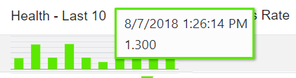
This bar chart shows up to the last 10 instances that the UDO was executed, with each bar representing a single instance. The instances are listed earliest to latest, from left to right. A red bar indicates a failure. A green bar indicates a success. The height of each bar indicates the length of time taken to process the UDO. Move your cursor over each bar to display the date and time the instance was executed and the time in seconds it took to complete.
Success Rate
The success rate of ALL instances of the UDO, not just the last 10 instances shown in the bar chart.
Shortest
The shortest time it took an instance to complete, measured in seconds.
Longest
The longest time it took an instance to complete, measured in seconds.
Last Success
The last time the instance ran successfully.
Last Fail
If there was a failure, the date and time of the last failure.
Runs Per Day
The average number of times the UDO is executed each day.