Working with the Graphical Representation of an Orchestration
The following image shows an example of the initial Orchestrations page, which lists all orchestrations that you have access to and provides a graphical representation of an orchestration with all its components.
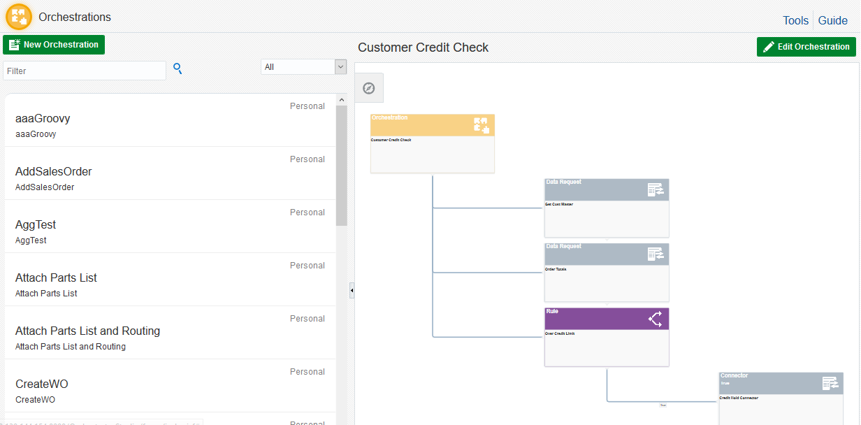
The graphic area includes the following features:
Control Panel
The Control Panel icon in the upper-left corner of the graphic area contains directional controls to pan left, right, up, and down, as well as zoom in or zoom out. "Zoom to Fit" displays the entire graphical representation in the window. The layout buttons change the layout to vertical, horizontal, tree, radial, or circle, which helps to view more complex orchestrations that contain multiple components.
Informational hover help
Hover your mouse over a component in the graphical area to view an enlarged image of the component. Hovering over the labels on the lines between a rule component and its child components magnify the "True" or "False" label. A "True" label indicates the child component will be invoked if the conditions in the rule are met. A "False" label indicates the child component will be invoked when the condition of the rule is not met.
Isolate and Restore buttons
The Isolate button on the left side of a component shows only that component in the graphic area. Restore displays all orchestration components.
Access to the design page for editing the component
When you click a box representing a component, the Orchestrator Studio takes you to the design page for modifying that particular component.