Entering Widget Pane Information
This section describes the tasks associated with the Widget Pane.
- On Create Link to Widget Pane, complete the following fields and tasks:
- Name
Enter a name for the Widget Pane. This is a required field. The name that you enter can be up to 80 characters.
- Description
Enter a description for the content frame. This is an optional field. The description that you enter can be up to 100 characters.
The description that you enter appears on the title bar of the Widget Pane when the content is saved. If you do not enter a description, the Widget Pane will not have a name when it is displayed on the Composed EnterpriseOne Page.
You can use the description to provide information about the Widget Pane.
- Name
- After you enter the required information, click OK to add a Widget Pane to the Composed EnterpriseOne Page. See also: Working with Designer Pane in this guide.
-
From the Select Widget drop-down list, select the Widget to display on the Pane.
Note: In the Widget drop-down list, you can distinguish whether a Widget is personal or shared one using the hash symbol (#). If a Widget option has a hash symbol (#) as prefix, it indicates that it is a personal Widget. - If inputs are defined for the selected Widget, the system displays the Widget
Configuration window.
-
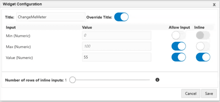
If you want to change the Widget title, enable the Override Title option, and enter the new value in the Title field. This option is also available during the runtime.
-
Enter the input value in the Value field.
-
Enable the Allow Input option.
When the Allow Input option is enabled, the system allows the user viewing the widget at runtime to change or override the input value by using the Configuration window that is displayed when clicking the
 icon.
icon. -
(Release 9.2.26.0) Enable the Inline option to display input values inline.
The Inline Input fields are available for all widget types.
When the Inline option is enabled, the input field will be rendered at runtime above the widget visualization, allowing the user to both see and change what value is being supplied to the widget on the fly.
-
(Release 9.2.26.0) Move the Number of rows of inline inputs slider to set a row value.
This value determines how the available space for the widget is shared between inline inputs and the widget visualization. A larger number displays more inline inputs without a scroll bar, but it decreases the size of the data visualization.
-
-
Click Save.