Understanding the Profitability Simulator Program (P42X20)
The Profitability Simulator program (P42X20) enables you to view and compare profit and revenue scenarios for a specified period with graphic chart display. You can set processing options to specify:
-
Whether the system displays or hides the charts.
-
The order in which the system displays the charts.
-
Whether the Profitability Simulator program opens in comparison mode or single mode.
Comparison mode is a vertical side-by-side format that enables you to compare two profit scenarios on the same form.
You can define the document types to display for past sales order information. Past sales information includes data stored in the Sales Order Detail File (F4211) and Sales Order History (F42119) tables.
The Profitability Simulator program displays charts that depict information related to price and cost comparison, profit margin, revenue, and profit. The system uses historical data stored in the Sales Order Detail (F4211) and Sales Order History Files (F42119) tables. For future quantities and price information, the system uses information stored in the Forecast File (F3460), Item Base Price File (F4106), and Item Cost File (F4105) tables. If you select the Use Advance Price option, the system uses the item price information stored in the Price Adjustment Details table (F4072).
Each chart displays its respective information based on the period type (weekly, monthly, quarterly, yearly) and the number of periods that you specify in the processing options on the Process tab. However, you can change the number of periods while using the Profitability Simulator form. You can set the Profitability Simulator program to display these charts:
-
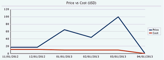
Cost vs. Price (line chart).
This line chart displays two lines that compare the item price to the item cost for the specified number of periods.
The x-axis is the date with increments based upon the number of periods. The y-axis is the currency amount. The currency is built into the chart title when you activate multicurrency processing.
-
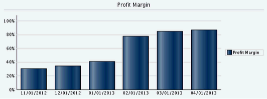
Profit Margin (bar chart).
This bar chart displays a vertical bar for each period based on the number of periods that you specify. It compares the profit margin for each period to show you a view of historical and forecast trends based on the start date that you specify.
The x-axis is the date with increments based upon the number of periods. The y-axis is the profit margin percent.
-
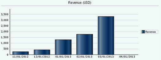
Revenue (bar chart).
This bar chart displays a vertical bar for each period based on the number of periods that you specify. It compares the revenue for each period to show you a view of historical and forecast trends based on the start date that you specify.
The x-axis is the date with increments based upon the number of periods. The y-axis is the currency amount. The currency is built into the chart title when you activate multicurrency processing.
-
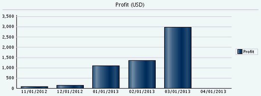
Profit (bar chart).
This bar chart displays a vertical bar for each period based on the number of periods that you specify. It compares the profit for each period to show you a view of historical and forecast trends based on the start date that you specify.
The x-axis is the date with increments based upon the number of periods. The y-axis is the currency amount. The currency is built into the chart title when you activate multicurrency processing.
The system displays the currency of the company that you indicate in the Company processing option. This processing option is on the Process tab of the Profitability Simulator program.
You can hover over any bar in the chart to display the actual value that is being depicted by the bar.