Setting Page Attributes
Each page in a component has attributes. Each attribute is represented by a column in the component definition:
This example illustrates the fields and controls on the Component item label and tab label. You can find definitions for the fields and controls later on this page.
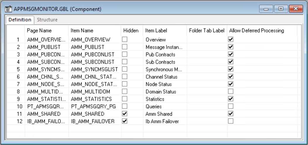
| Field or Control | Description |
|---|---|
|
Page Name |
Displays the read-only name of the page definition. If you rename the page, the system updates this column automatically. When creating page definitions, you might want to use similar names to make them easily recognizable as a group of pages. For example, if you create three pages to hold the information for the Personal Data Table, the page names might be:
|
|
Item Name |
Displays a name for each page in the component. This name must be unique in the component, and the default is the page name. This name is for informational purposes only. If you use the same page for more than one component, you might want to change the item name to reflect the purpose of the page in the component. |
|
Hidden |
Specifies whether the page can be viewed by the user at runtime. Pages are usually hidden when they are used in work groups or associated with derived work records. For example, information from a page might need to be loaded into the buffer for PeopleCode to perform calculations, but the user does not need to see it. Note: Marking the page as hidden also hides the toolbar, including the Save button, even if you choose to display the page by means of another method, such as the Transfer PeopleCode function. |
|
Item Label |
Serves as the default folder tab label unless you specify a different label. The item label should be unique for each page in a single component menu. The folder tab label is usually used when shorter names are needed for folder tabs. In the preceding example (BANK_ACCOUNT.GBL), the same text appears on both the folder tab and the component menu for the first page in the component. The second and third pages have different menu names and folder tabs. |
|
Folder Tab Label |
Displays the text that appears on the folder tab label. If no text is specified, the system uses the text of the item label on the folder tabs. |
|
Allow Deferred Processing |
Indicates whether deferred processing is active for that page in its property settings. |
Setting Access Keys
You can set access keys by placing an ampersand (&) in the text of each item label. Put the ampersand in front of the letter that you want to be underlined on the folder tab at runtime:
This example illustrates the fields and controls on the Item labels with ampersands. You can find definitions for the fields and controls later on this page.

At runtime, a user can navigate between pages by pressing the Alt key plus the letter that is underlined, followed by the Enter key.
This example illustrates the fields and controls on the Underlined access keys on tabs. You can find definitions for the fields and controls later on this page.

Related Topics