Creating Fluid Pop-up Menus
You can create a pop-up menu on a fluid page with menu items performing any action or navigation. Fluid pop-up menus can contain only a single level of menu items. Using the page controls and techniques described in this section will create pop-up menus that are rendered, styled, and tagged to standards that work with assistive technology.
The following example illustrates a fluid pop-up menu:
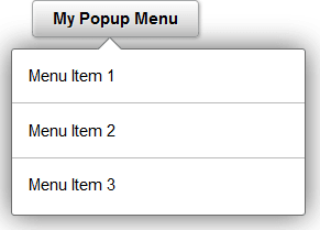
A fluid pop-up menu is not a separate, distinct page control found in Application Designer. Instead, you can use several methodologies to create fluid pop-up menus, including a parent group box (described here), a hyperlink or button, and others. The procedure described here relies on a parent group box of type Popup to serve as the button to activate the pop-up menu. This procedure requires no further coding by you to create a control and menu that is generated to standards that work with assistive technology. In addition to the parent Popup group box, you can use one of three methods to create the pop-up menu:
-
A group box of type Menu. Each menu item is a hyperlink contained within a group box of type Menu Item.
-
A grid with a layout of Menu Grid Layout. Each row in the grid is a menu item.
-
A scroll area with a layout of Menu. Each row in the scroll is a menu item.
To create a fluid pop-up menu:
-
Create a parent group box of type Popup to serve as the button to activate the pop-up menu:
-
On the Label tab, specify a text label for this button.
-
On the Use tab, specify an image for this button if applicable.
-
On the Fluid tab: Specify any additional styles for this button—for example, psc_image_only.
-
On the Fluid tab: Oracle recommends that you enable a vertical scroll bar for this menu; whether a vertical scroll bar is displayed depends on how the page is displayed (in a modal window, for example) and form factor usage (smart phone, for example).
-
Using the SetGroupletMOptions PeopleCode built-in function, set modal popup options enabling bPopupMenu on the record field. For example:
MY_RECORD.POPUP_MENU_GBX.SetGroupletMOptions("bPopupMenu@1;");Note:
When bPopupMenu is enabled (set to 1), the system will automatically set bHeader to 0 (disabled), bAutoClose to 1 (enabled), bMask to 1 (enabled), and sMaskStyle to ps_masktrans; these options cannot be overridden. In addition, bVertical will be set to 1 (which is recommended), but it can be overridden.
-
-
Within the popup group box, create the menu container using one of three options:
-
To create a static menu, use a group box of type Menu.
-
To create a dynamic menu, use a grid with a layout of Menu Grid Layout.
-
Alternatively, use a scroll area with a layout of Menu to create a dynamic menu.
-
-
Define menu items within the menu container depending on the option selected in step 2:
-
If the menu container is a group box, create a group box of type Menu Item for each static menu item. Within each menu item group box, insert a single control, a hyperlink that executes the PeopleCode for this menu item. If you require a complex grouping of controls, use a grid or scroll as the menu container.
-
If the menu container is a grid or a scroll area, you can create a simple grid or scroll with one column: a hyperlink that executes the PeopleCode for this menu item.
-
Alternatively, if the menu container is a grid or a scroll area, you can also create a grouping of columns to be acted upon as a single menu item: a layout group box as the first column in the grid (in a scroll, this layout group box contains the other columns), one hyperlink that executes the PeopleCode for this menu item, and any additional controls such as images or counters (badges) to adorn the menu item.
-