Working with Accordion Group Boxes
The Accordion is a web control that allows you to provide multiple, collapsible panes and display them one at a time. With an accordion group box,
When working with the accordion feature:
-
Set the parent group box container as Accordion Vertical for vertical accordion behavior (up and down) or Accordion Horizontal for horizontal accordion behavior (left and right).
-
Set the children group boxes (the group boxes that will be the recipient of the expanding and collapsing behavior) as Accordion Group Boxes.
Note:
Horizontal Accordion group boxes should not be used in the current release. It is reserved for internal use.
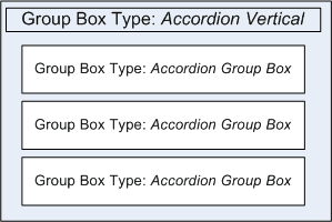
This example illustrates that when creating an accordion construct, the outer group box is assigned the Accordion Vertical group box type, and the content within resides in group boxes of type Accordion Group Box.
This example illustrates how an accordion group box appears initially, after page load, with all sections collapsed, by default.

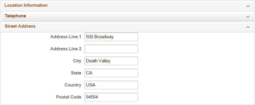
This example illustrates how one section can be expanded at a time, showing the page content within, while keeping the other sections collapsed, saving display space.