Working with Check Boxes
With check boxes on a fluid page, there are differences based on the Control Structure settings on the Check Box Properties > Fluid tab.
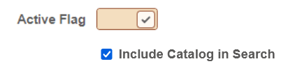
The default (Advanced) is presented as a toggle switch, which has an on or off value, without any text on the switch control. While the on state displays a check mark on the switch control, the off state does not display a check mark. The switch control has a single size (or width). With Basic selected, the system shows just a check box, similar to classic rendering.
Label positioning can be important with these options, as you typically want labels to appear after a standard check box but before the control with the Advanced option selected.
This example illustrates the differences in rendering and label placement of the Advanced and Basic Control Structure settings for check boxes. The Advanced selection shows the toggle switch, while the Basic selection displays a more standard check box.
Related Topics