The Pagelet Area
The WorkCenter pagelet area consists of three parts:
-
The header.
-
The pagelet area.
-
The footer.
In the header, the title, the Home button, and the pagelet area controls drop-down menu are visible. You click the Home button to return to the WorkCenter starting page. You click the pagelet area controls drop-down menu to access up to three links that enable you to reload, personalize, and configure the WorkCenter page.
Note:
When the WorkCenter is created from an existing menu item, the default title of the pagelet area is the same as the label for the menu item. However, when the WorkCenter is created from a link to a menu item, the title of the pagelet area is Task Panel.
The pagelets that you assign to the WorkCenter page appear in the main body of the pagelet area. Each pagelet you assign to the area is a self contained unit that you control independently of other pagelets. Pagelets appear one above the other, either in an expanded or collapsed state based on your configuration. Expanded pagelets divide the available space evenly until the user resizes a pagelet by dragging the pagelet handle. The system automatically adjusts the size of remaining pagelets to fill the available space.
At the bottom of the pagelet area, the More drop-down menu appears in the footer. You can configure the WorkCenter page to hide any pagelet that is minimized instead of collapsing the pagelet into its header. The hidden pagelet is minimized to the More menu. When you click the drop-down button, the titles of the minimized pagelets appear in a list. Select a pagelet from the list and the systems restores the pagelet to its original size and positions it at the bottom of any other expanded pagelets in the pagelet area.
The pagelet area is adjustable in width and its configuration is flexible. You can organize the pagelet area by creating pagelet groups. Each group appears as a separate tab. If you configure multiple pagelet groups, a tab appears at the top of the each page to identify the pagelet group and provide a familiar vehicle for accessing the pagelets. You can define options such as the initial size of the pagelet area, the pagelet group order, and the pagelet group that appears by default when you access a WorkCenter page.
The following example of a WorkCenter pagelet area shows three, tabbed pagelet groups:
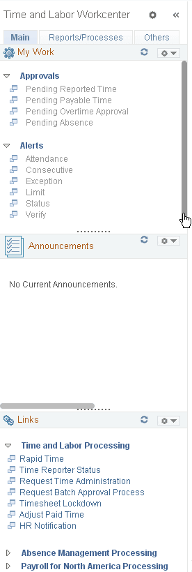
After creating pagelet groups, you assign pagelets to the groups. You specify options such as the order of the pagelets, which pagelet receives focus by default, whether the pagelet is collapsed or expanded as its initial state, and the maximum number of pagelets that remain visible when in a minimized state. The pagelet area also supports user personalizations to the extent that you enable them.
Generally, pagelets that you assign to WorkCenter pages are narrow format pagelets that are specifically designed to appear in the resizable pagelet area. The pagelet area supports homepage and template pagelets that are registered in either the Pagelets or the Template Pagelets folder in the portal registry.
Note:
You access these folders by selecting and then clicking the Portal Objects link.
The pagelet area supports iScript-based pagelets, component-based pagelets, and even external URL-based pagelets. You can use Pagelet Wizard to create and publish iScript-based template and homepage pagelets such as those that use navigation collections and queries as data sources. You can also manually create and register component-based or other pagelets.
Related Topics