Configuring a List Layout
The framework provides the capability to render a table for a Siebel list applet or hierarchical list applet based on JSON configuration embedded in a custom Presentation Model (PM). To render the list, the framework uses the Oracle JET oj-table component. Therefore, the JSON configuration can use the configuration options that the Oracle JET oj-table component supports, along with Siebel-specific extensions.
Use this configuration to define table properties, data-column properties, non-data-column properties, and the overall column sequence for the rendered list. The framework also provides additional attributes and behaviors for binding Siebel list applet metadata and data to the configured layout.
The following examples describe common customization use cases for configuring a list layout.
You can configure siebel/listmodelviewpm as the Presentation Model (PM) for the corresponding list applet to render the list or hierarchical list by using the Oracle JET oj-table component. In this case, all column controls that are configured for the list and exposed through the related applet web template are rendered through the framework.
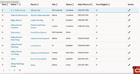
Here is a sample screenshot of how UI would appear for such use case:
To configure the default list layout:
-
Create a custom Presentation Model (PM) file for the Siebel list applet. The custom PM must extend ListModelViewPM, which provides the base framework behavior for rendering a Siebel list applet through the Web Component Framework.
define('siebel/mycustomlistpm', ['siebel/listmodelviewpm'], function () { "use strict"; SiebelJS.Namespace("SiebelAppFacade.MyCustomListPM"); SiebelAppFacade.MyCustomListPM = (function () { function MyCustomListPM() { SiebelAppFacade.MyCustomListPM.superclass.constructor.apply(this, arguments); } SiebelJS.Extend(MyCustomListPM, SiebelAppFacade.ListModelViewPM); MyCustomListPM.prototype.Init = function () { SiebelAppFacade.MyCustomListPM.superclass.Init.apply(this, arguments); }; return MyCustomListPM; }()); return "SiebelAppFacade.MyCustomListPM"; }); -
Go to the Manifest Administration view to configure the manifest.
-
Create a new entry in Applet "UI Objects":
- Type: Applet
- Usage Type: Presentation Model
- Name: <Applet Name>
-
Create a record in "Object Expression" applet:
- Expression: "Redwood Theme"
- Level: 1
For the above record, associate file "siebel/mycustomlistpm" with it by using the Applet "Files".
-
-
Review the JSON configuration
-
Default List Layout.
The following example shows a basic JSON configuration for rendering a list applet through the Oracle JET oj-table component:{ "editMode": "rowEdit", "horizontalGridVisible": "enabled", "verticalGridVisible": "enabled" }This configuration applies Oracle JET table properties at the top level of the JSON definition.
-
Data Columns Sequence Controlled by ODH Template with Customization.
The framework provides the capability to render a Siebel list applet by using JSON configuration embedded in a custom Presentation Model (PM). Use this approach when you want to retain the column sequence from the ODH template but override selected table properties or selected column properties.
Use this configuration to:
- Retain the columns configured in the ODH template, while honoring the overriding configuration that the JSON provides.
- Override selected table properties or selected data-column properties without redefining the entire list layout.
JSON configuration for this scenario:{ "editMode": "rowEdit", "horizontalGridVisible": "enabled", "verticalGridVisible": "enabled", "columns": [ { "field": "Parent Account Name", "resizable": "disabled", "templates": { "Edit": { "UIType": "JText" } } } ] }The JSON configuration provides configuration at two levels. At the first level, it defines Oracle JET table properties that oj-table supports. At the second level, it defines data-column or non-data-column properties in the columns property of the Oracle JET table.
For example, the following JSON defines a data-column override:{ "field": "Parent Account Name", "resizable": "disabled", "templates": { "Edit": { "UIType": "JText" } } }Use this configuration when you want to override the ODH template column order and render only a selected subset of columns. In this case, the framework renders only the columns that the JSON configuration defines and honors the order in which those columns appear in the columns property.
To support this behavior, set the top-level JSON property columnsSequenceOverride to true.
JSON configuration for this scenario:const JSON_PROPERTY_VALUE = { columnsSequenceOverride: true, editMode: "rowEdit", horizontalGridVisible: "enabled", columns: [ { field: "Row Status" }, { field: "Name", headerText: "Account Name" }, { field: "Parent Account Name", resizable: "disabled", templates: { Edit: { UIType: "JText" } } } ] };In this configuration, only the columns listed in the JSON are rendered, and they are displayed in the same sequence in which they appear in the columns array.
-
- Convert Oracle JET kebab-case property names to camelCase in the JSON configuration. For example, vertical-grid-visible becomes verticalGridVisible, and selection-mode becomes selectionMode.
- If a property accepts an object value, provide the value in JSON object form according to the Oracle JET property definition. For example, the selectionMode property can contain keys such as row or column, depending on the Oracle JET documentation.
Multi-select Support
- selection-mode.row='multiple' (default), the row selection checkbox column can be displayed.
- The row selection checkbox column is always displayed when "MultiSelect" is enabled for a list applet. The Open UI applet property Multi Row Select Checkbox Display is no longer honored based on device capability.
- To customize multi-select behavior, use the applet (SWEFrame) method MultiSelect.
Set the CanInvoke value for this method to true or false, or set
selection-mode.row='multiple' or selection-mode.row='single'.Note: Unsupported Open UI features must not be assumed to work automatically in the Web Component Framework list layout. Only the controls, bindings, and extensions that are documented for this framework are supported. If a specific Open UI behavior depends on legacy rendering logic, then additional redesign or customization might be required.