Configuring a Foldout Layout
The Web Component Framework provides the capability to render a Siebel view by using the Oracle JET oj-sp-foldout-layout component. This layout is useful when you want to present an overview region together with multiple foldout panels that organize related applet content in a modern, responsive user interface.
The Foldout Layout configuration is defined in the SEBL_COMPONENT_CONFIG
property of a custom view Presentation Model (PM). The JSON specification defines the imported
Oracle JET modules, the variables used across the configuration, the main foldout layout
component, and the child components that are rendered in the supported slots.
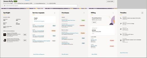
Sample UI :
Following functions are supported:
- A horizontal overview region in the overview slot.
- Multiple oj-sp-foldout-panel-summarizing panels in the default slot.
- Dynamic binding of panel title, action label, and action state to Siebel applet controls.
- Secondary actions by using supported JSON functions such as $fn:array, $fn:object, $fn:join, $fn:map, and $fn:execute.
- Optional content, such as recommendation content, inside supported panel slots.
-
Reuse of existing Siebel applets inside the foldout layout.
To configure a Foldout Layout:
- Create a custom view PM that extends SiebelAppFacade.BaseViewModelViewPM.
- Define the Foldout Layout JSON in the SEBL_COMPONENT_CONFIG property.
- Configure the overview area and the foldout panels in the children array.
- Configure the manifest so that the custom PM is loaded for the view.
- Configure any applets that are reused in the overview region or foldout panels by using their corresponding PMs.
Example of Foldout Layout JSON
{
  "imports": [
    "ojs/ojinputsearch",
    "oj-sp/foldout-layout/loader",
    "oj-sp/foldout-panel-summarizing/loader",
    "oj-sp/empty-state/loader",
    "oj-sp/horizontal-overview/loader",
    "ojs/ojlabelvalue",
    "oj-c/input-text",
    "ojs/ojformlayout"
  ],
  "variables": {
    "Applet1": "<Applet Name #1>",
    "Applet2": "<Applet Name #2>",
    "Applet3": "<Applet Name #3>",
    "Applet4": "<Applet Name #4>",
    "Applet5": "<Applet Name #5>",
    "Applet6": "<Applet Name #6>",
    "Applet7": "<Applet Name #7>",
    "AppletTitle": "<Siebel control used for the panel title>",
    "ViewAll": "<Siebel control used for the View All action>",
    "PayBill": "<Siebel control used for a panel action>"
  },
  "component": "oj-sp-foldout-layout",
  "attributes": {
    "orientation": "horizontal",
    "displayMode": "light",
    "animate": "auto",
    "displayOptions": {
      "goToParent": false,
      "inFlowBack": true
    }
  },
  "children": [
    {
      "component": "div",
      "attributes": {
        "slot": "overview"
      },
      "children": [
        {
          "component": "$Applet:($var:Applet1)"
        }
      ]
    },
    {
      "component": "div",
      "attributes": {
        "slot": "search"
      },
      "children": [
        {
          "component": "$Applet:()"
        }
      ]
    },
    {
      "component": "oj-sp-foldout-panel-summarizing",
      "attributes": {
        "panelTitle": "$fn:value($var:Applet2,$var:AppletTitle,DisplayName)",
        "overflowActionLabel": "$fn:value($var:Applet2,$var:ViewAll,DisplayName)",
        "onspOverflowAction": "$fn:execute($var:Applet2,$var:ViewAll)",
        "secondaryActions": {
          "$type": "$fn:array",
          "value": [
            {
              "$type": "$fn:object",
              "value": {
                "id": {
                  "$type": "$fn:join",
                  "value": [
                    "$var:Applet2",
                    "$var:AppletTitle"
                  ],
                  "combiner": ":"
                },
                "label": "$fn:value($var:Applet2,$var:AppletTitle,DisplayName)",
                "icon": "oj-ux-ico-actions",
                "display": {
                  "$type": "$fn:map",
                  "value": "$fn:value($var:Applet2,$var:AppletTitle,CanInvoke)",
                  "mapper": "$fn:execute($,BooleanToOnDisabled)"
                }
              }
            },
            {
              "$type": "$fn:object",
              "value": {
                "id": {
                  "$type": "$fn:join",
                  "value": [
                    "$var:Applet2",
                    "$var:ViewAll"
                  ],
                  "combiner": ":"
                },
                "label": "$fn:value($var:Applet2,$var:ViewAll,DisplayName)",
                "icon": "oj-ux-ico-actions",
                "display": {
                  "$type": "$fn:map",
                  "value": "$fn:value($var:Applet2,$var:ViewAll,CanInvoke)",
                  "mapper": "$fn:execute($,BooleanToOnDisabled)"
                }
              }
            }
          ]
        },
        "onspAction": "$fn:execute($,SecondaryActionsHandler)"
      },
      "children": [
        {
          "component": "div",
          "attributes": {},
          "children": [
            {
              "component": "$Applet:($var:Applet2)"
            }
          ]
        }
      ]
    },
    {
      "component": "oj-sp-foldout-panel-summarizing",
      "attributes": {
        "panelTitle": "$fn:value($var:Applet3,$var:AppletTitle,DisplayName)",
        "overflowActionLabel": "$fn:value($var:Applet3,$var:ViewAll,DisplayName)",
        "onspOverflowAction": "$fn:execute($var:Applet3,$var:ViewAll)"
      },
      "children": [
        {
          "component": "div",
          "attributes": {},
          "children": [
            {
              "component": "$Applet:($var:Applet3)"
            }
          ]
        },
        {
          "component": "div",
          "attributes": {
            "slot": "recommendation"
          },
          "children": [
            {
              "component": "$Applet:($var:Applet7)"
            }
          ]
        }
      ]
    }
  ]
}
Configuring the Foldout Layout JSON
- Add all required Oracle JET modules in the imports array.
- Define reusable values, such as applet names and control names, in the variables object.
- Set the main component value to oj-sp-foldout-layout.
- Define layout-wide settings, such as orientation, displayMode, animate, and displayOptions, in the attributes object.
- Use the children array to define content for the supported slots.
- Use the overview slot for the overview applet or component.
- Use the default slot for one or more oj-sp-foldout-panel-summarizing components.
- Use supported dynamic bindings to populate panel title, overflow action label, and action state from Siebel data.
- Add multiple foldout panel JSON objects as required for the business use case.
Overview Slot
The overview slot is typically used to display summary information for the current record or context. The following example shows the JSON structure for the overview slot:
{
  "component": "div",
  "attributes": {
    "slot": "overview"
  },
  "children": [
    {
      "component": "$Applet:($var:Applet1)"
    }
  ]
}
You can configure the applet used in the overview slot by using a dedicated PM that renders a horizontal overview web component.
Default Foldout Panel
The default slot is used to render one or more oj-sp-foldout-panel-summarizing components. Each panel can display applet content and optional actions.
{
  "component": "oj-sp-foldout-panel-summarizing",
  "attributes": {
    "panelTitle": "$fn:value($var:Applet2,$var:AppletTitle,DisplayName)",
    "overflowActionLabel": "$fn:value($var:Applet2,$var:ViewAll,DisplayName)",
    "onspOverflowAction": "$fn:execute($var:Applet2,$var:ViewAll)"
  },
  "children": [
    {
      "component": "div",
      "attributes": {},
      "children": [
        {
          "component": "$Applet:($var:Applet2)"
        }
      ]
    }
  ]
}
This configuration renders the specified applet inside the foldout panel and binds the panel title and overflow action to Siebel controls.
Configuring JSON for the Horizontal Overview Applet
The Foldout Layout often uses a horizontal overview applet in the overview slot. Configure that applet separately by using a dedicated PM. The following example shows a representative JSON structure:
{
  "imports": [
    "oj-sp/horizontal-overview/loader",
    "oj-sp/smart-search/loader",
    "ojs/ojlabelvalue",
    "ojs/ojformlayout"
  ],
  "variables": {
    "Applet": "<Applet Name>",
    "itemTitle": "Name",
    "Status": "Status",
    "AccountNumber": "Account Number",
    "StreetAddress": "Address1",
    "EmailAddress": "Main Email Address",
    "PhoneNumber": "Main Phone Number",
    "ButtonAccountDetails": "ButtonAccountDetails"
  },
  "component": "oj-sp-horizontal-overview",
  "attributes": {
    "id": {
      "$type": "$fn:join",
      "value": [
        "$var:Applet",
        "$var:ButtonAccountDetails"
      ],
      "combiner": ":"
    },
    "itemTitle": "$fn:value($,$var:itemTitle,Value)",
    "displayMode": "light",
    "displayOptions": {
      "showDetails": "on"
    },
    "translations": {
      "$type": "$fn:object",
      "value": {
        "showDetails": "$fn:value($,$var:ButtonAccountDetails,DisplayName)"
      }
    },
    "badge": {
      "$type": "$fn:object",
      "value": {
        "text": "$fn:value($,$var:Status,Value)",
        "status": {
          "$type": "$fn:map",
          "value": "$fn:value($,$var:Status,Value)",
          "mapper": "$fn:execute($,StatusColor)"
        },
        "style": "strong"
      }
    },
    "onspShowDetails": "$fn:execute($,AccountDetailEvent)"
  }
}
This configuration uses dynamic bindings to display record-specific summary information in the overview area.
Configuring the View PM
-
Set the JSON configuration in the custom view PM by using the SEBL_COMPONENT_CONFIG property.
this.AddProperty("SEBL_COMPONENT_CONFIG", { "imports": [ "ojs/ojinputsearch", "oj-sp/foldout-layout/loader", "oj-sp/foldout-panel-summarizing/loader", "oj-sp/empty-state/loader", "oj-sp/horizontal-overview/loader", "ojs/ojlabelvalue", "oj-c/input-text", "ojs/ojformlayout" ], "variables": { "Applet1": "<Applet Name #1>", "Applet2": "<Applet Name #2>", "Applet3": "<Applet Name #3>", "Applet4": "<Applet Name #4>", "Applet5": "<Applet Name #5>", "Applet6": "<Applet Name #6>", "Applet7": "<Applet Name #7>", "AppletTitle": "<Siebel control used for the panel title>", "ViewAll": "<Siebel control used for the View All action>", "PayBill": "<Siebel control used for a panel action>" }, "component": "oj-sp-foldout-layout", "attributes": { "orientation": "horizontal", "displayMode": "light", "animate": "auto", "displayOptions": { "goToParent": false, "inFlowBack": true } }, "children": [ { "component": "div", "attributes": { "slot": "overview" }, "children": [ { "component": "$Applet:($var:Applet1)" } ] } ] }); -
Configure the Siebel Manifest for the View.
- In Manifest Files, create a new record. Name: siebel/foldoutlayoutmodelviewpm.js
- In Manifest Administration, create a new record. Type: View. Usage Type: Presentation Model. Name: <View Name>.
- For this record, create a record in Object Expression. Expression: Redwood Theme. Level: 1.
- Associate the file siebel/foldoutlayoutmodelviewpm.js with the record by using the View Files list.
-
Configure the Siebel Manifest for the Horizontal Overview Applet.
- In Manifest Files, create a new record. Name: siebel/horizontaloverviewwebcomponent.js
- In Manifest Administration, create a new record. Type: Applet. Usage Type: Presentation Model. Name: <Applet Name>.
- For this record, create a record in the Object Expression applet. Expression: Redwood Theme. Level: 1.
- Associate the file siebel/horizontaloverviewwebcomponent.js with the record by using the Applet Files list.
-
Configure the Siebel Manifest for the Foldout Panel List Applet
The foldout panels can reuse list applets that are configured separately. For example, a panel can render a list applet that uses a custom list-style PM.
- In Manifest Files, create a new record. Name: siebel/orderlistdashboardappletpm.js
- In Manifest Administration, create a new record. Type: Applet. Usage Type: Presentation Model. Name: <Applet Name>.
- For this record, create a record in the Object Expression applet. Expression: Redwood Theme. Level: 1.
- Associate the file siebel/orderlistdashboardappletpm.js with the record by using the Applet Files list.
Validation
- The foldout layout renders correctly in the Redwood theme.
- The overview area displays the expected summary content.
- Each foldout panel displays the expected applet content.
- The panel title and overflow action label display the correct values.
- Overflow actions and secondary actions invoke the expected Siebel behavior.
- Any configured recommendation content is displayed in the appropriate panel slot.
- The reused list applets and overview applets function correctly inside the layout.