About Gauge Charts

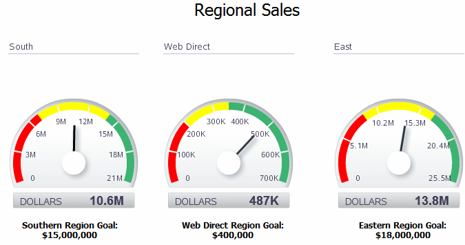
A gauge chart is a useful way to illustrate progress or goals. The illustration shows a report with gauges.

For example, the following figure shows a report with three gauges to indicate the status of regional sales goals:

Insert a Gauge Chart

Follow these steps to insert a gauge chart.

To insert a gauge chart in the layout:
  1. From the Insert menu, select and drag the Gauge component to the layout. This inserts an empty gauge chart.
  2. Select and drag the data fields from the Data Source pane to the Label, Value, and Series areas of the chart. The chart immediately updates with the preview data.

    Note the following:

    • A separate gauge is created for each occurrence of the Label (that is, each REGION). One set of properties applies to each occurrence.

    • By default, the Value field is a sum. You can change the expression applied to the value field.

    • You can apply a sort to the other gauge chart fields.

Apply and Manage Filters

Follow this section to know how to apply and manage filters.

See About Filters for information on how to apply and manage filters.