Add Statistical Analytics to Visualizations
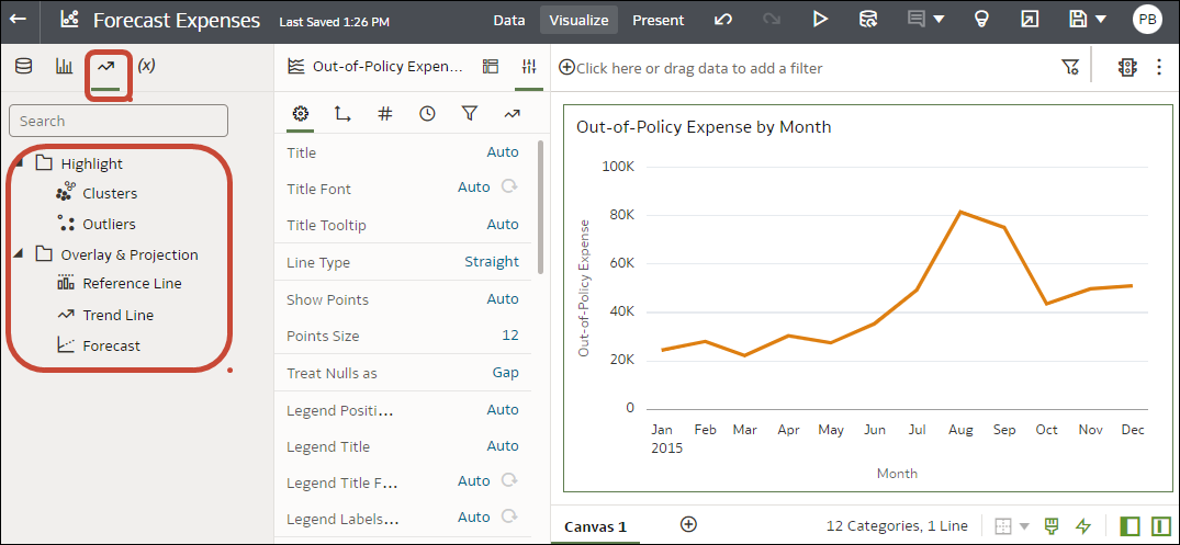
Statistical analytics enable you to highlight clusters or outliers, add forecasts, and show trend and reference lines in your workbooks. Select them on the Analytics tab of the Data pane in the workbook editor.
Alternatively, you can add forecasts, trendlines, and clusters to a workbook using text-only analytics functions. See Analytics Functions.
Before you start, make sure that you have the required data in your visualization for the type of analytics you want to add. For example, for a forecast, you need at least one time dimension and a measure or metric.
- On your home page, hover over a workbook, click Actions, then select Open.
- In the Data Panel, click the Analytics icon
 .
. - Drag and drop Cluster or Outlier from the Analytics pane to a visualization.
- To configure the analytics function click Properties on the Grammar Panel and use the options in the Analytics pane.
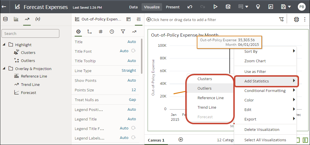
You can also access the analytics options by right-clicking on a visualization, and selecting Add Statistics.

