Create a Visualization
After you’ve created a workbook and added a dataset to it, you can start creating visualizations on a canvas to visualize and analyze your data.
For information about creating a workbook, see Begin to Build a Workbook.
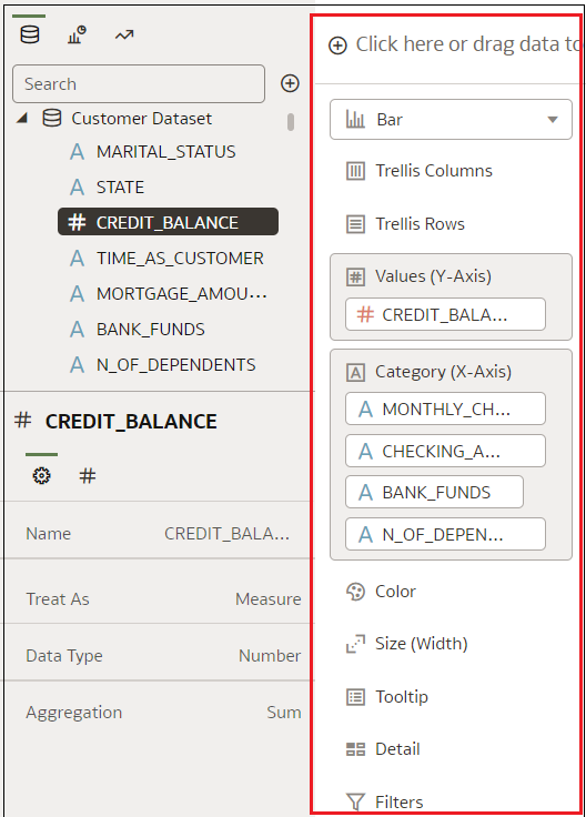
You can select compatible data elements from a dataset and drop them onto the Grammar pane in the Grammar Panel in the Visualize canvas. Based on your selections, visualizations are created on the canvas. The Grammar pane contains sections such as Columns, Rows, Values, and Category.
- On your home page, hover over a workbook, click Actions, then select Open.
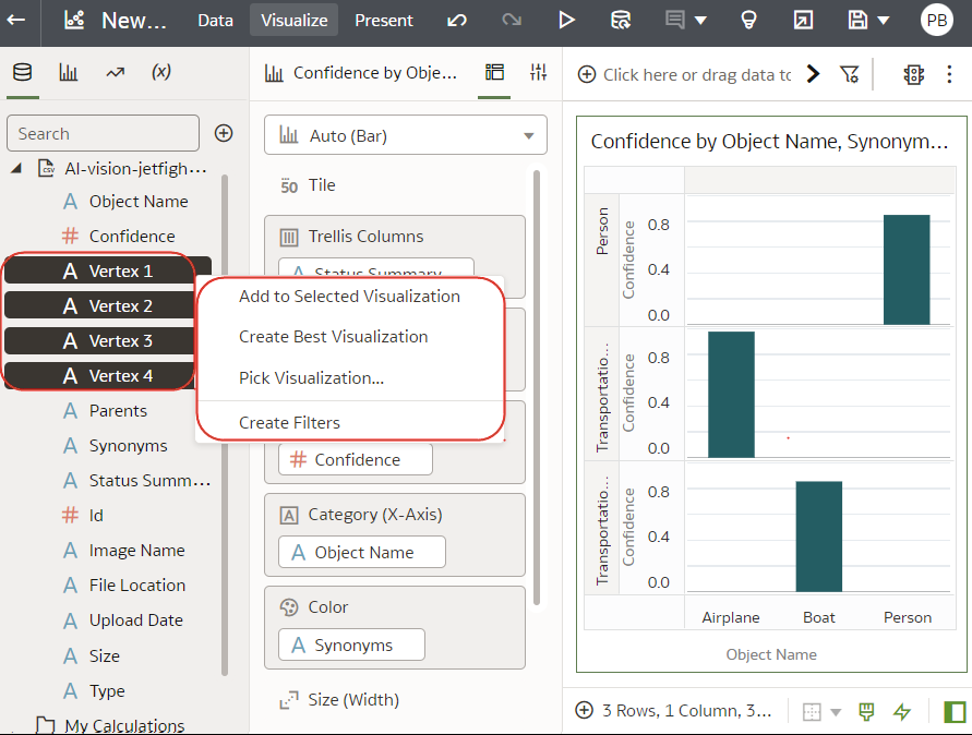
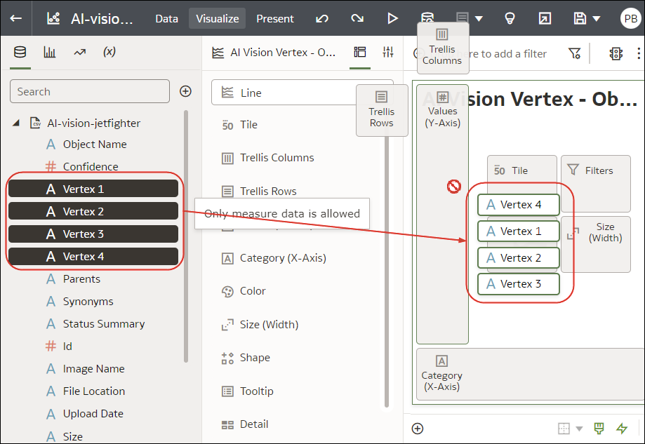
- Select the data you want to visualize by selecting one or more data elements in the Data pane in the Data Panel and then use one of the following methods:
- Right-click, then select Create Best Visualization to let Oracle Analytics choose an appropriate visualization for the selected data elements.
- Right-click, select Pick Visualization, and select the visualization type that you want to use (for example, a table or heat map).
- Drag and drop the data elements directly onto the canvas or into the Grammar pane.
- Right-click, then select Create Best Visualization to let Oracle Analytics choose an appropriate visualization for the selected data elements.
Tips on adding data
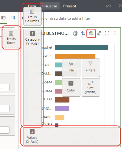
- To help you understand the components of a visualization, hover over it and click Show Assignments to annotate the visualization components, for example, the X-Axis and Y-Axis of a chart.
- Use the Grammar pane to configure visualization components (for example, add,
remove, re-order).
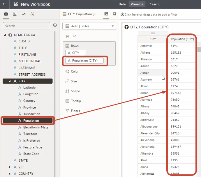
- If a dataset is augmented with knowledge enrichments, you'll see knowledge enrichments in the element tree displayed just like regular data elements in the dataset. In this example, the Oracle Analytics administrator has added Population and other city-related data to Oracle Analytics. When you create a workbook based on the CITY dataset, you can add population and other data elements directly to your visualization.
