Represent Data Values with Color and Size on a Map
You can use color and size to represent values in a map visualization.
Use color to represent attribute or measure values for both point and polygon layer types. For example, you can use color to show sales performance by region or to distinguish product categories across locations.
Use size to represent values for Point layer types only. Size is based on a measure column and shows the relative magnitude of values at each location.
Color and size are configured using the Color and Size edges in the Grammar pane. Oracle Analytics automatically adds a visualization legend if the columns used for Color or Size have multiple values.
For example, you can create a map visualization that shows cities around the world using the City column, color the cities by Product Category, and size the points by Sales. This makes it easy to compare sales performance and product distribution across locations.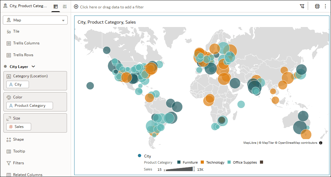
Description of the illustration maps_basic_example.png
- On your home page, hover over a workbook, click Actions, and select Open.
- In the Data pane, right-click a map-related column, click Pick Visualization, and select Map
 .
. - Drag and drop an attribute or measure column to Color in the Grammar pane.
- If your map layer uses points, drag and drop a measure column to Size in the Grammar pane.
- Click Save.