Swap Columns in a Visualization
In Oracle Analytics, you can swap the columns used in a visualization to explore the data further and discover insights.
If your content author has enabled column swapping for a visualization that has a vertical axis, horizontal axis, or legend, you can change the columns used for those elements.
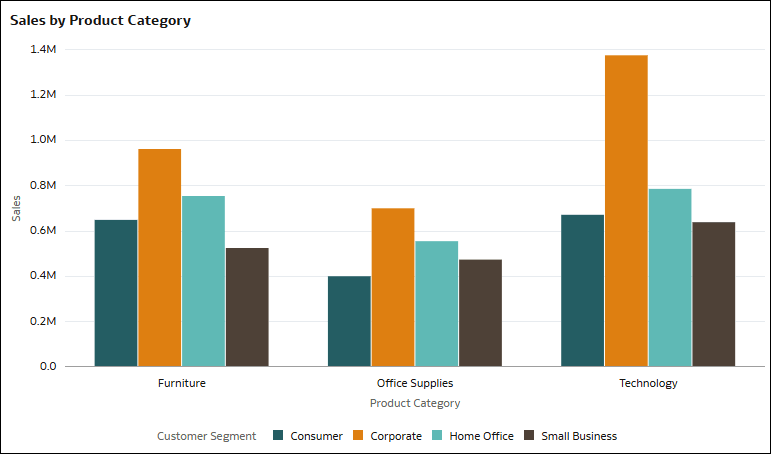
For example, you might have a bar graph showing Sales by Product Category, where Product Category is on the horizontal axis and Sales is on the vertical axis. This bar graph also shows the breakdown of Customer Segment for each product category using colors and a legend.
Description of the illustration column_swap_example1.png
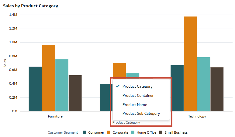
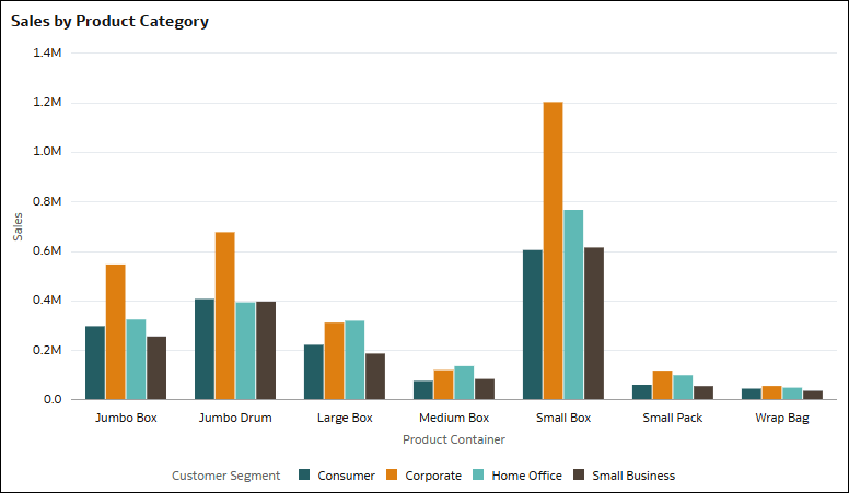
If column swapping is enabled, you can click the column names Sales, Product Category, or Customer Segment in the visualization and select alternate columns from a list curated by the author. This way, you can explore the data in the visualization based on different column configurations.
The changes you make to the visualization are only temporary for your session, you can't save them in a workbook state.
- On your home page, hover over a workbook, click Actions, then select Open.
- In a visualization, click the column name for the vertical axis, horizontal axis, or legend.
- Select a column from the list of available columns.

